Role
User research, UI design, usability testing
Timeline
4 months
Domain
Education, prior learning assessment
Scope
Research, IA, user flows, journey maps, wireframes, hi-fi prototypes
EAS, REDESIGNED
CHAPTERS
01 — RESPONSIBILITIES
Requirement Gathering
Stakeholder Collaboration
User Research
Usability Testing
Information Architecture
User Flow
Journey Mapping
Wireframing
High-Fidelity Prototyping
02 — PROJECT CONTEXT
The Education Assessment System (EAS) aims to help students earn academic credit through Prior Learning Assessment (PLA), leveraging real-world experience such as work, certifications, and independent learning.
However, the existing platform lacked clarity, guidance, and intuitive navigation. As more students explore alternative pathways to education, the challenge was to create a seamless, easy-to-understand experience that would:
Help users clearly understand what to do, what to input, and how to progress through the platform.
Cater to students with varying levels of experience, education, and familiarity with PLA.
Ensure course suggestions feel relevant, transparent, and reliable.
Encourage users to confidently complete submissions and move forward in their academic journey.
03 — PROBLEM STATEMENT
PROBLEM STATEMENT
“How might we design a structured and user-friendly PLA experience that reduces friction, improves clarity, and builds confidence throughout the student journey?”
04 — RESEARCH METHODS
Requirement Gathering
Stakeholder Collaboration
User Research
Usability Testing
Information Architecture
User Flow
Journey Mapping
Wireframing
High-Fidelity Prototyping
05 — SURVEY
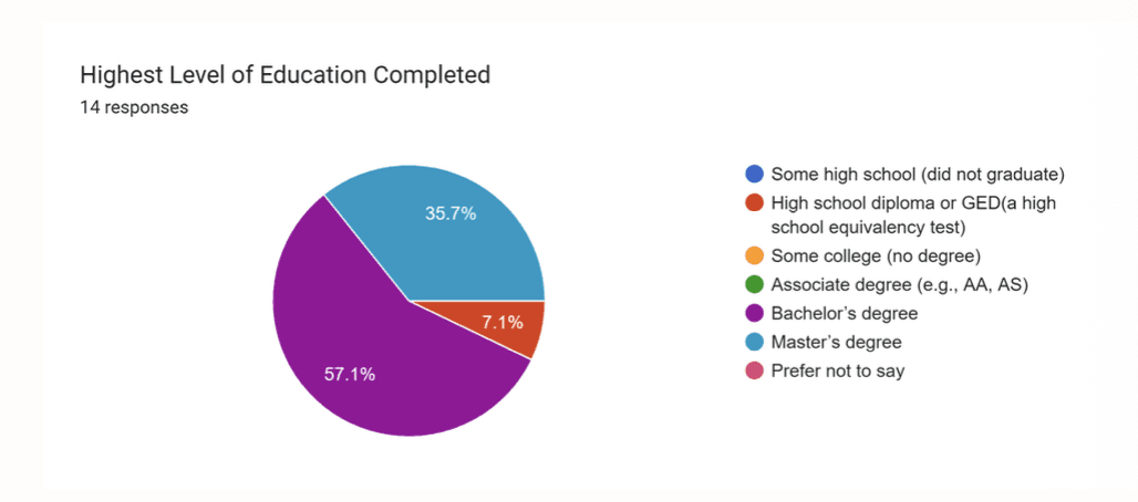
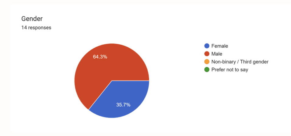
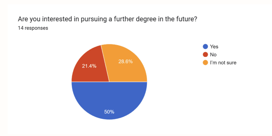
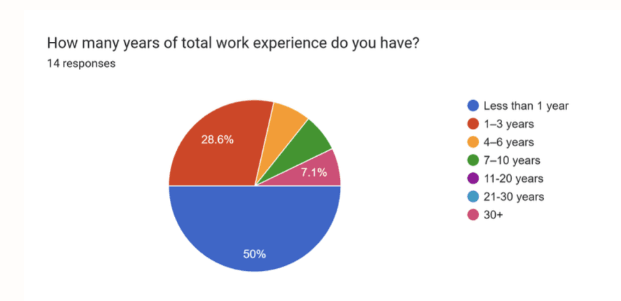
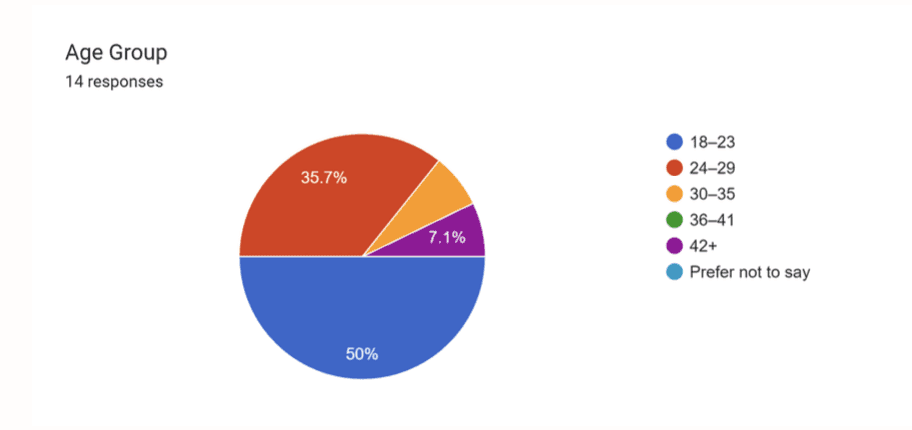
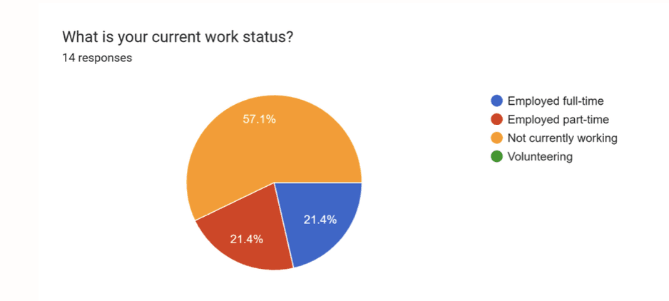
We conducted research with 14 participants from diverse backgrounds, varying in age, education, and work experience.
Participants were from the USA, India, and Taiwan, providing both domestic and international perspectives to identify usability challenges across different user groups.
06 — USER FLOW
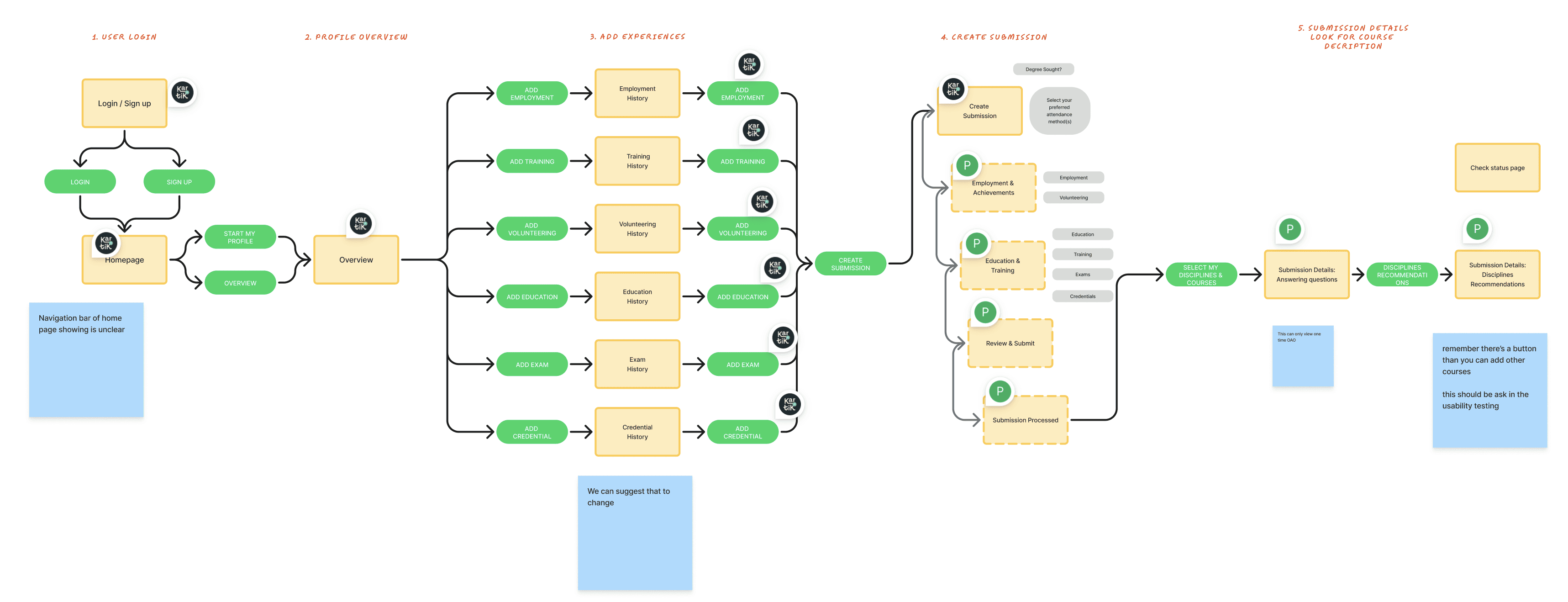
Before usability testing, we mapped the core user flow to understand how students submit prior learning for academic credit.
The journey included five key stages:
1. Log in / Sign up
2. Profile overview
3. Add experiences
4. Create submission
5. Review recommendations and verify course fit
07 — POST-TEST SURVEY
We first asked users to test the platform by completing key tasks across the full journey. After the usability session, participants filled out a post-test survey to evaluate their experience.
Most users rated guidance around the midpoint, indicating they were unsure how to begin or what to do next.
While some users found the layout clean, others described it as text-heavy and confusing, slowing down task completion.
Only a small number of users felt the course suggestions accurately reflected their experience. Many reported low confidence in using these results for academic credit.
Users reported feelings of confusion, hesitation, and disappointment, especially during the recommendation stage.
Some users felt reassured by the structured process, while others remained uncertain about whether their experience would translate into valid credit.
08 — PERSONA
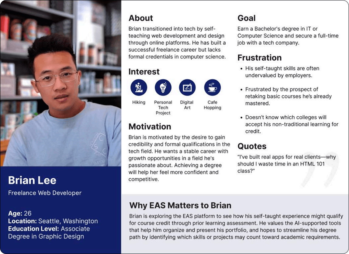
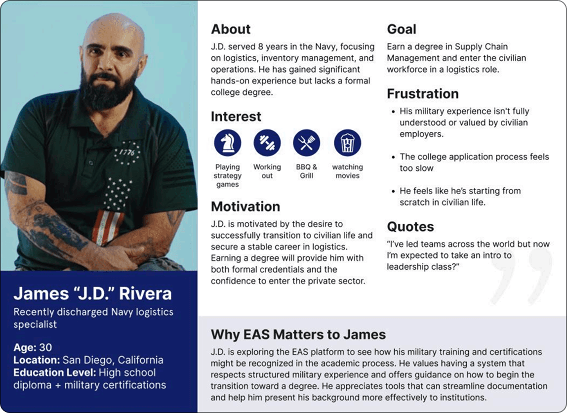
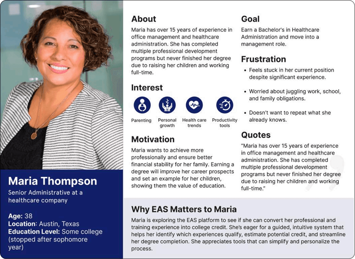
To better understand user needs and design for real-world scenarios, we created three personas based on research insights. These personas represent different types of students using the platform and helped guide our design decisions.
09 — USER JOURNEY
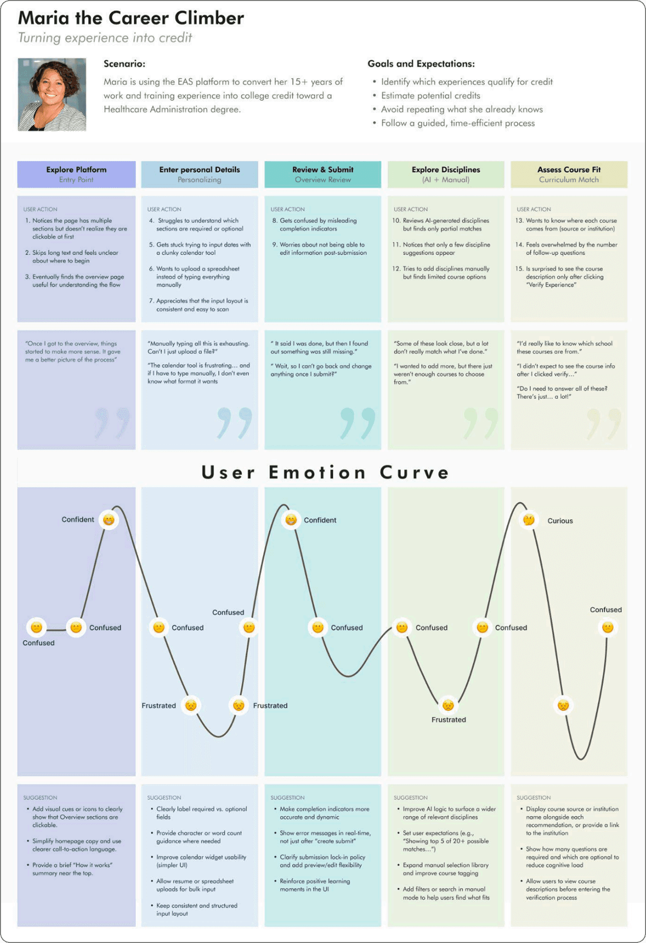
Maria’s journey showed a shift from confusion to brief confidence, then frustration due to complex inputs, unclear submission flow, and weak recommendations.
Key pain points were manual entry, lack of flexibility, and poor clarity.
10 — LOW-FIDELITY PROTOTYPING
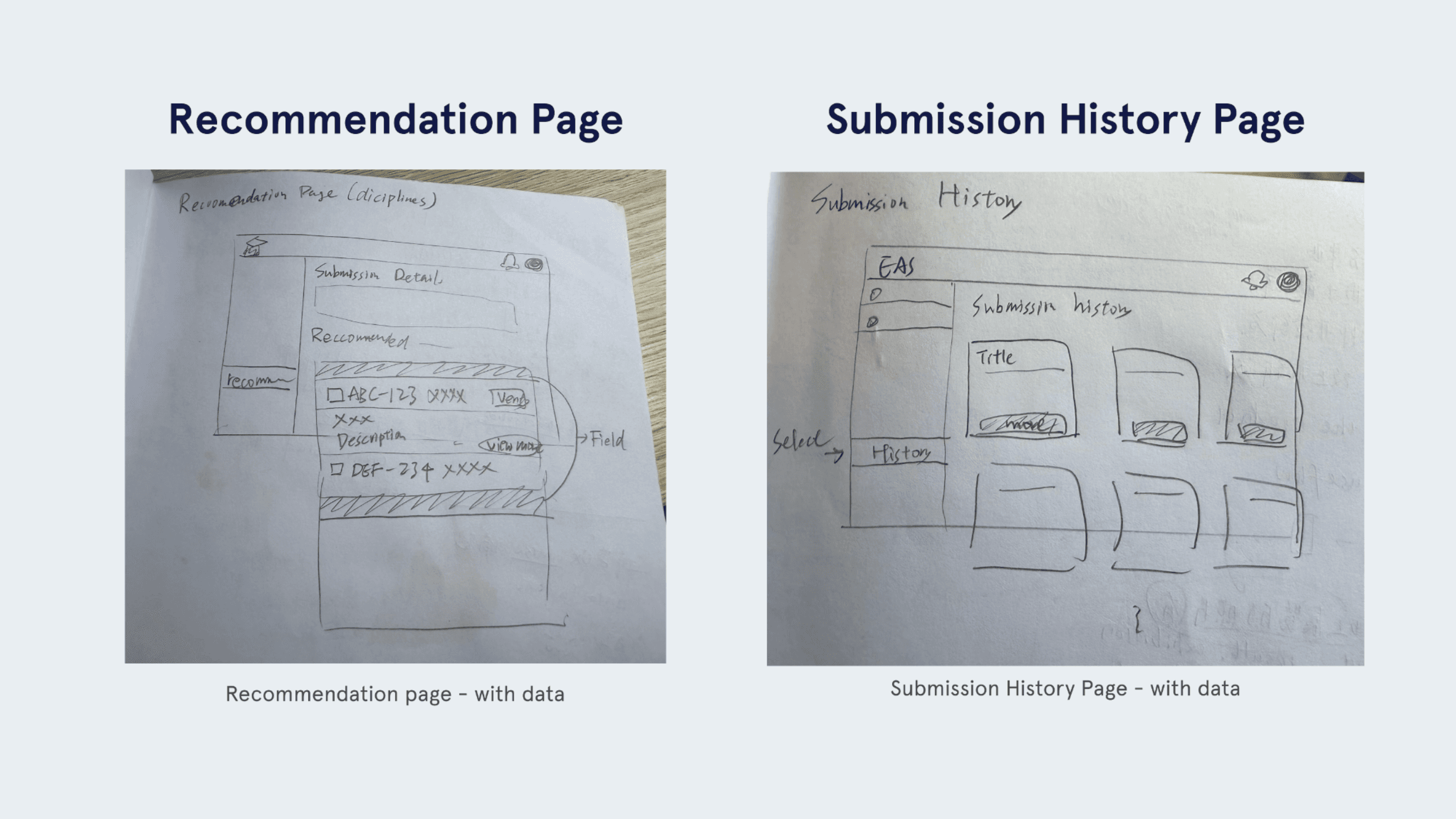
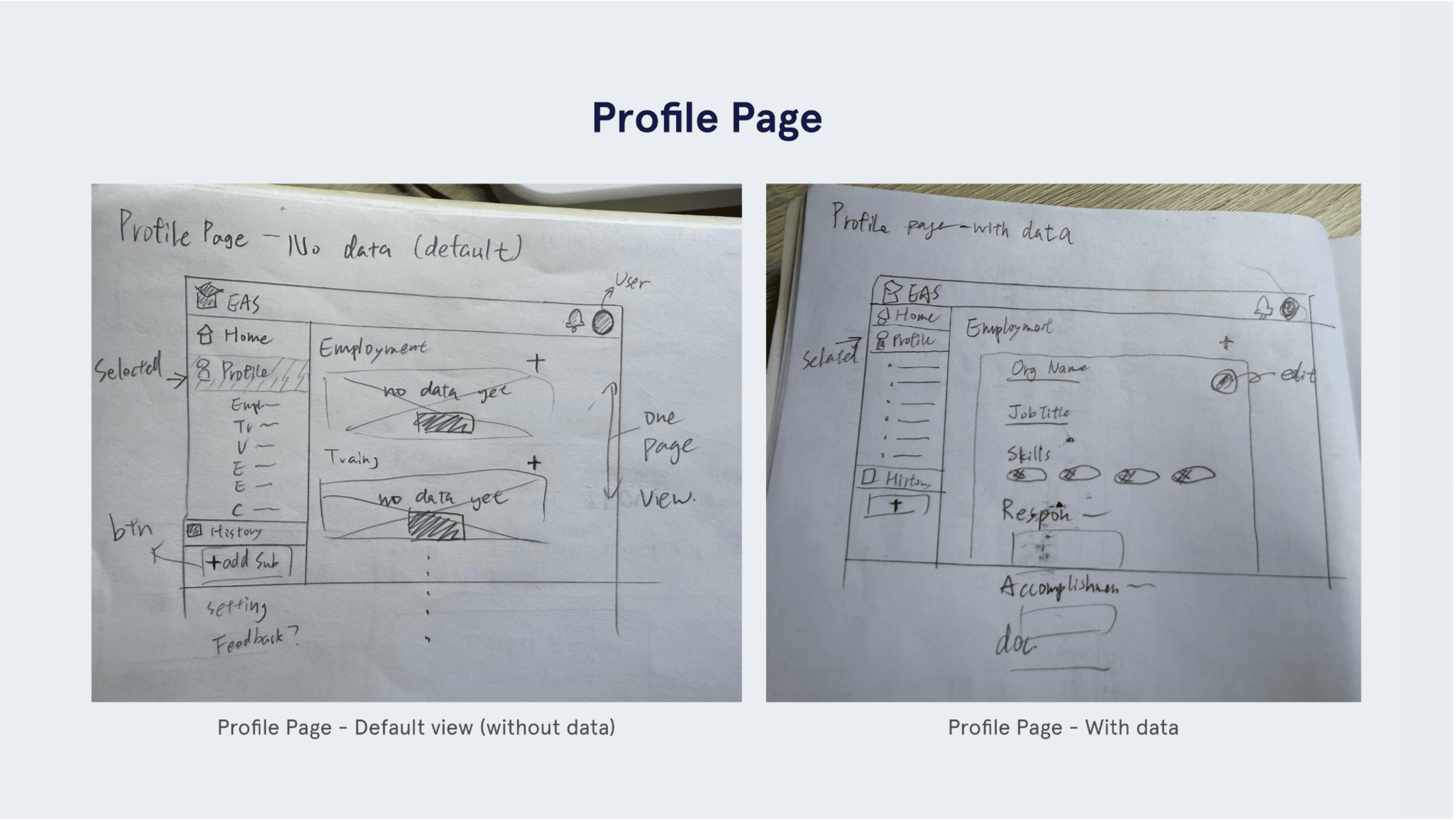
We created low-fidelity wireframes to explore layout, navigation, and input flow improvements.
These quick iterations helped reduce user confusion and validate ideas before moving to high-fidelity designs.
11 — HIGH FIDELITY
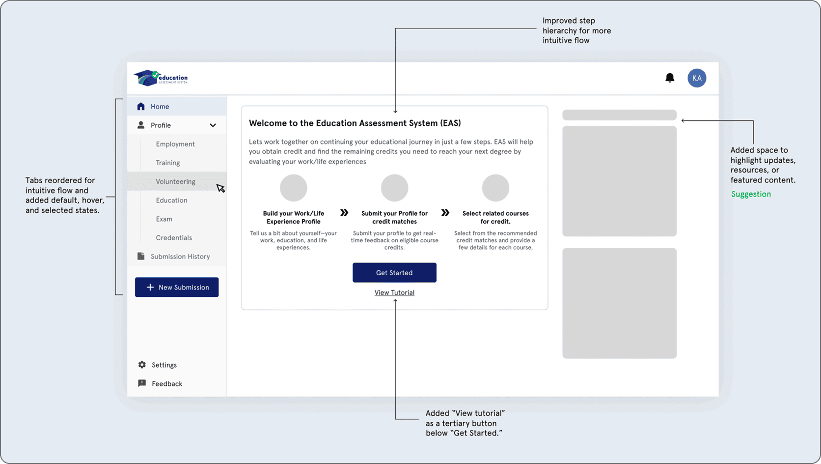
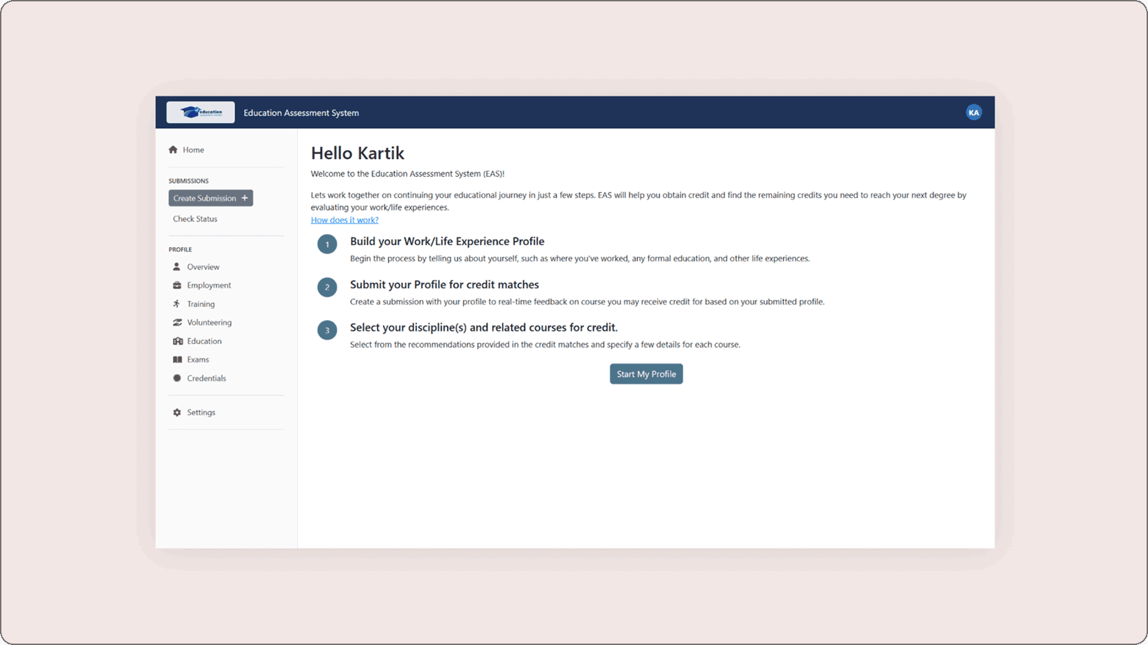
Issue 01: Confusing Onboarding Experience -
Observation
Users lacked clear guidance on the homepage, making it hard to know where to start. Weak navigation feedback and low visibility of tutorials caused confusion.
Redesign Solutions
Improved navigation clarity and content hierarchy, and repositioned “How it works” as “View tutorial” for better visibility.
Before
After
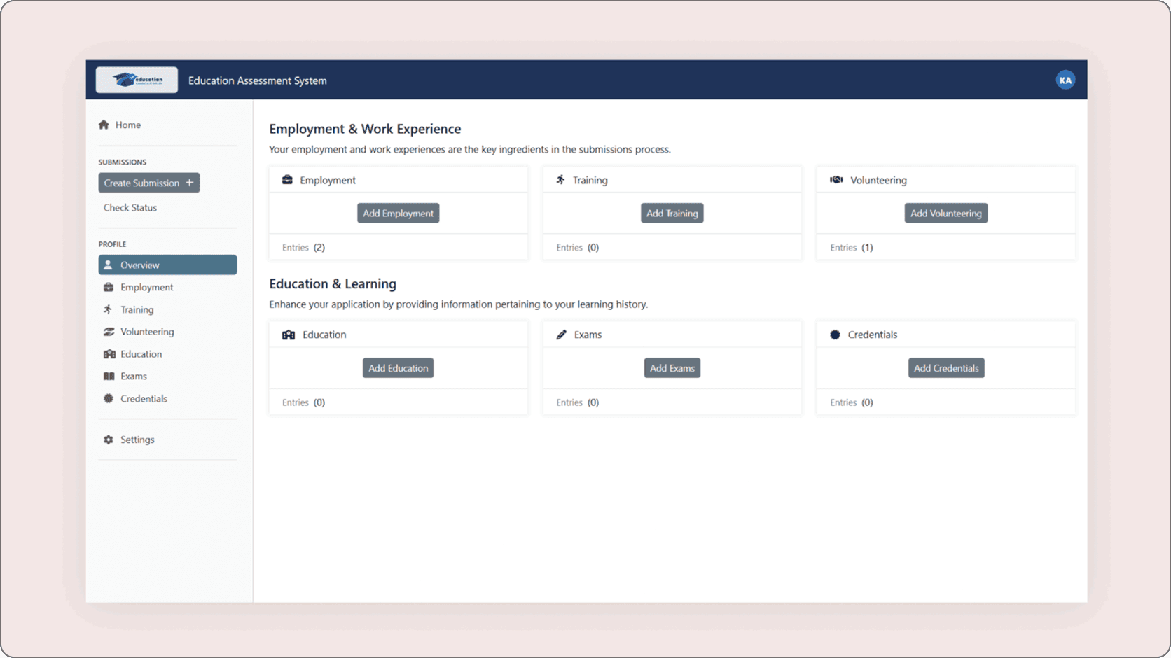
Issue 02: Inefficient Navigation & User Confusion -
Observation
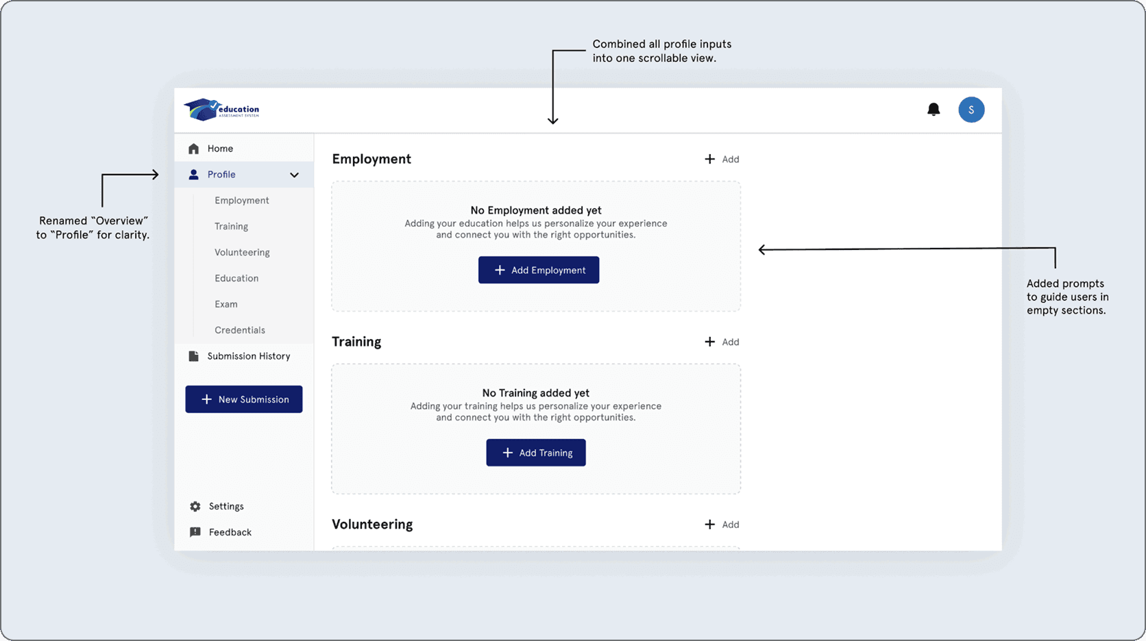
Users struggled to navigate between sections and often returned to the “Overview” tab, causing confusion and unnecessary steps.
Redesign Solutions
Simplified navigation by renaming “Overview” to “Profile,” combining sections into a single scrollable page, and adding guided prompts for better clarity.
Before
After
Issue 03: Difficulty Locating Discipline Recommendation -
Observation
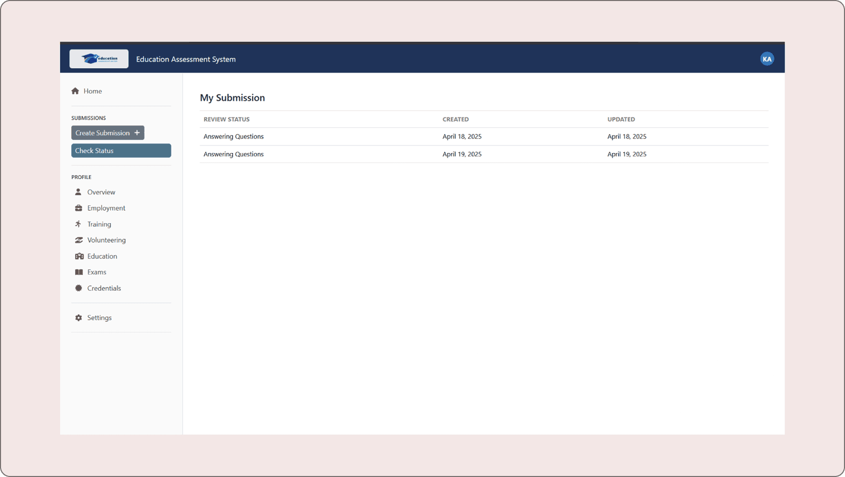
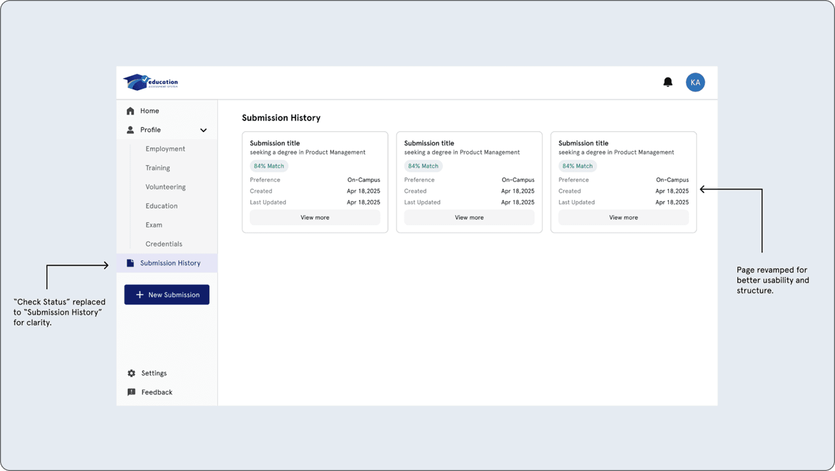
Users struggled to find their recommendations after submission due to unclear labeling and poor page structure.
Redesign Solutions
Renamed “Check Status” to “Submission History” and redesigned the page to clearly display submission status and recommendations.
Before
After
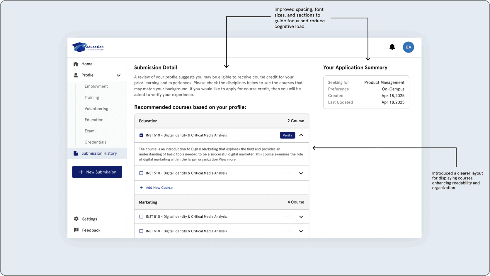
Issue 04: Cluttered Discipline Recommendation Page -
Observation
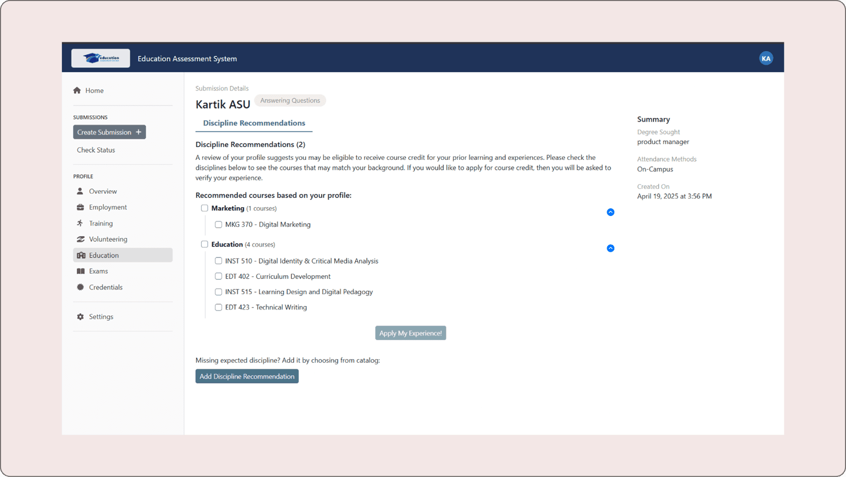
The recommendation page was visually cluttered and lacked clear hierarchy, making it difficult for users to scan and understand information.
Redesign Solutions
Improved visual hierarchy, simplified layout, and organized content with better spacing and structure for easier readability.
Before
After
12 — CONCLUSION
Through iterative prototyping, we addressed key usability issues by improving onboarding, navigation, submission clarity, and page structure.
Our solutions, guided by user feedback, focused on reducing friction and creating a more intuitive and user-friendly experience.
13 — SUGGESTIONS FOR FUTURE
This section outlines key areas for future improvement, focusing on enhancing usability, flexibility, accessibility, and overall user experience to better support diverse user needs.
Optimize for mobile and cross-device use
Conduct iterative usability testing to validate improvements
Enhance AI transparency and personalization
Provide flexible user actions (save drafts, upload files)
Improve accessibility and inclusivity
Continuously collect user feedback
Define success metrics (task completion, satisfaction)
Behance
Copyright @2026 Manish Durgude