Role
Research & UX/UI
Timeline
2 months
Type
Solo project
Scope
End-to-end mobile app: research, flows, IA, brand, 50+ hi-fi screens
HOMEBLISS, AS DESIGNED
CHAPTERS
01 — PROJECT DESCRIPTION
HomeBliss is a mobile app aimed at individuals living away from home, such as students, working professionals, and frequent travelers. The app offers quick access to essential services like home-cooked meals, cleaning, repairs, and rentals, while supporting local service providers in expanding their reach.
I led the end-to-end design process—conducting user research, identifying pain points, defining user flows, and designing intuitive, user-friendly interfaces to ensure seamless service access.
Key Design & Research Challenges
1. Fragmented Services – Merge many niche apps into one clean IA.
2. Building Trust – Use ratings, verification, and live tracking.
3. On‑Demand Needs – Enable real‑time matching and same‑day booking.
4. Personalization – Support varied diets, budgets, and recurring jobs.
5. Two‑Sided UX – Keep both resident and vendor flows simple.
What I accomplished
1. User insight – 12 interviews + 5‑app audit exposed gaps.
2. Strategy – Personas, empathy maps, flows & IA set direction.
3. UX/UI – Built brand and 50+ hi‑fi screens.
4. Booking flow – Real‑time match + split‑pay, 100% success.
5. Dual experience – Simple for users, light for vendors.
02 — MY DESIGN PROCESS
“From deep user insight to a polished, tested solution—an end-to-end, research-driven journey.”
Discover
12 user interviews 5‑app audit
Define
Personas
Empathy maps
Ideate
Card‑sorting
IA maps
Design
50+ hi‑fi screens
Brand system
Validate
Usability tests
Task Completion
Iterate
Feedback tweaks
Vendor flow
03 — DISCOVER
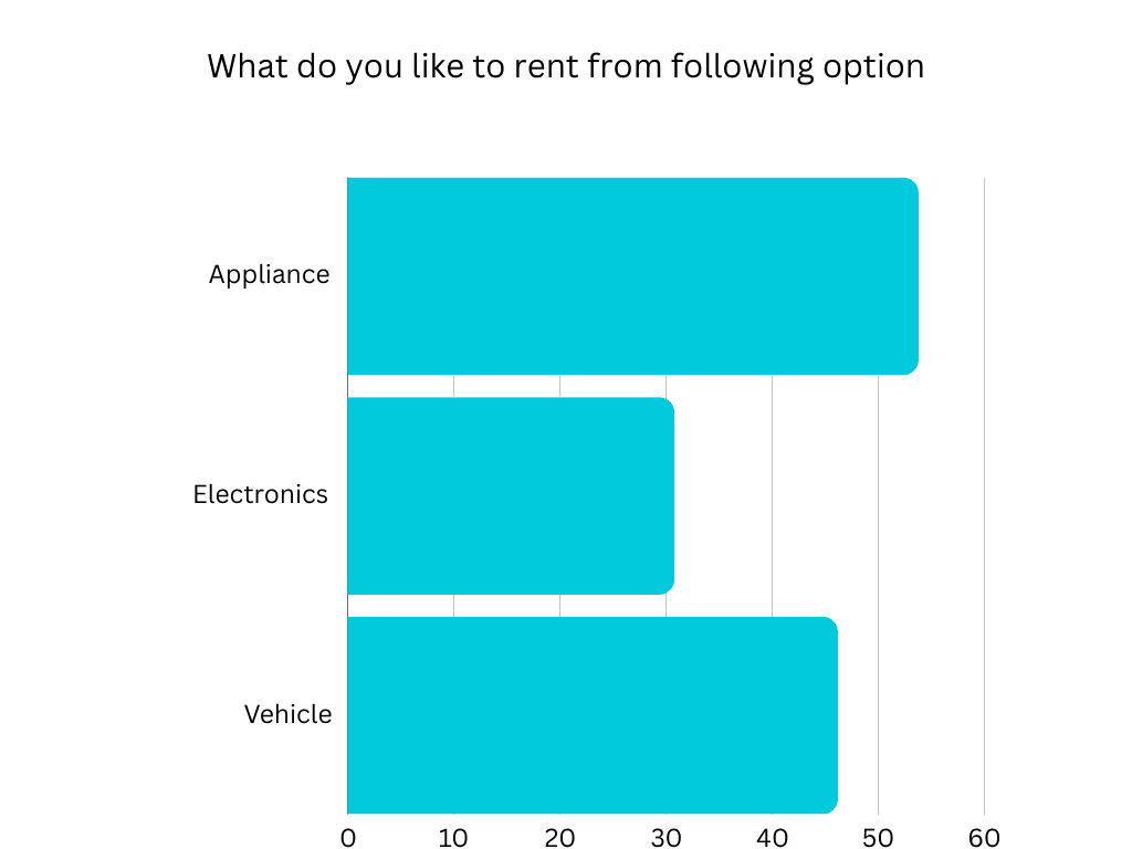
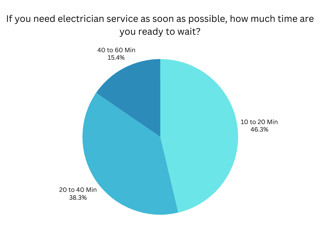
Survey
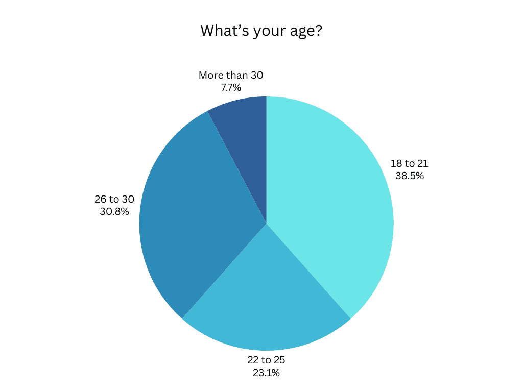
We fielded a tightly-focused questionnaire with 43 early adopters—students and young professionals—capturing hard numbers on trust, speed, and pricing pain-points.
43
Responses
54%
was students
46%
was professionals
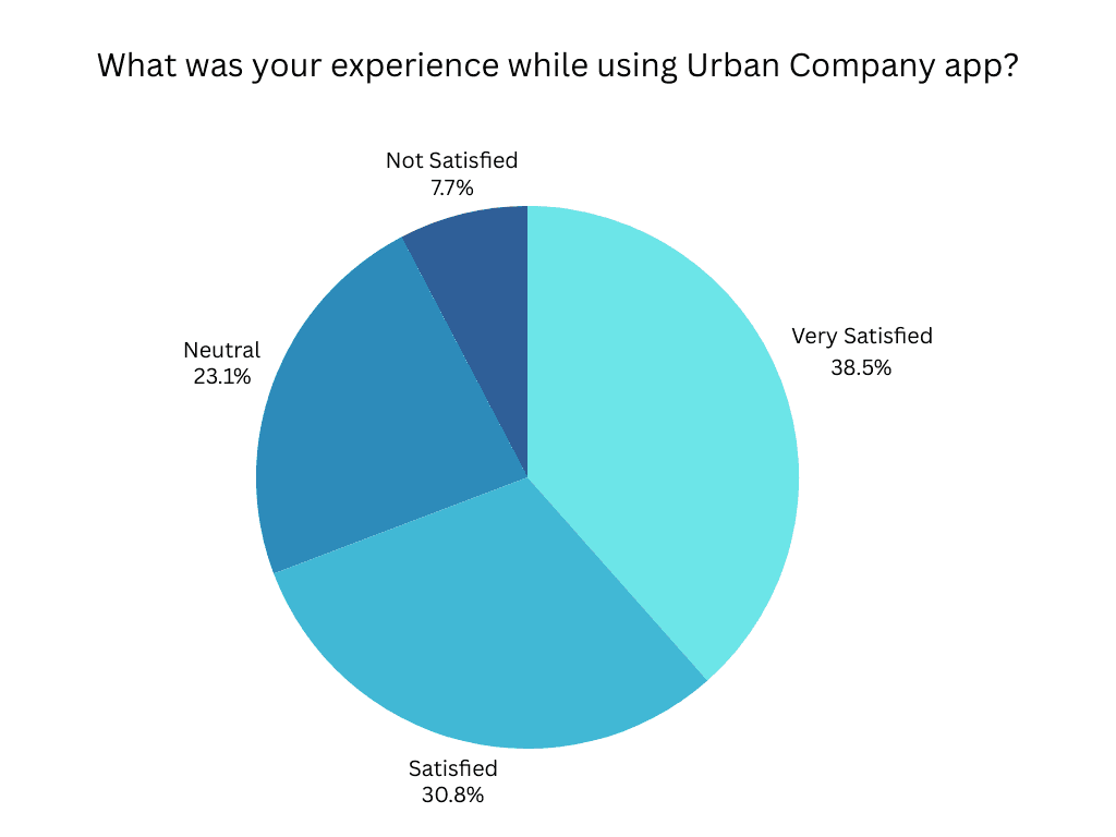
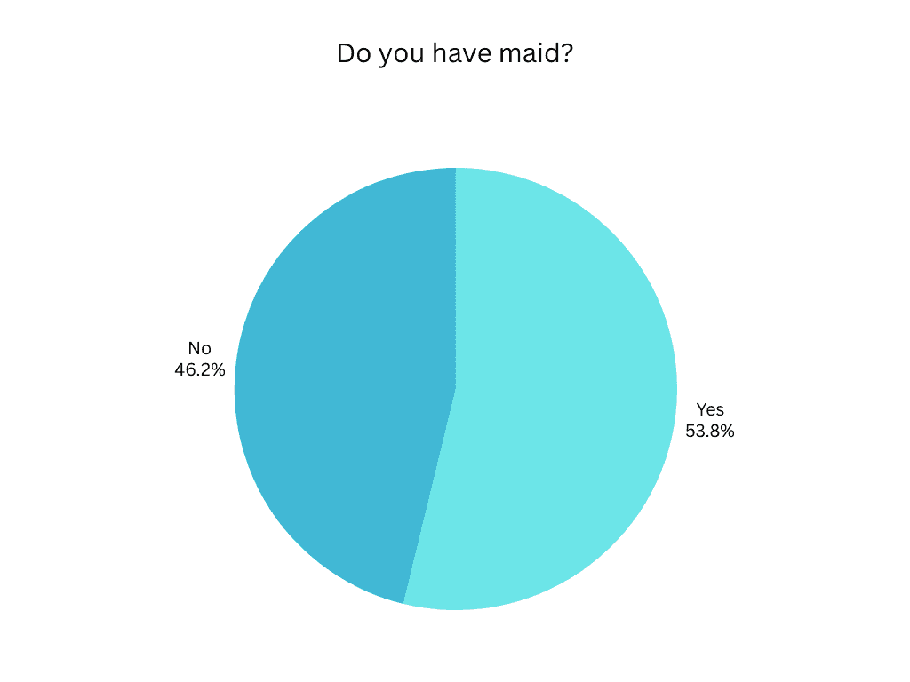
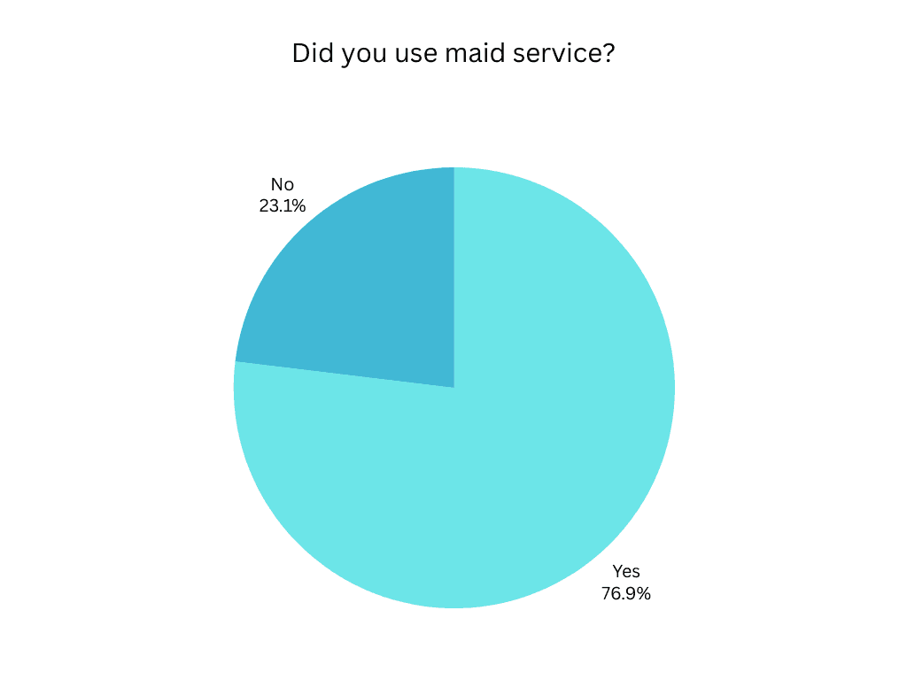
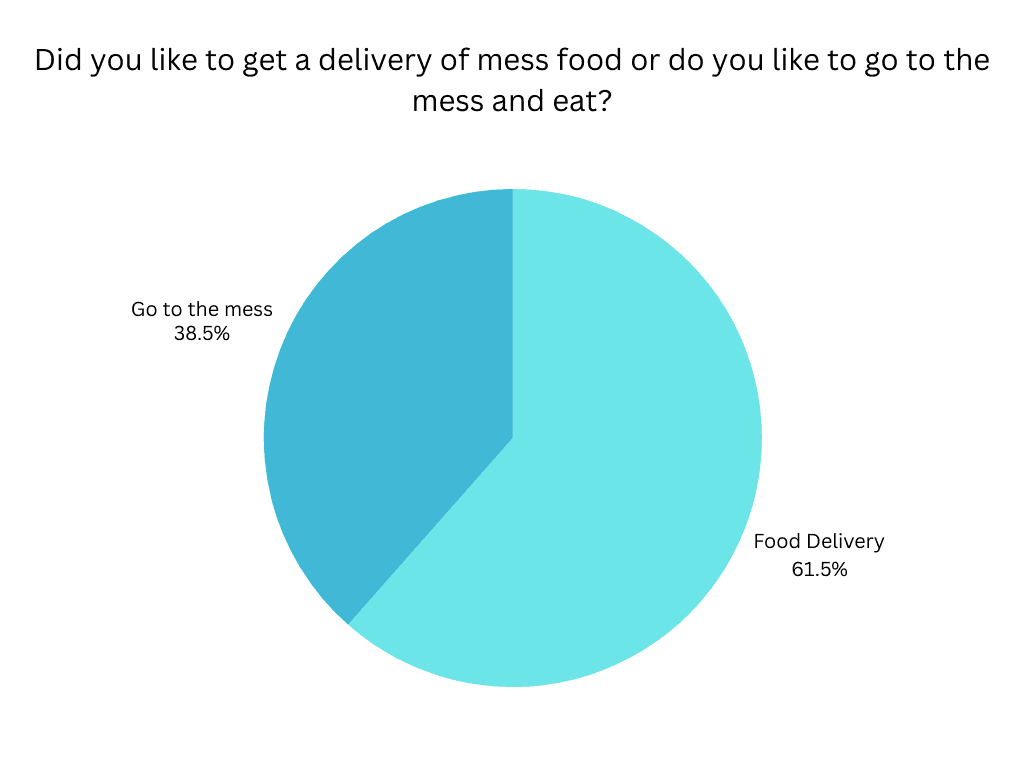
Interview
We spoke with 12 students and solo professionals who recently relocated, uncovering key struggles with trust, speed, and managing daily services. These insights shaped our problem statement and guided early design decisions.
12
Interviewees
9
was students
3
was professionals
Competitive Analysis
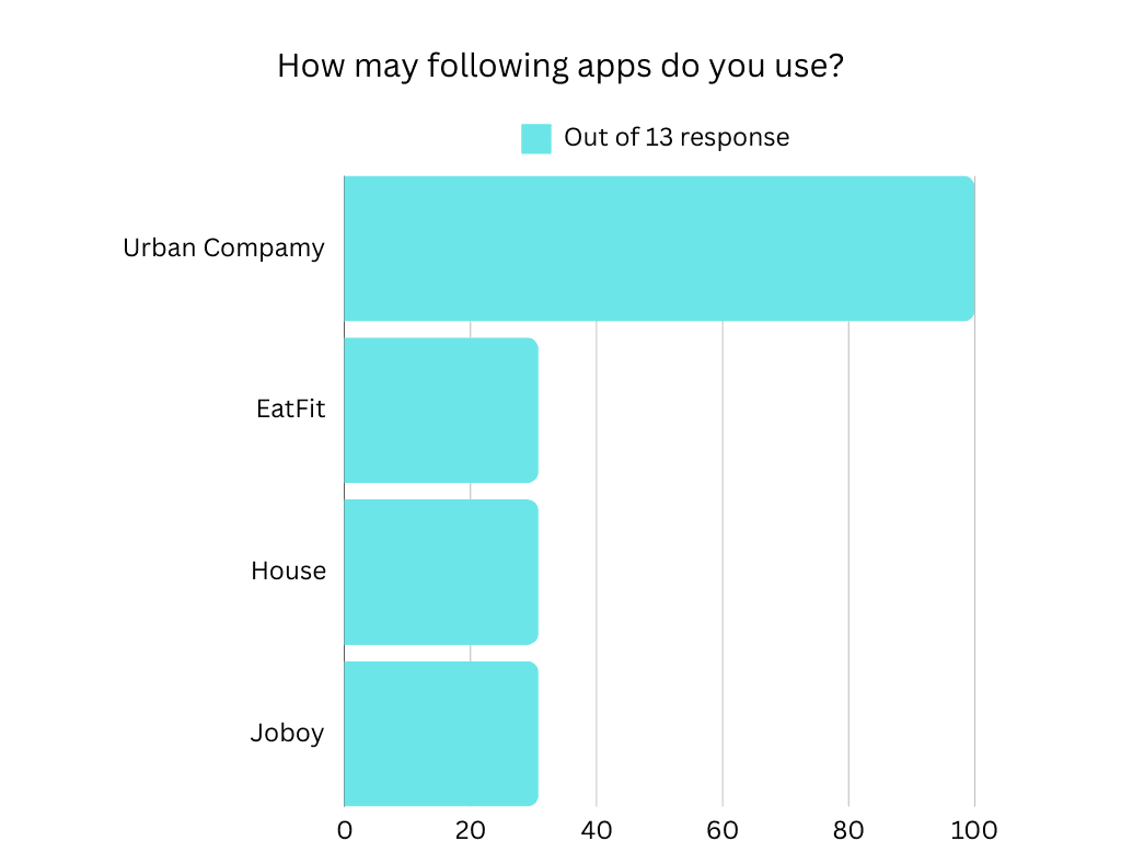
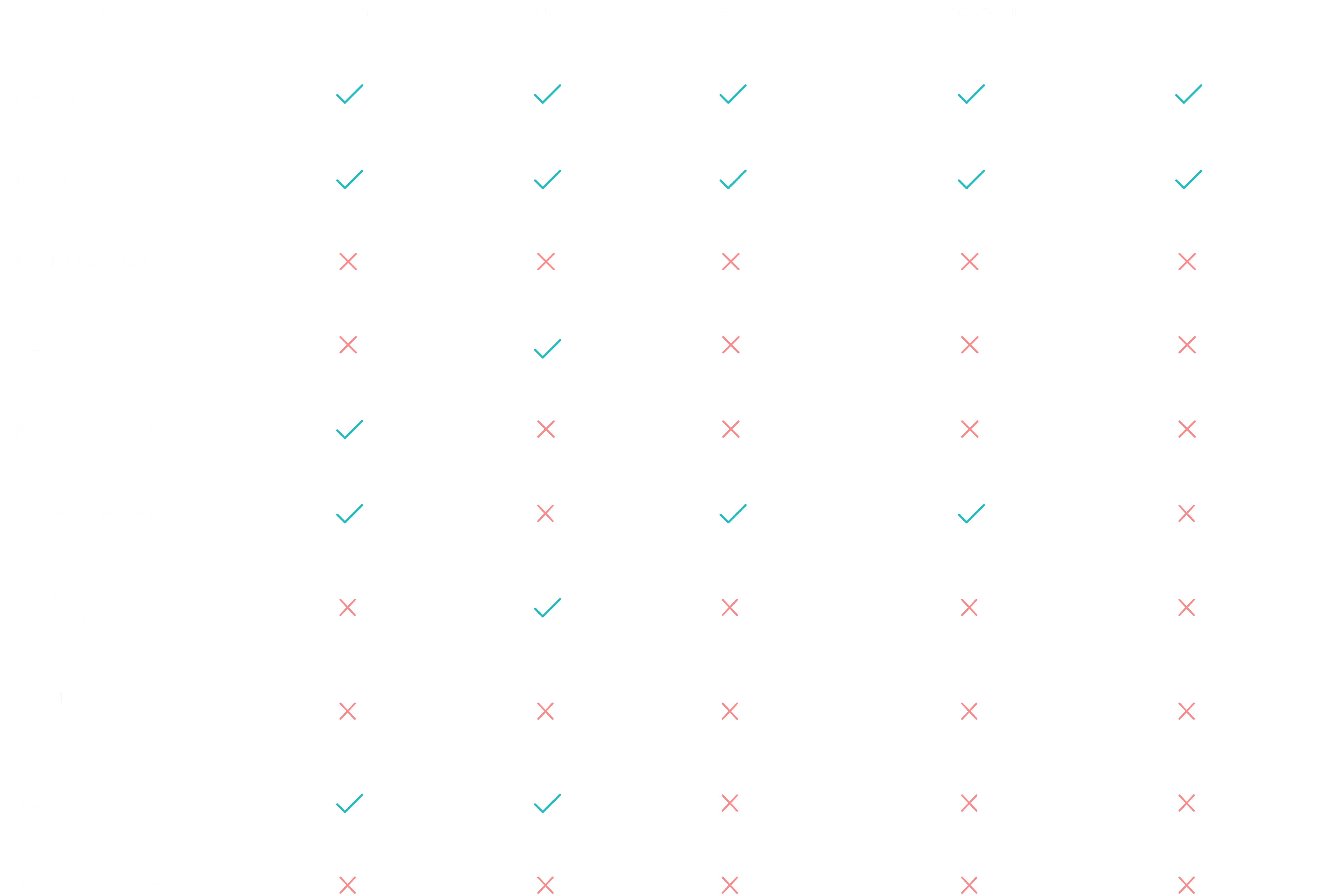
We reviewed five service apps to evaluate features, usability, and gaps. Most lacked an all-in-one solution and struggled with speed, trust, or convenience—highlighting clear opportunities for HomeBliss to stand out.
3 Apps
offer home services
2 Apps
offer meal/rental services
1 App
offers both
04 — DEFINE
Persona
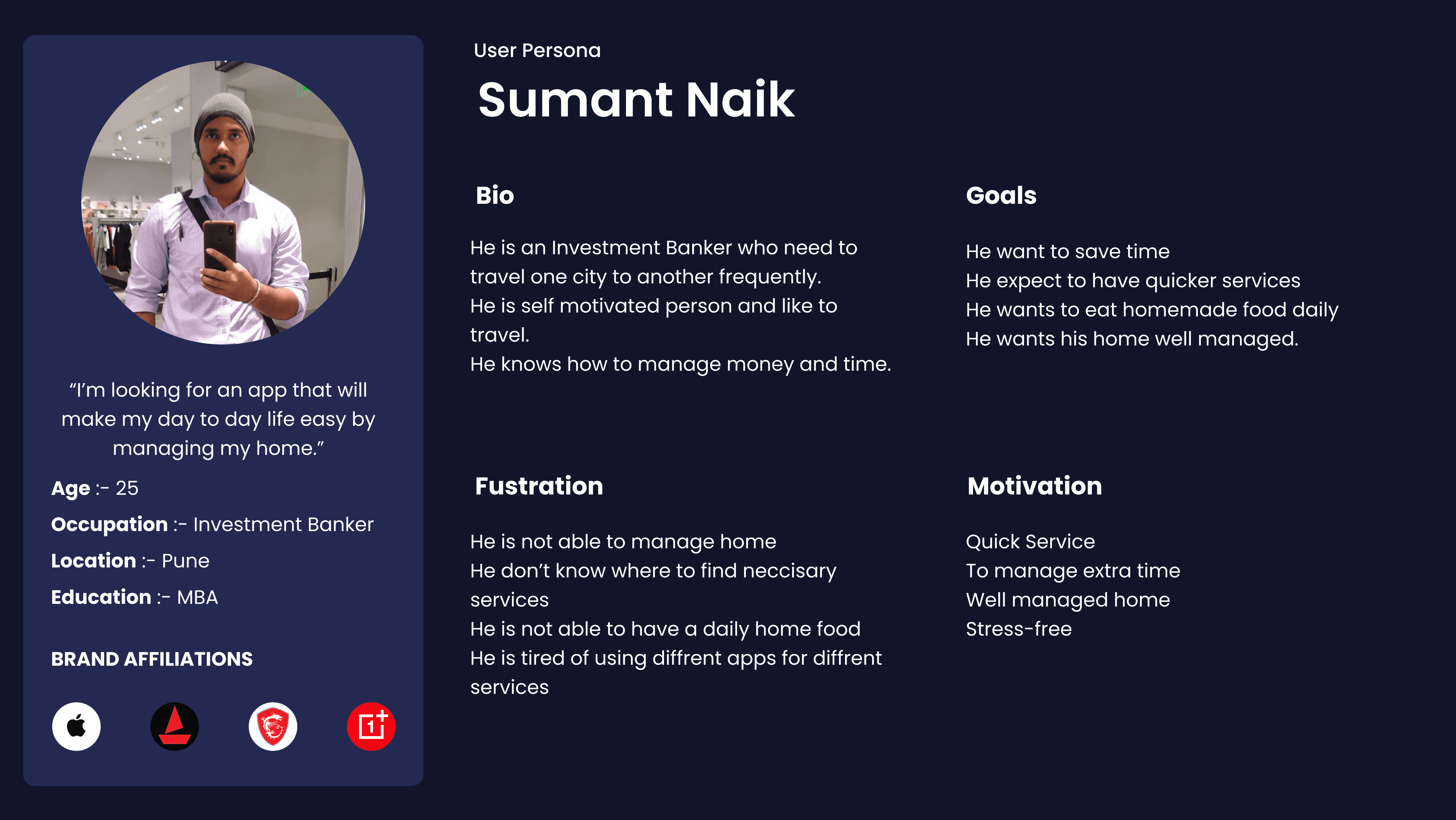
We created personas like Sumant, a busy professional, and Saurabh, a student living away from home, to reflect real user struggles—managing daily services, finding trusted help, and saving time. These profiles guided key design decisions throughout the project.
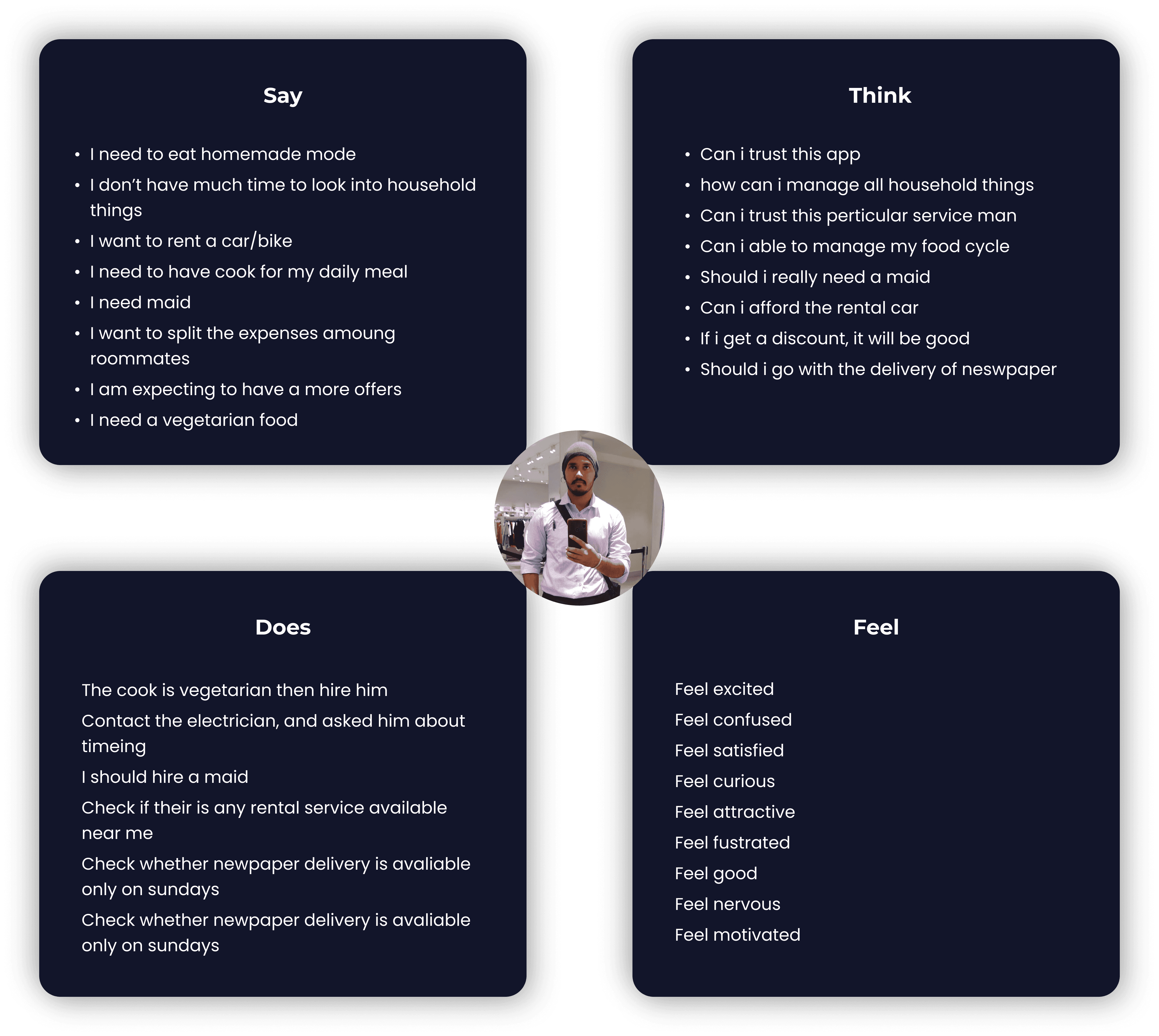
Empathy Map
Mapping user thoughts, actions, and emotions revealed pain points like delays, trust issues, and app fatigue—shaping a faster, simpler experience.
User Scenario
Saurabh, a 24-year-old postgraduate student, recently moved to Pune and struggles with managing daily needs like food, cleaning, and home services. Tired of trying multiple apps without reliable results, he was often left frustrated and short on time.
After a friend recommended HomeBliss, Saurabh registered and quickly found a vegetarian cook, daily maid, and access to other trusted services—all in one place. The app’s quick booking and reliable service flow eased his daily stress, letting him focus on his studies with peace of mind.
05 — IDEATE
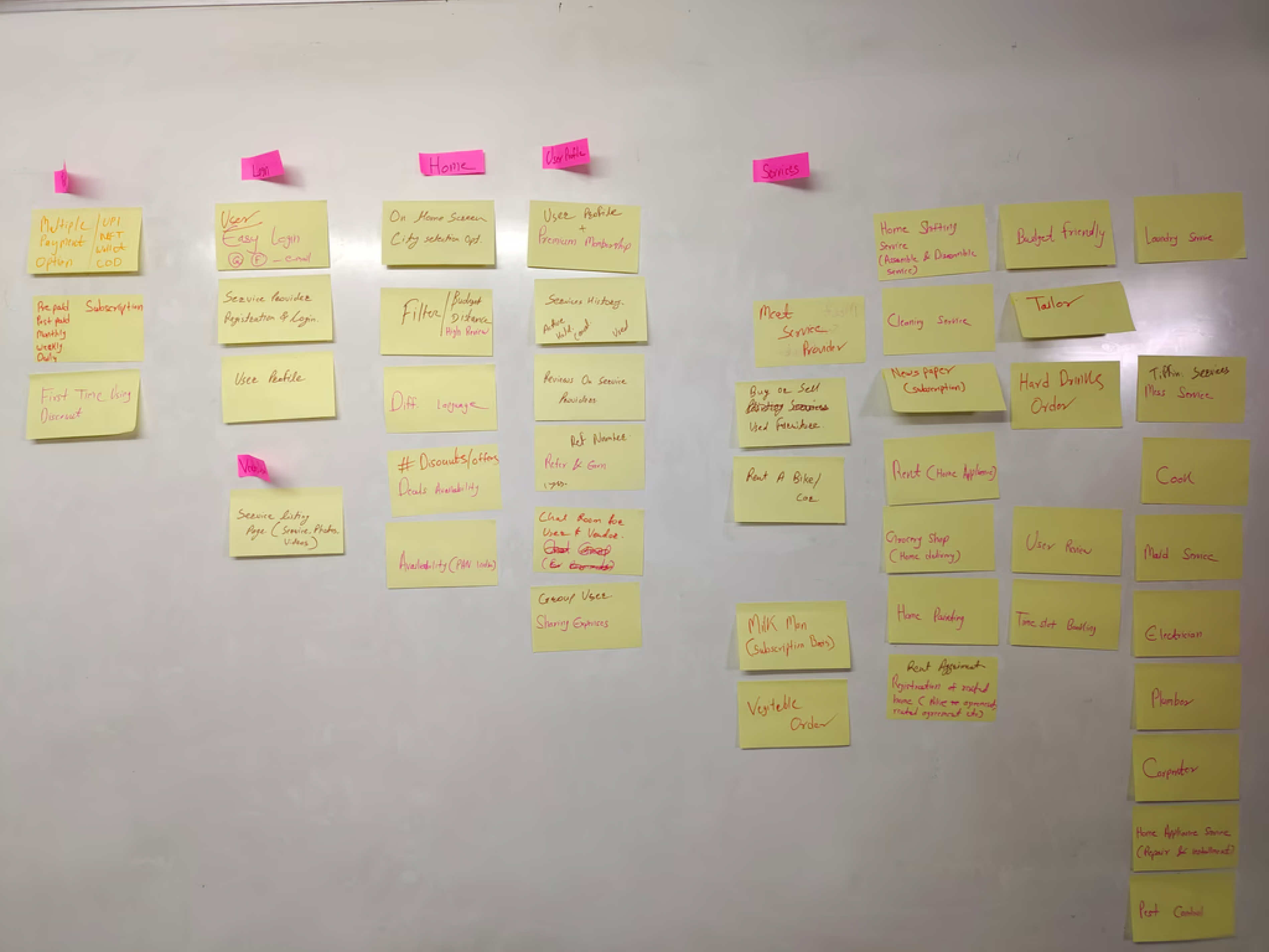
Card Sorting
I conducted a card sorting exercise to understand how users group services. It helped me design a clear and intuitive app structure.
Daily Needs
Food
Housing
Maid services
Cook booking
Mess food delivery
Repair help
Rental services
Relocation assistance
Newspaper delivery
Grocery ordering
Laundry services
User Flow
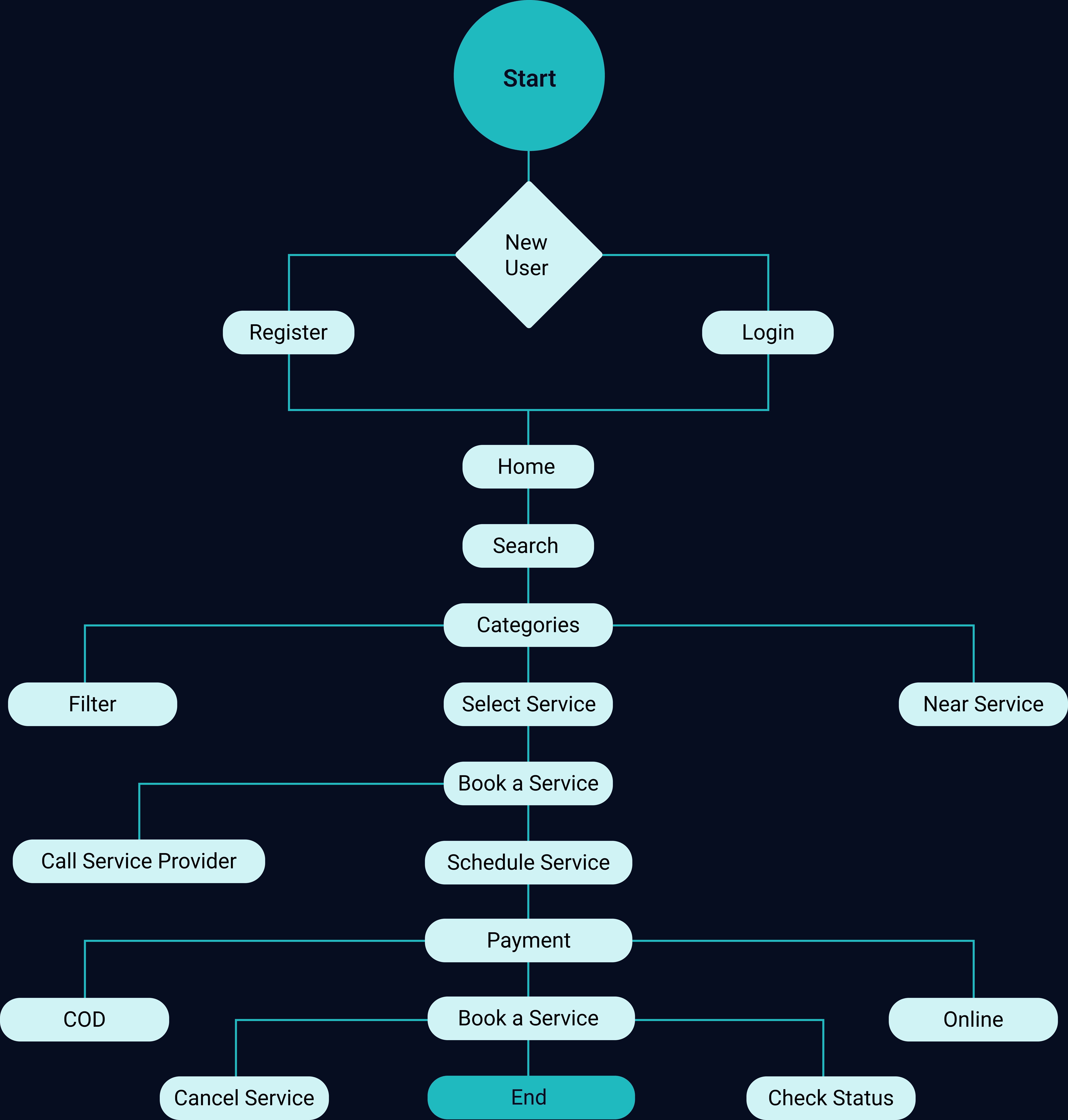
I designed a simple, task-focused user flow that guides users from onboarding to booking and managing services. It keeps key actions—like scheduling or payment—quick and accessible in just a few taps.
Onboarding
Login
Home
Explore
Select Service
Schedule
Confirm Booking
Payment
Track
History
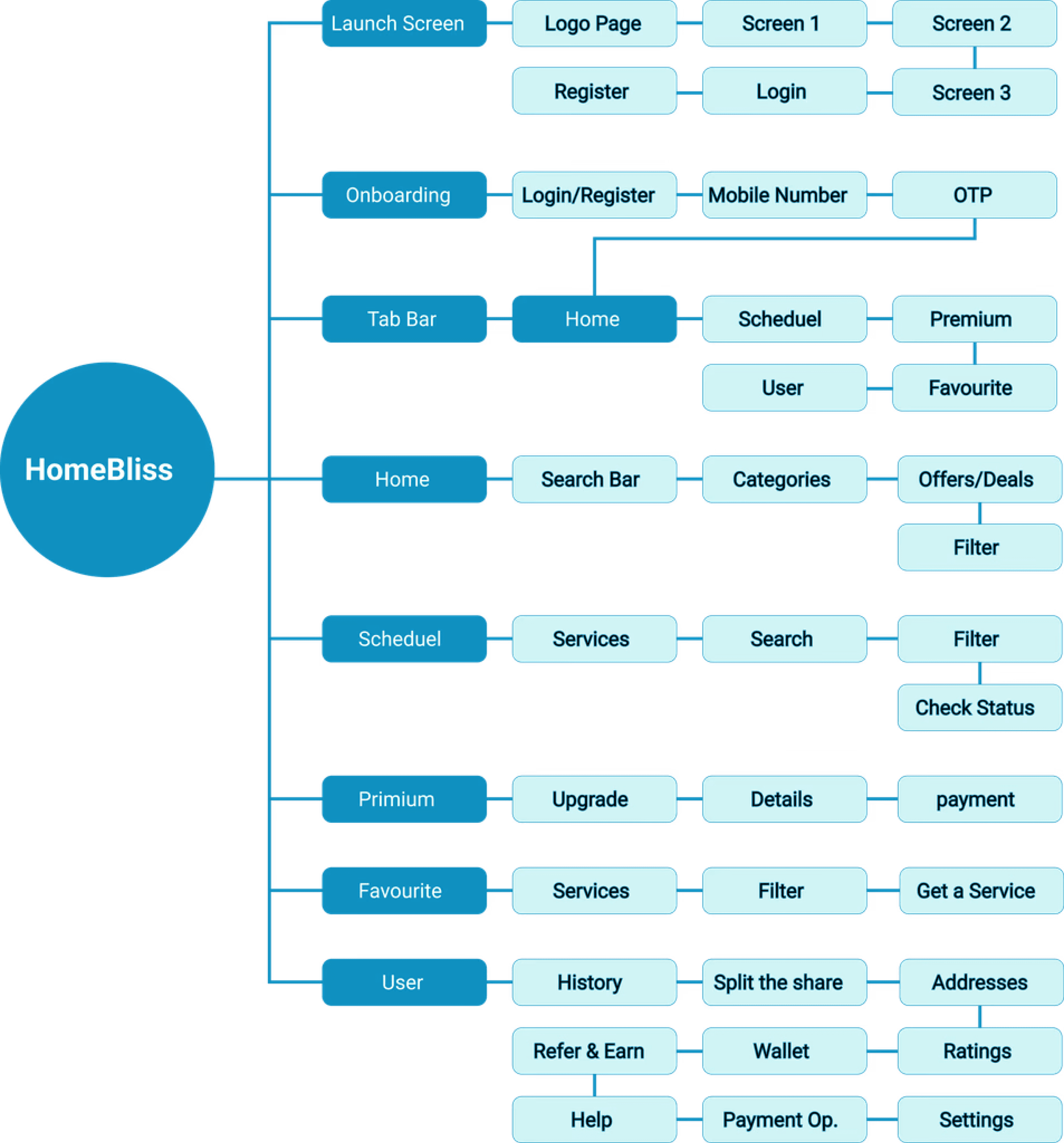
Information Architecture
I structured the app into clear categories like Food, Daily Needs, and Housing, based on user research and card sorting, ensuring quick and intuitive navigation.
Onboarding
Home
Categories
Services
Booking
Schedule
Payments
History
Schedule
06 — DESIGN
VISUAL STYLE
PRIMARY TYPOGRAPHY
Aa
Inter
Medium, Bold
SECONDARY TYPOGRAPHY
Aa
Noto Sans
Regular, Bold
BRAND COLORS
#0B759D
#1EBABF
#D0F4F5
#000000
#F6FFFC
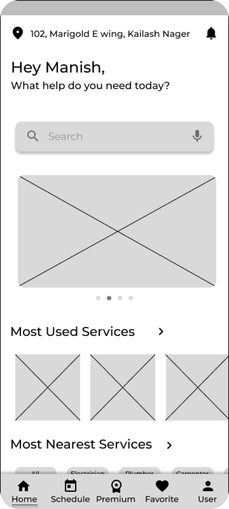
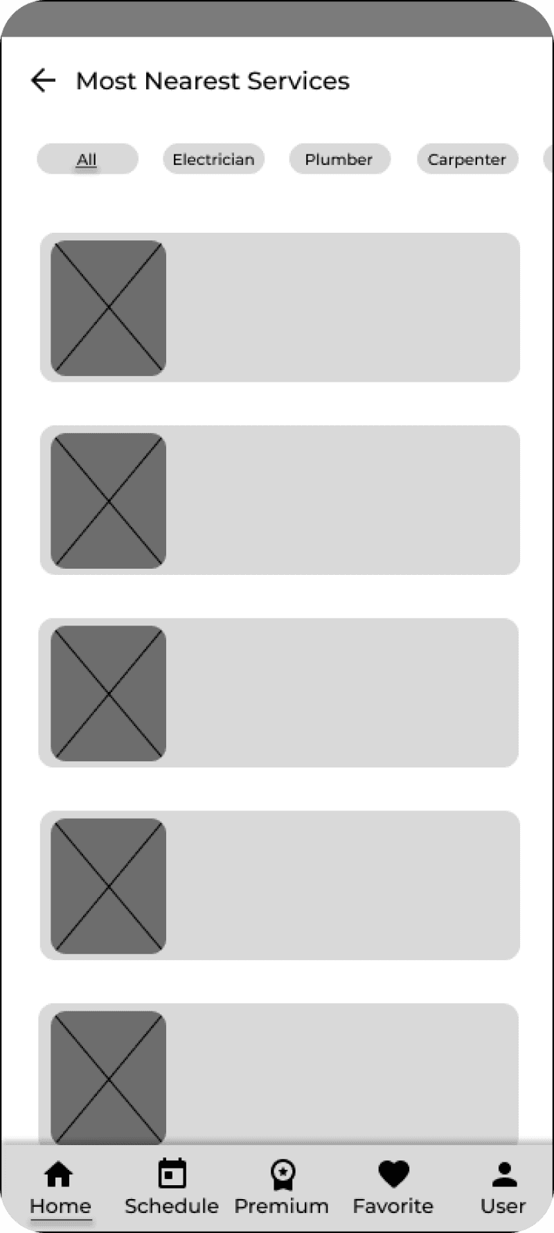
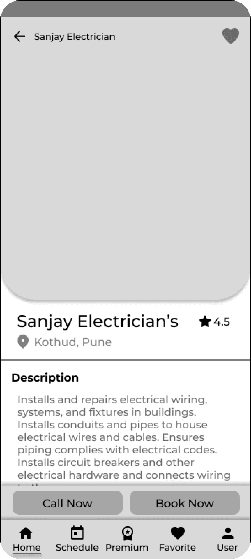
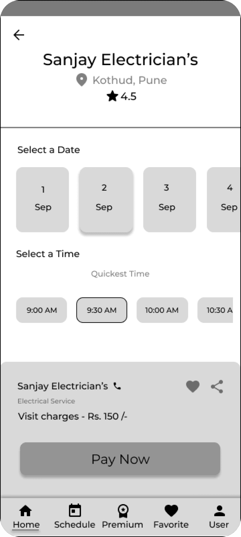
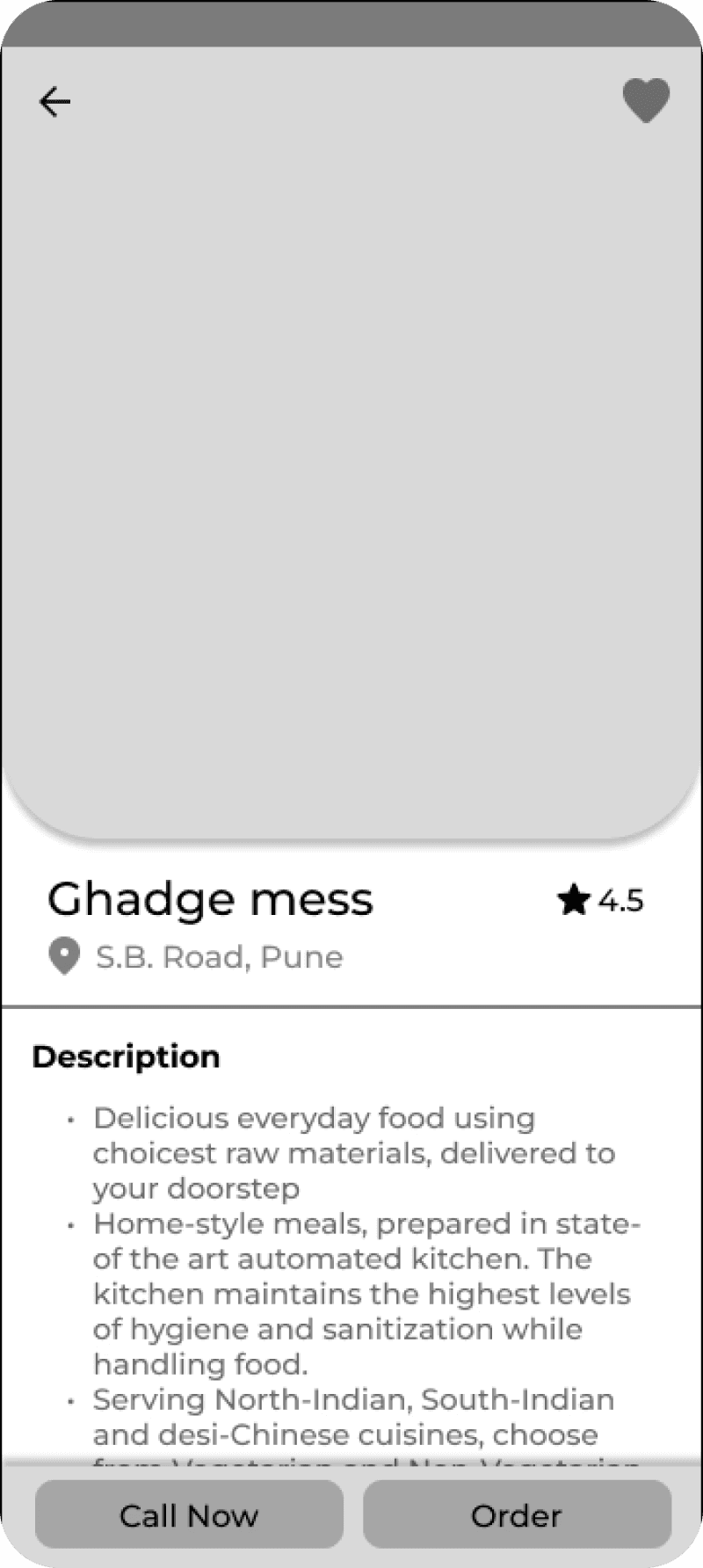
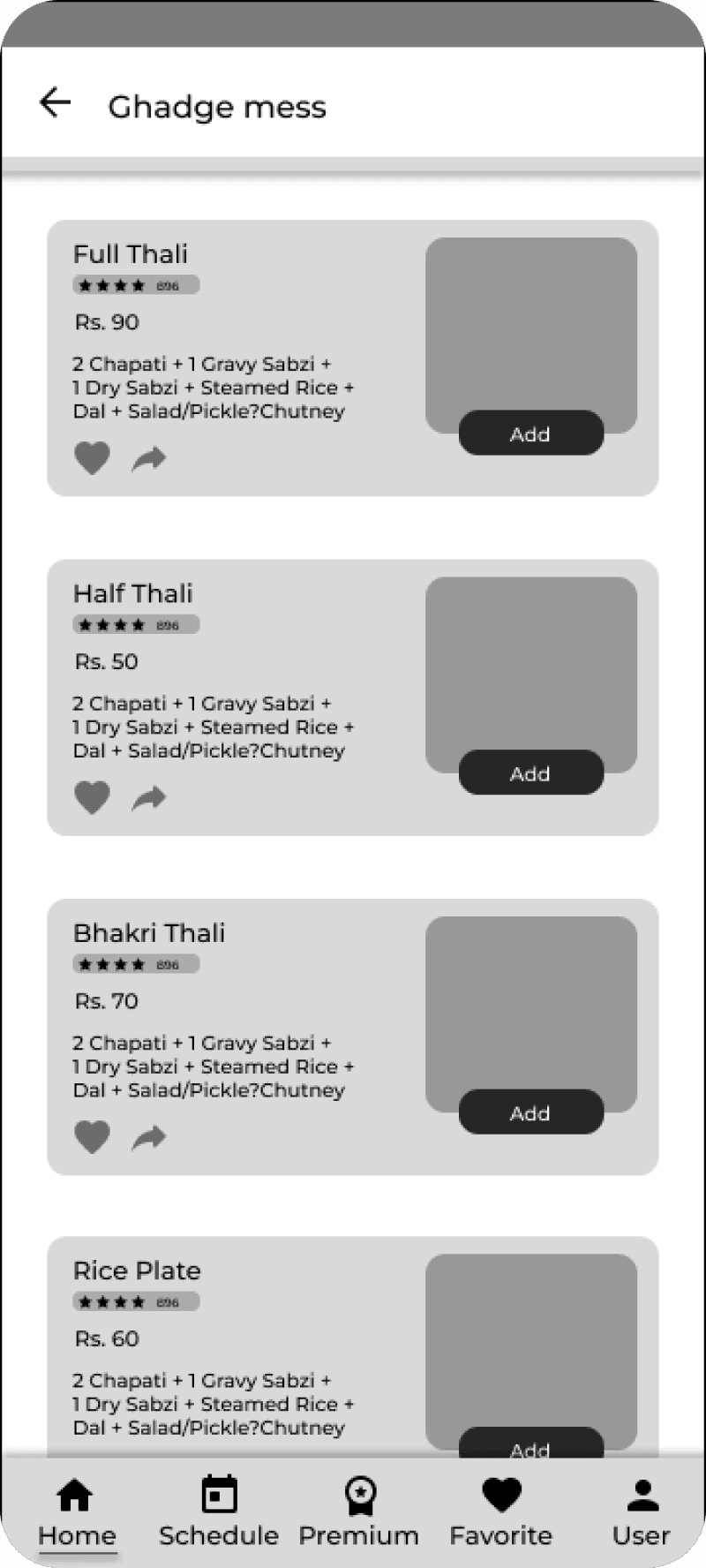
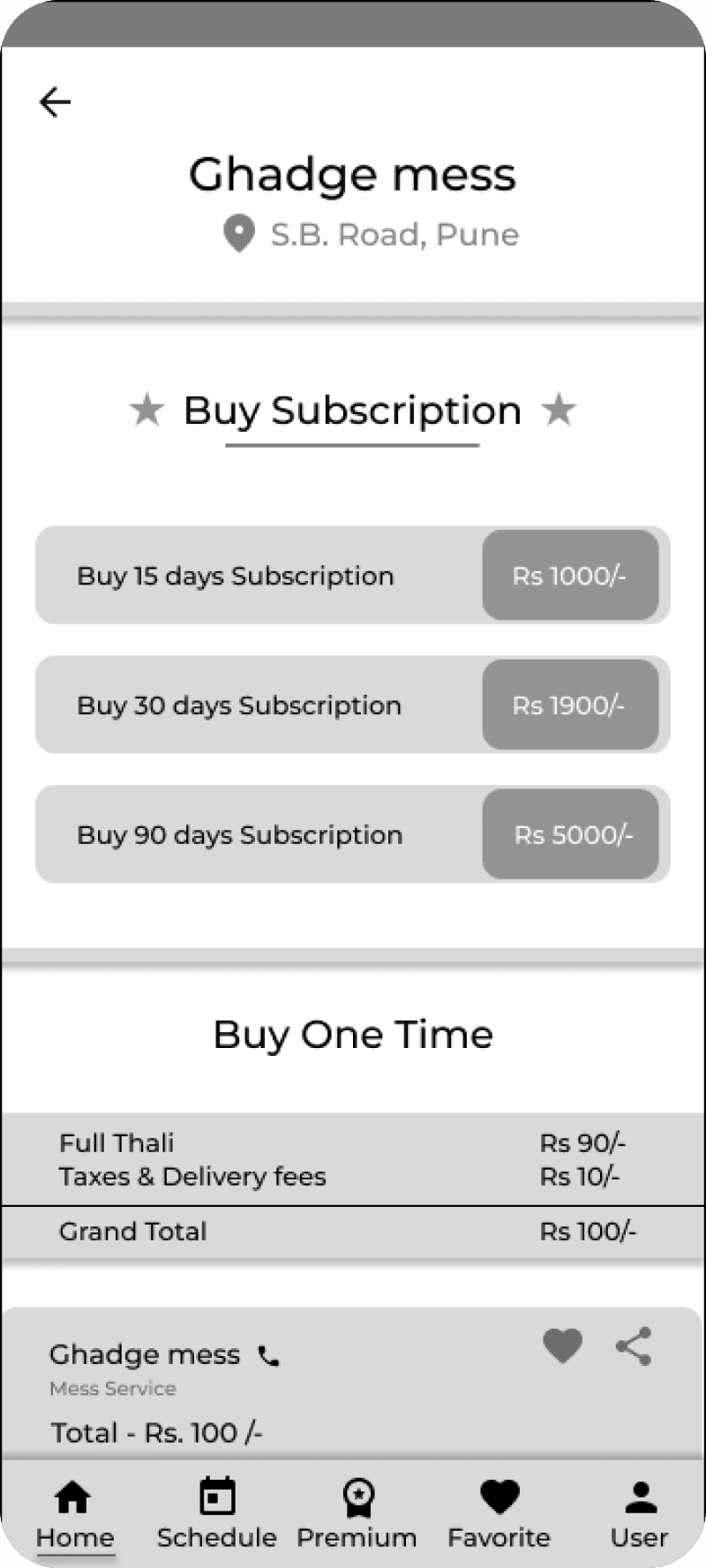
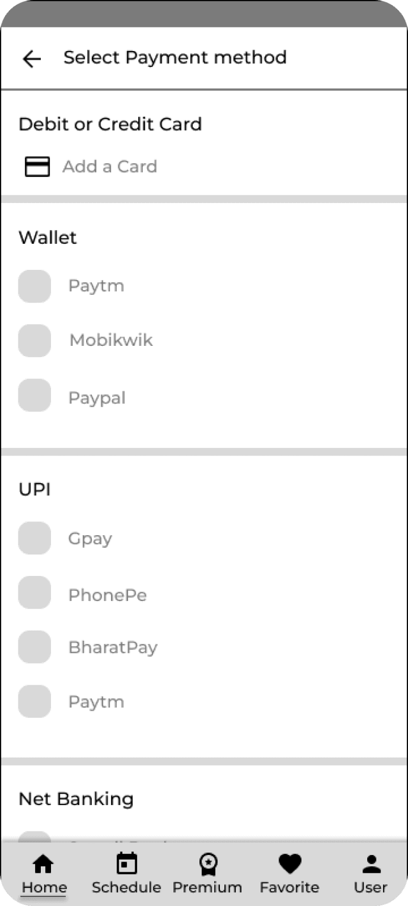
Wireframes
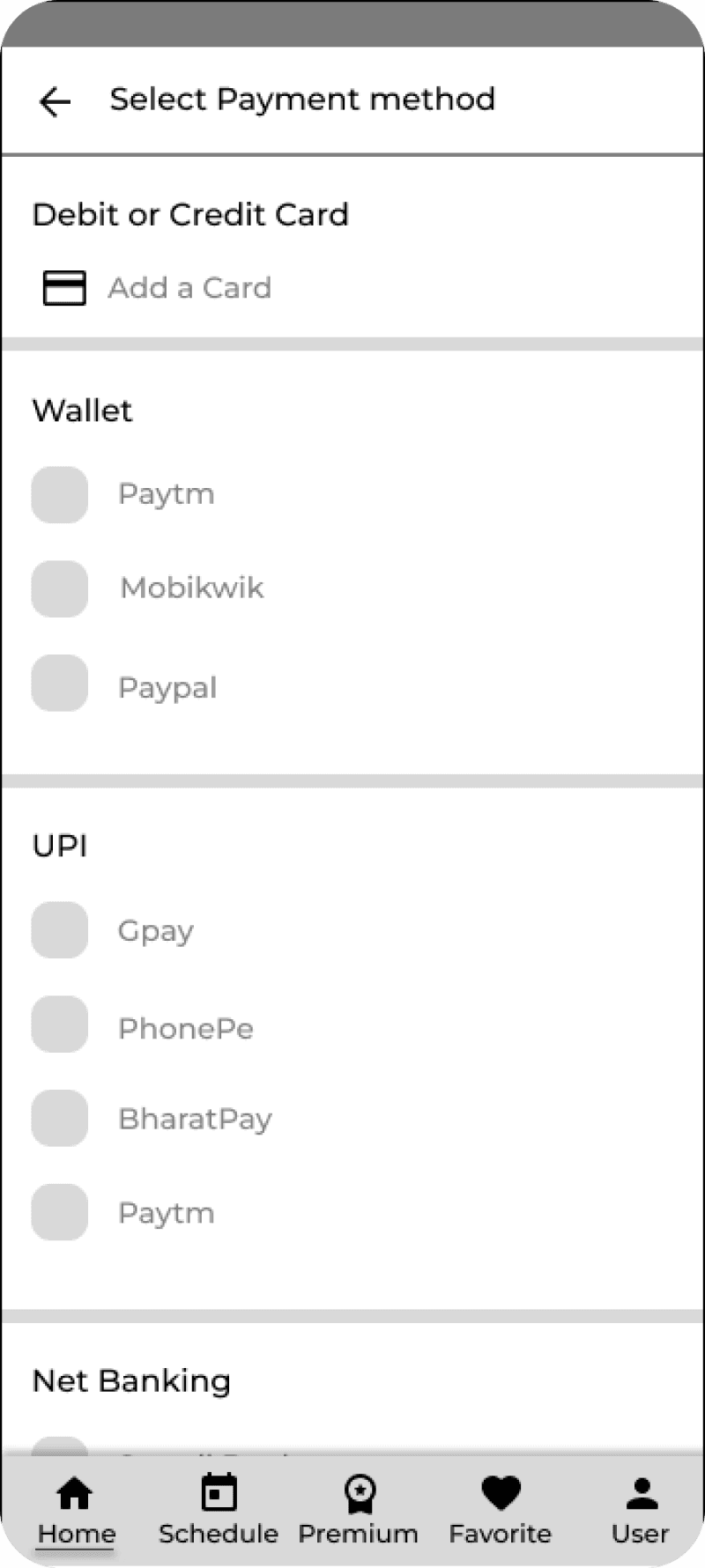
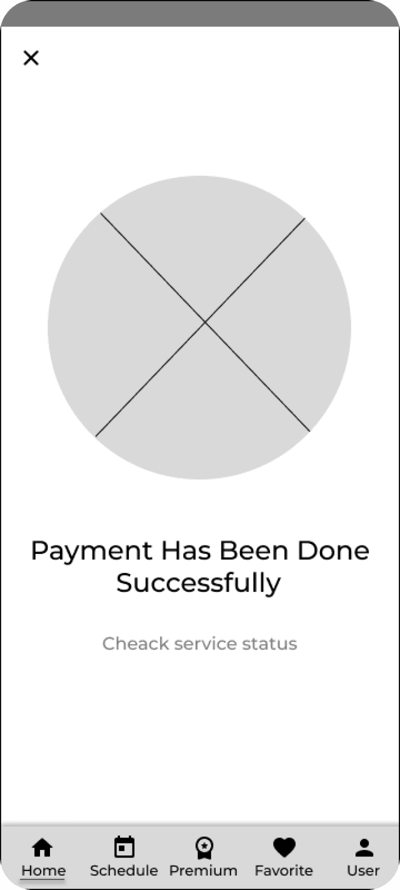
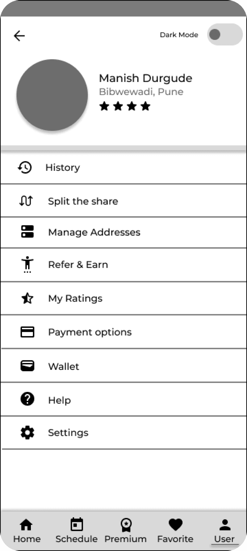
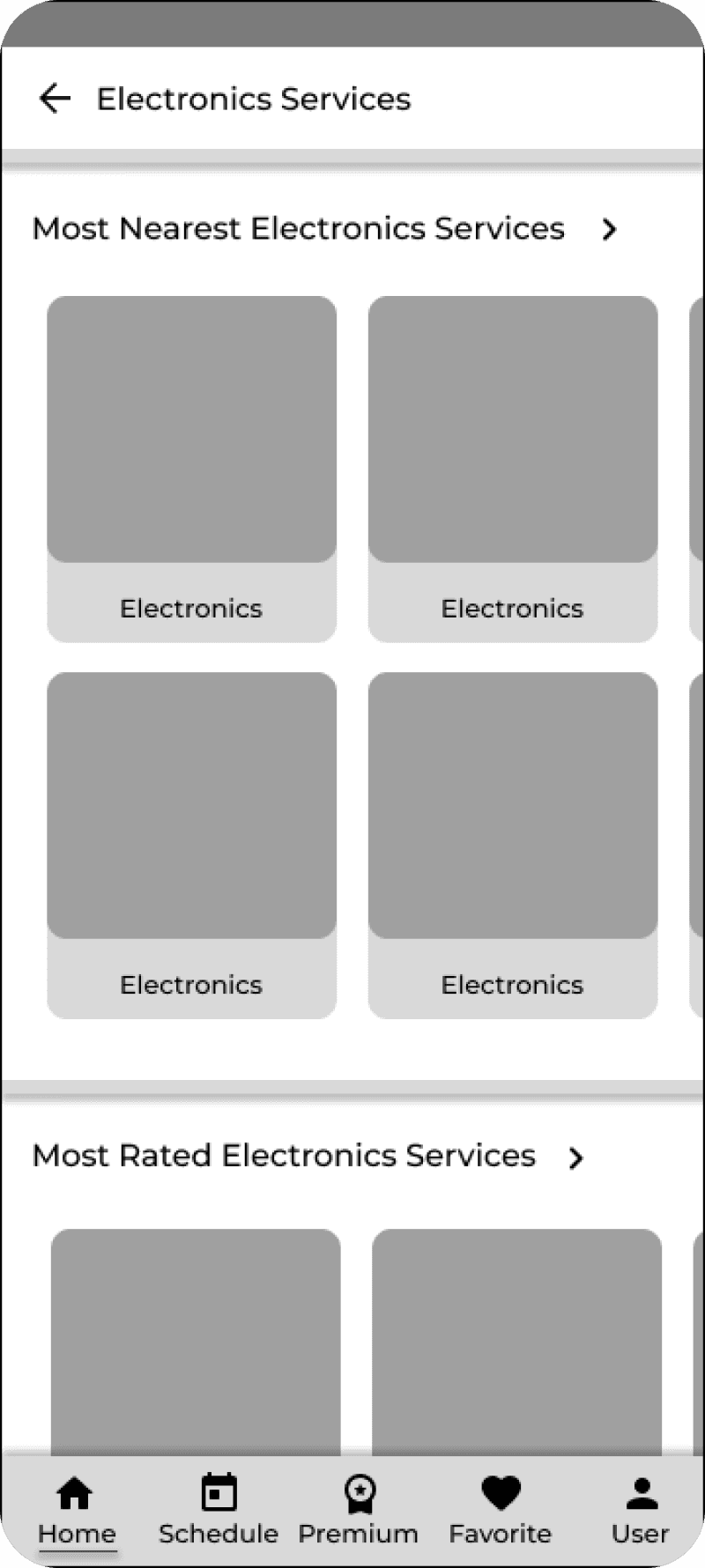
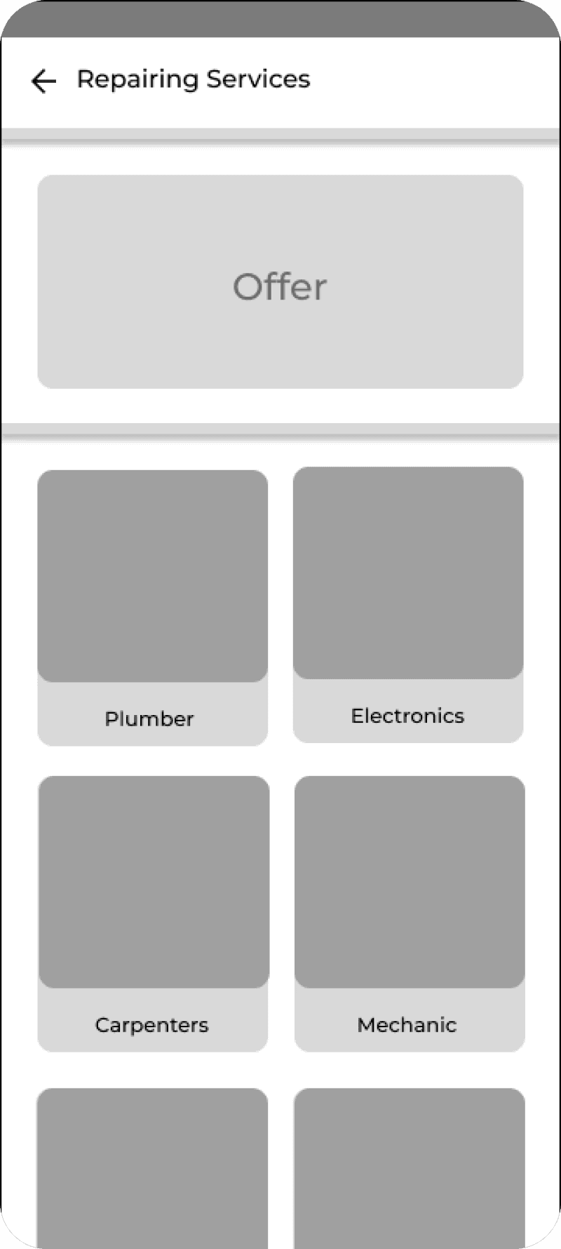
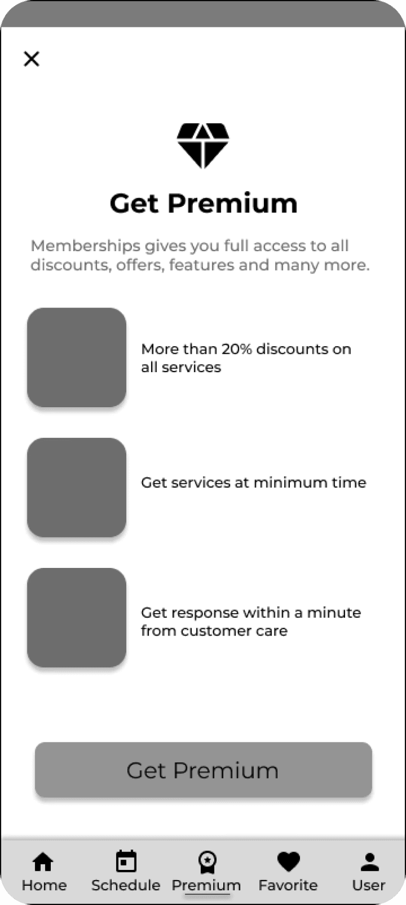
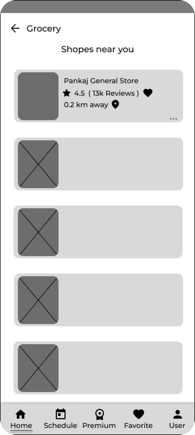
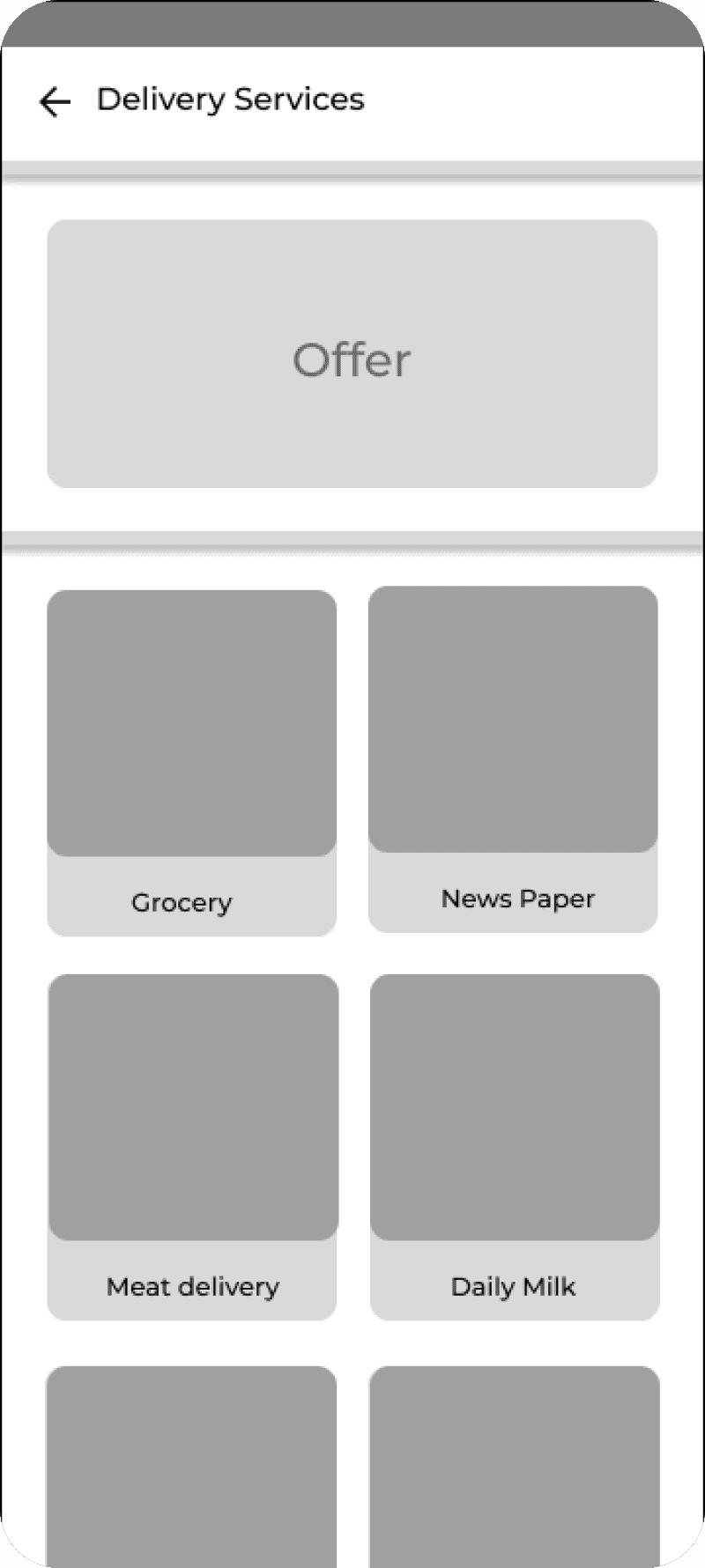
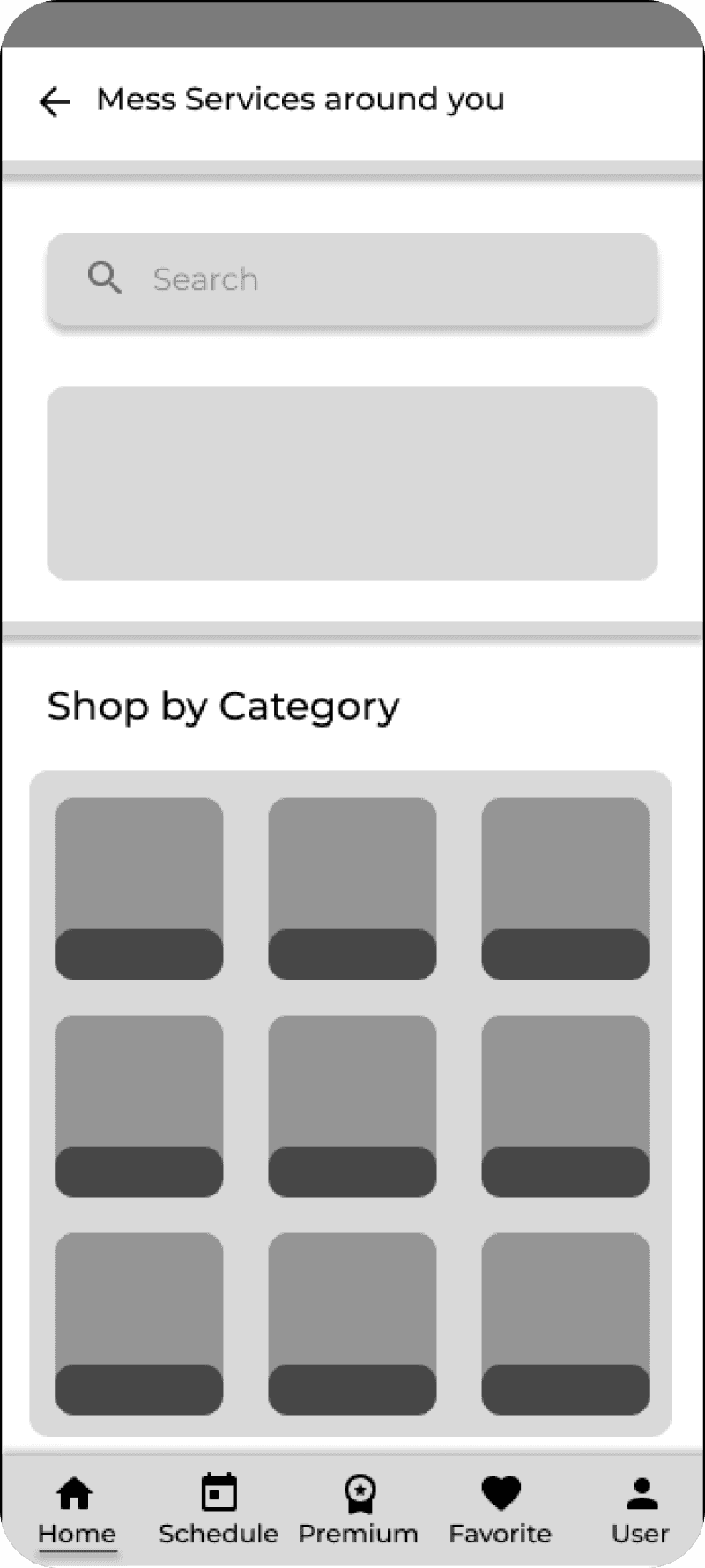
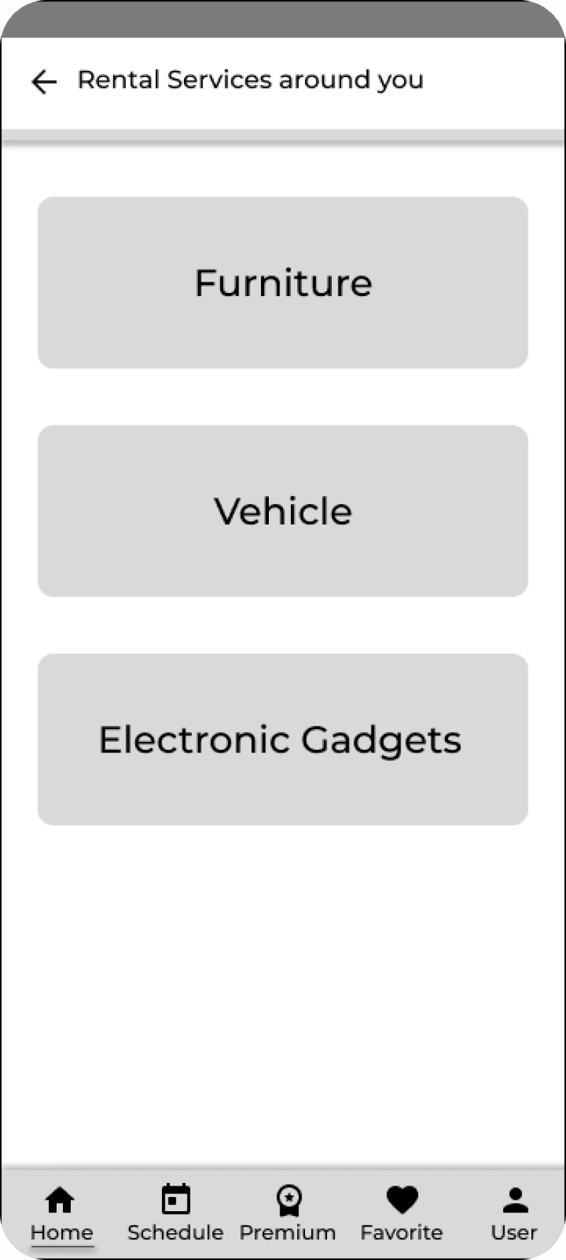
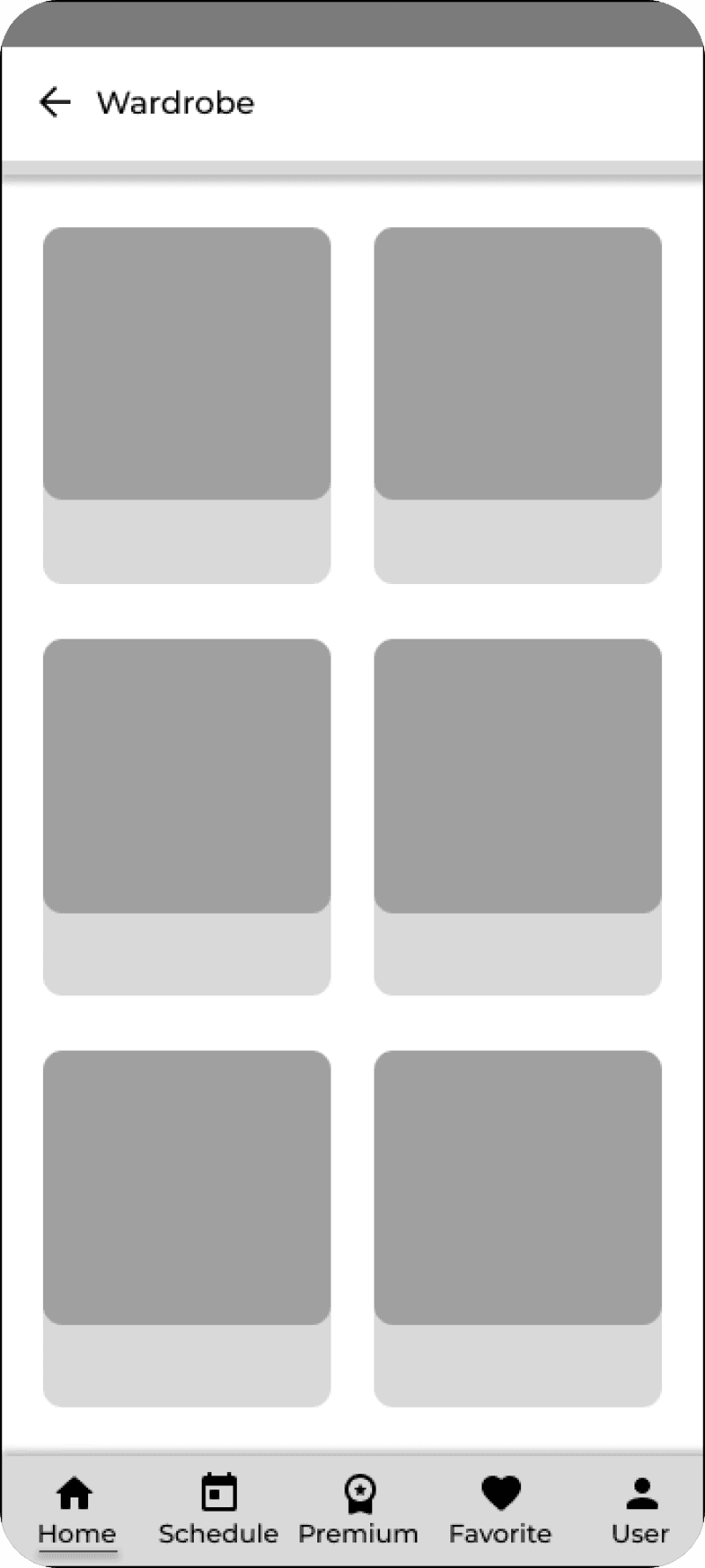
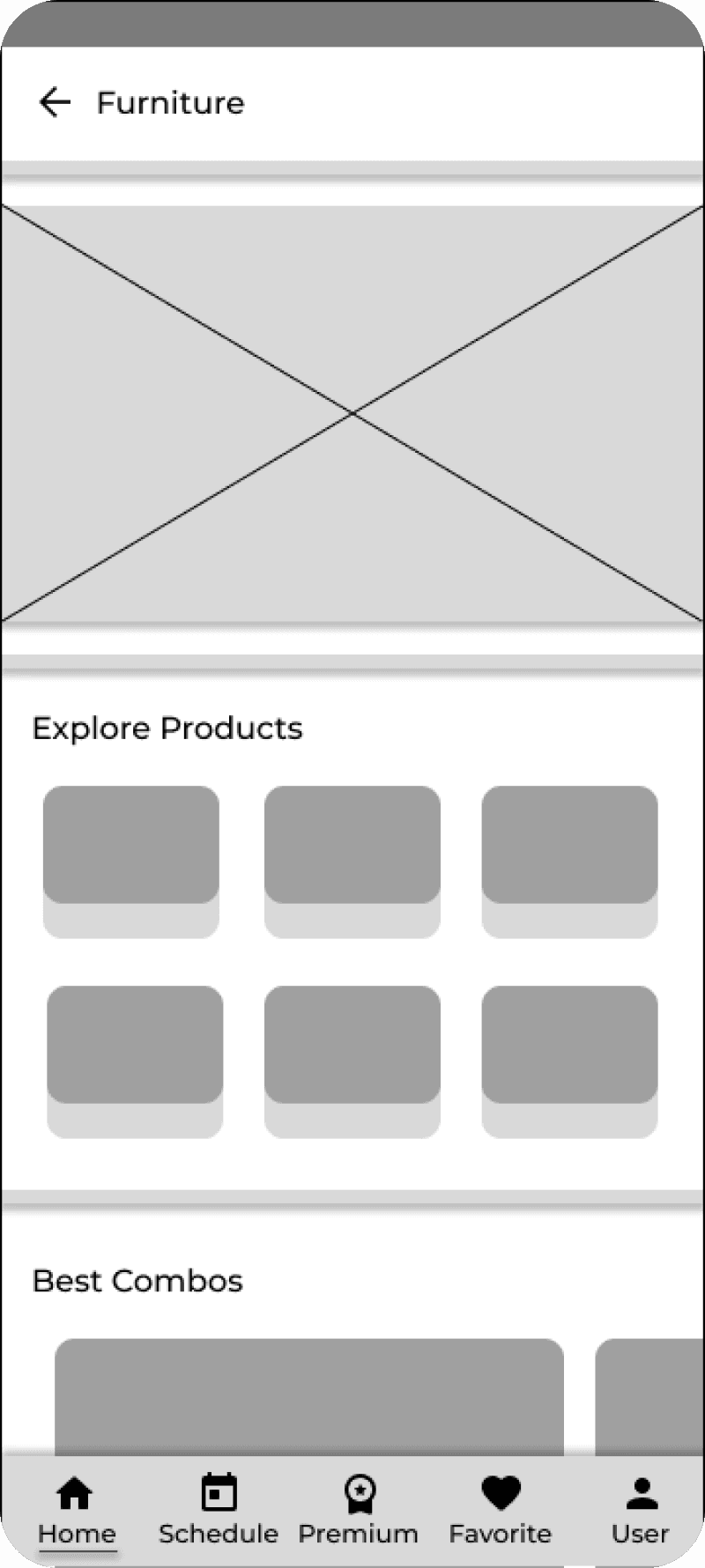
User Interface
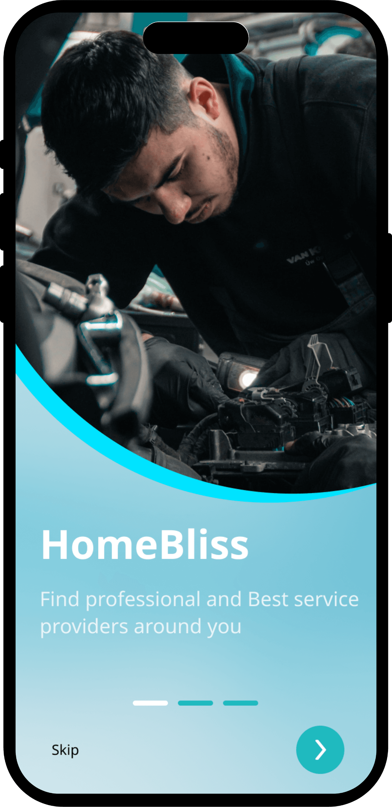
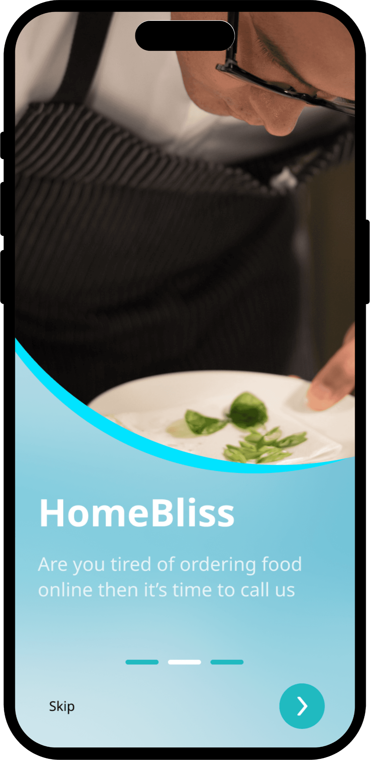
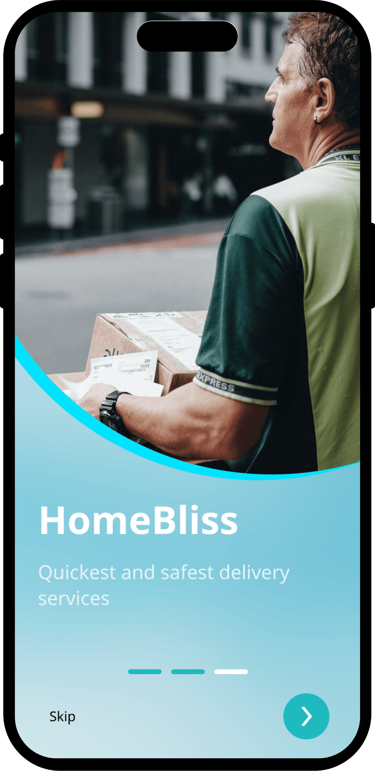
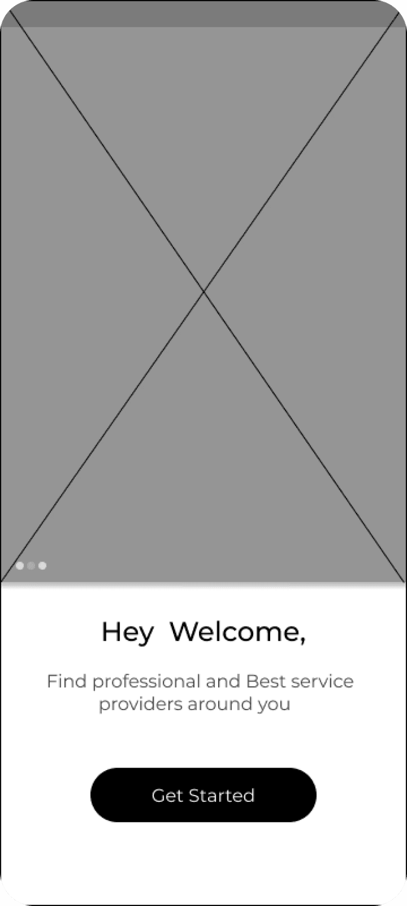
Onboarding Screen
I chose a straightforward, modern typeface to complement the flat, minimalistic look of the app.
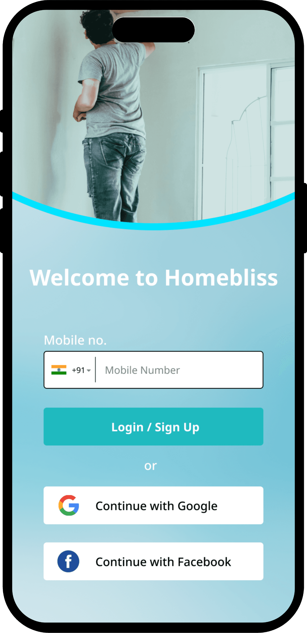
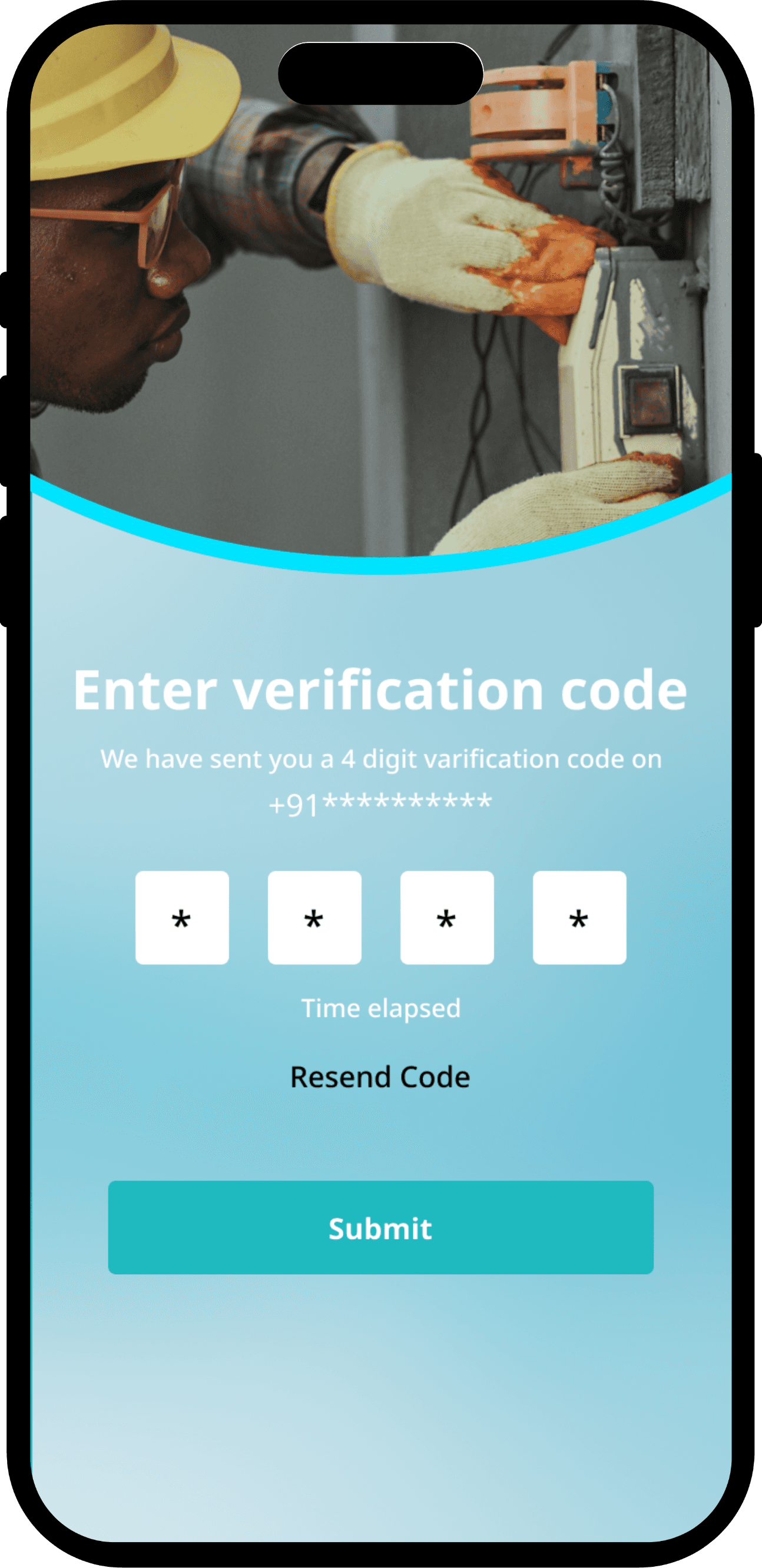
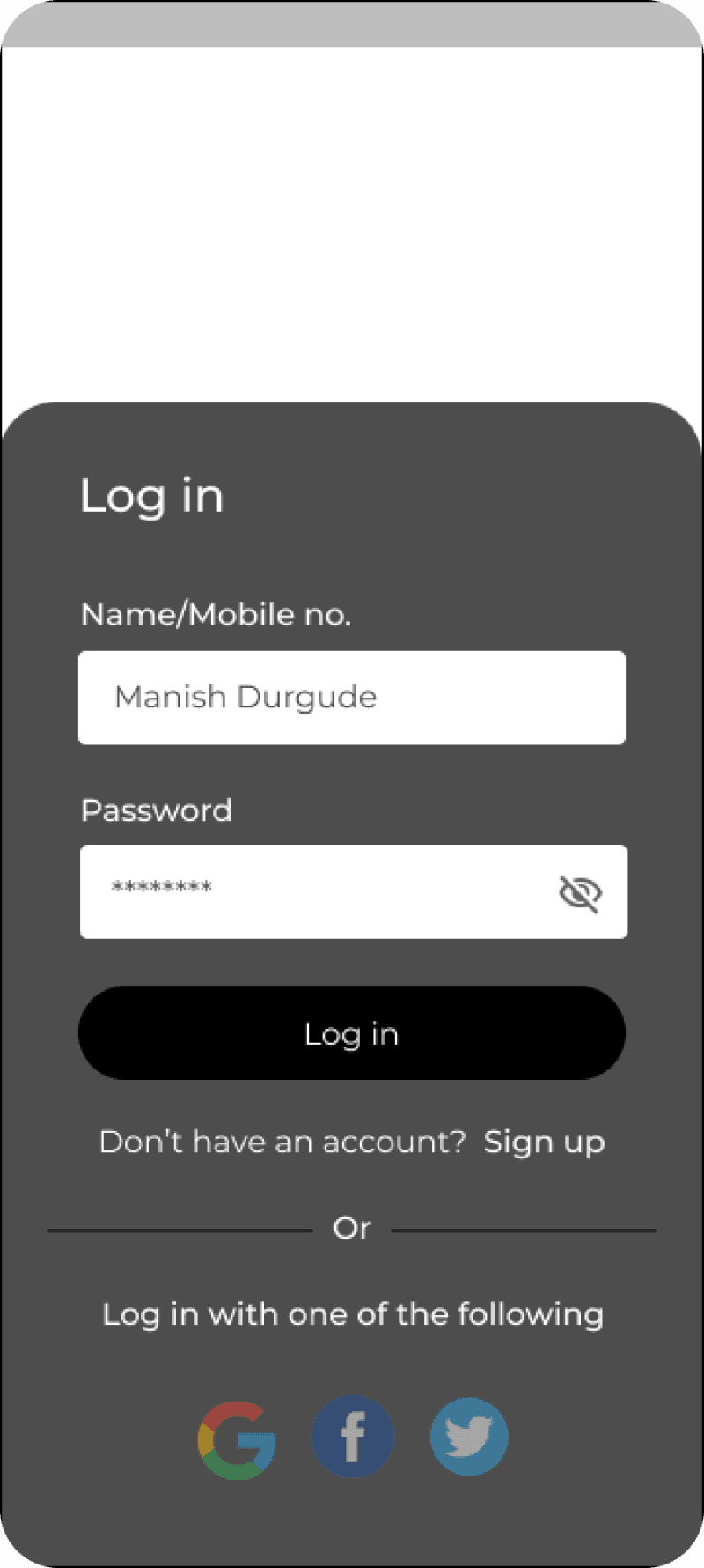
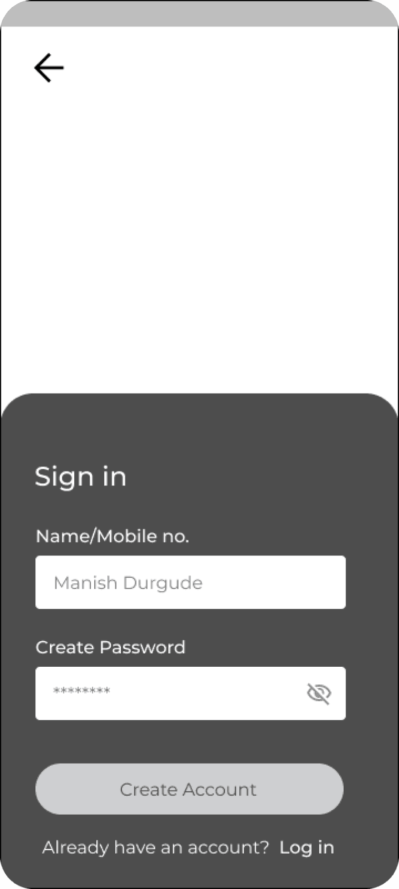
Sign In/Sign Up Screens
Users can sign in via social accounts or mobile OTP, enabling quick and easy authentication.
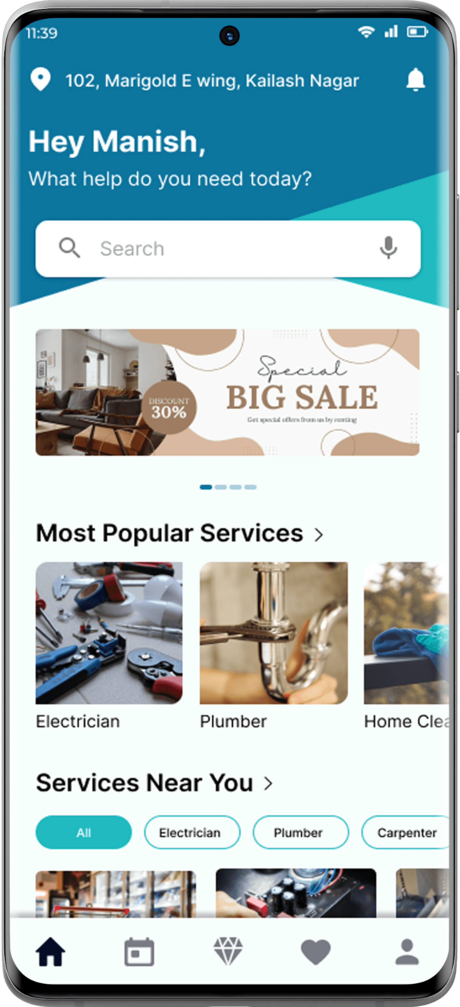
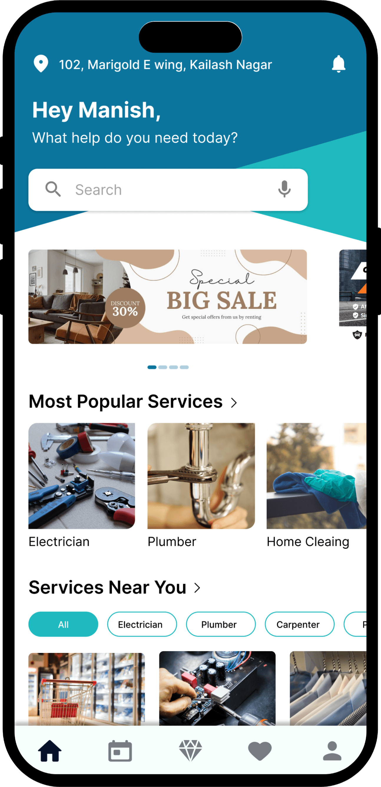
Home Screen
A clean, central hub with quick access to top services, smart categories, and clear icons for fast, hassle-free navigation.
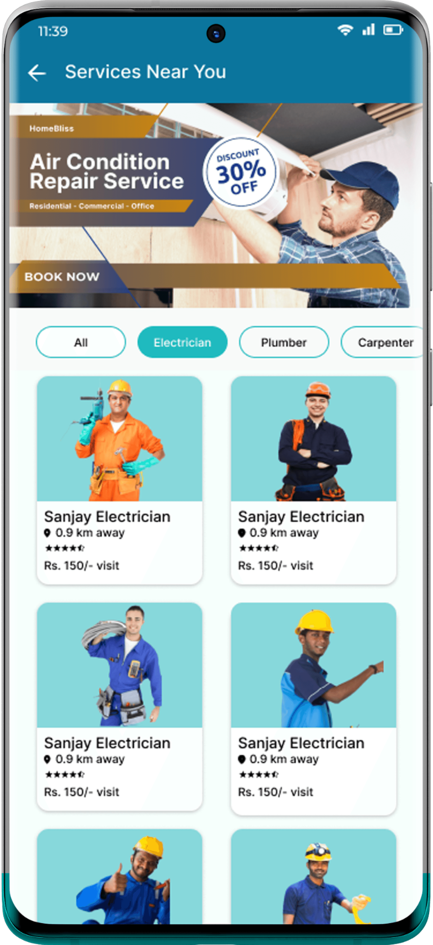
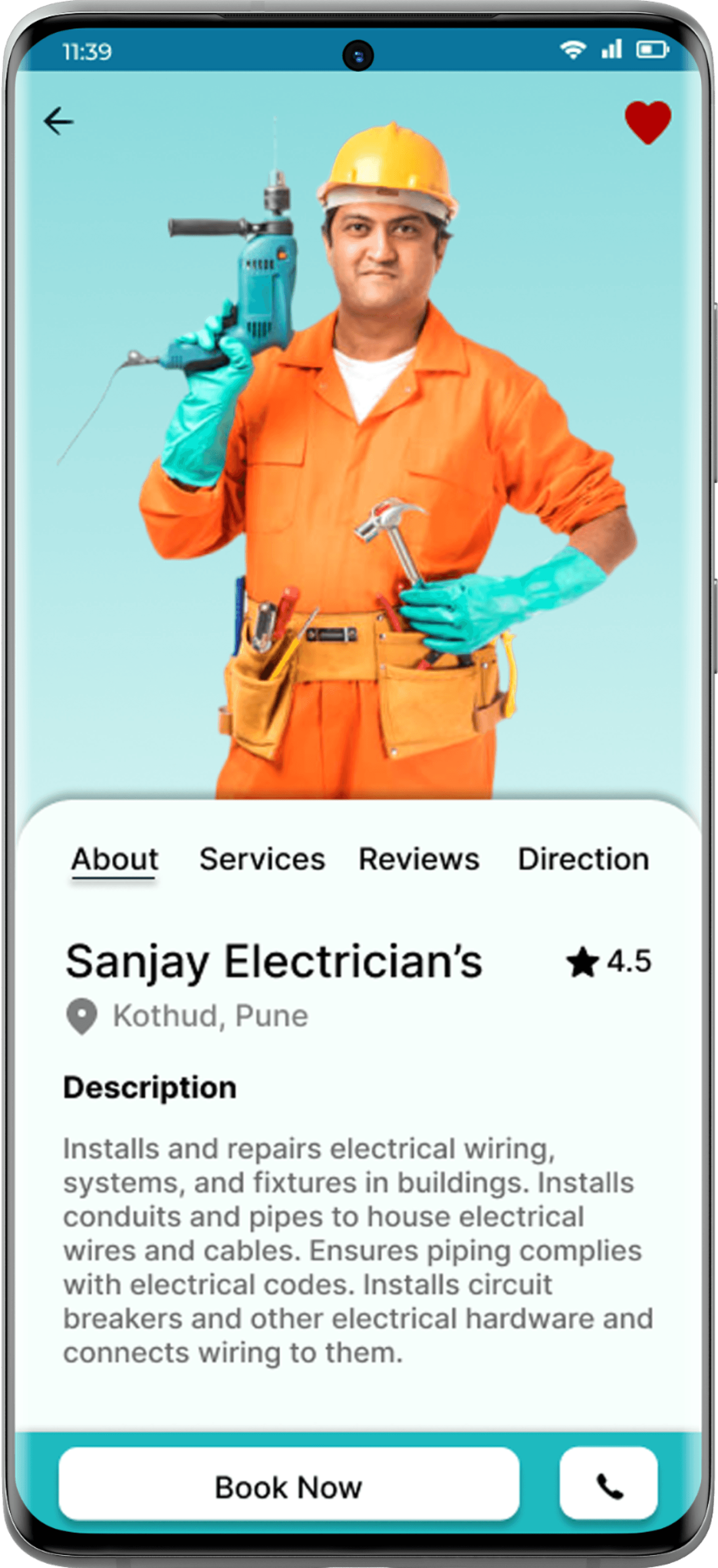
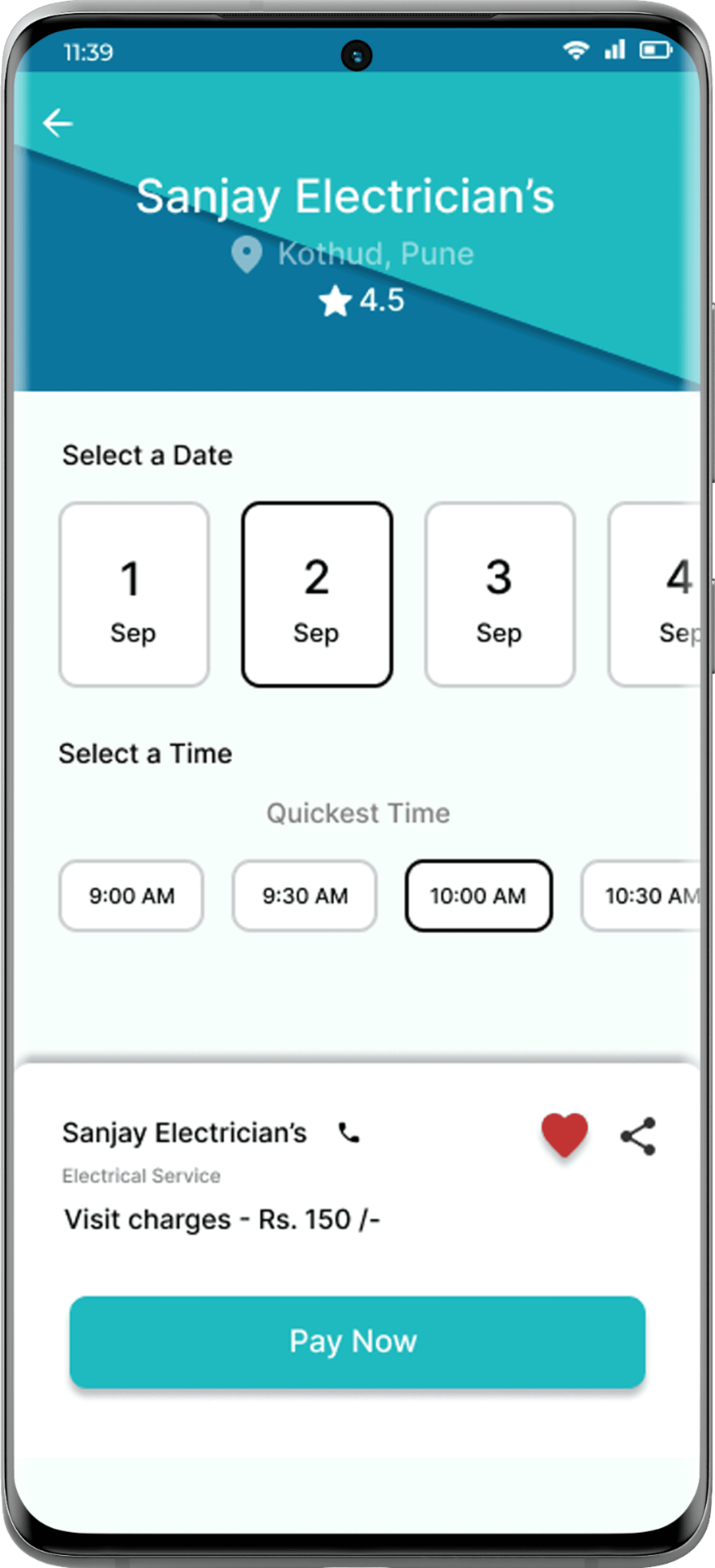
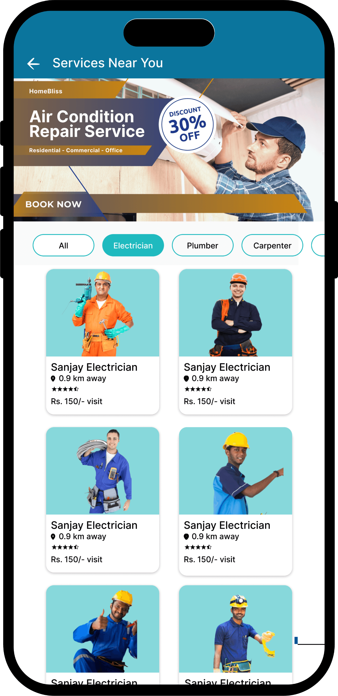
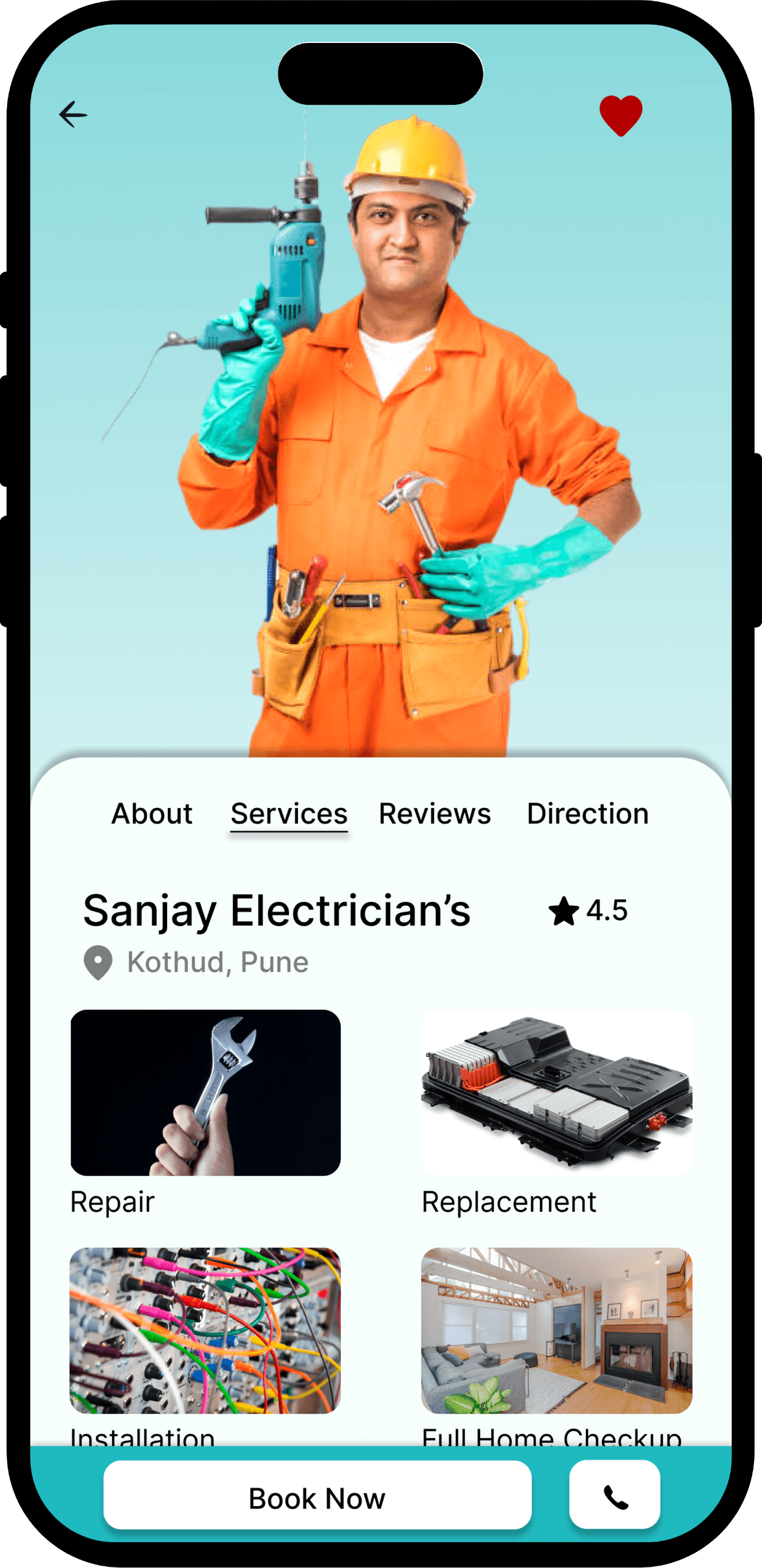
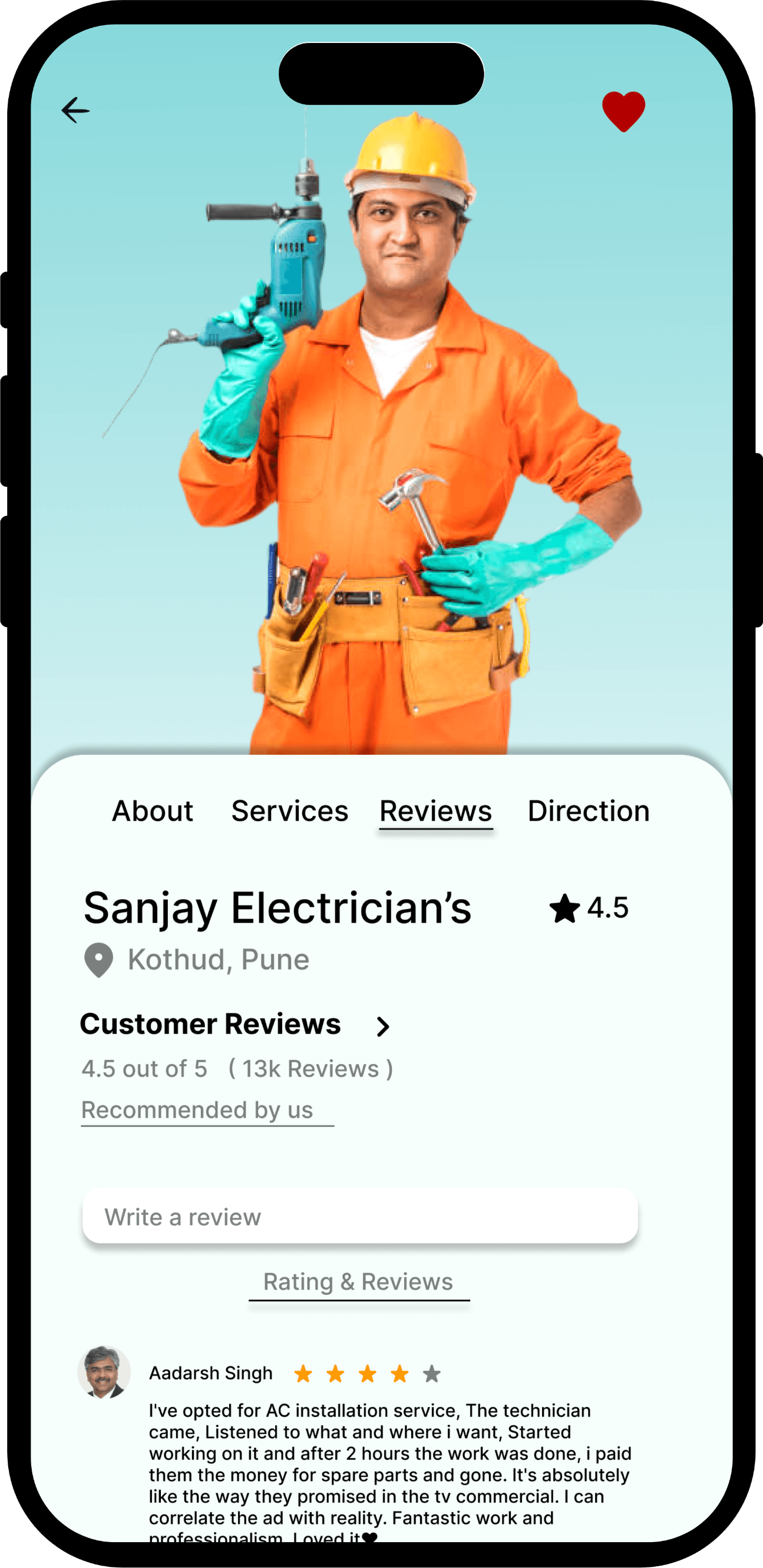
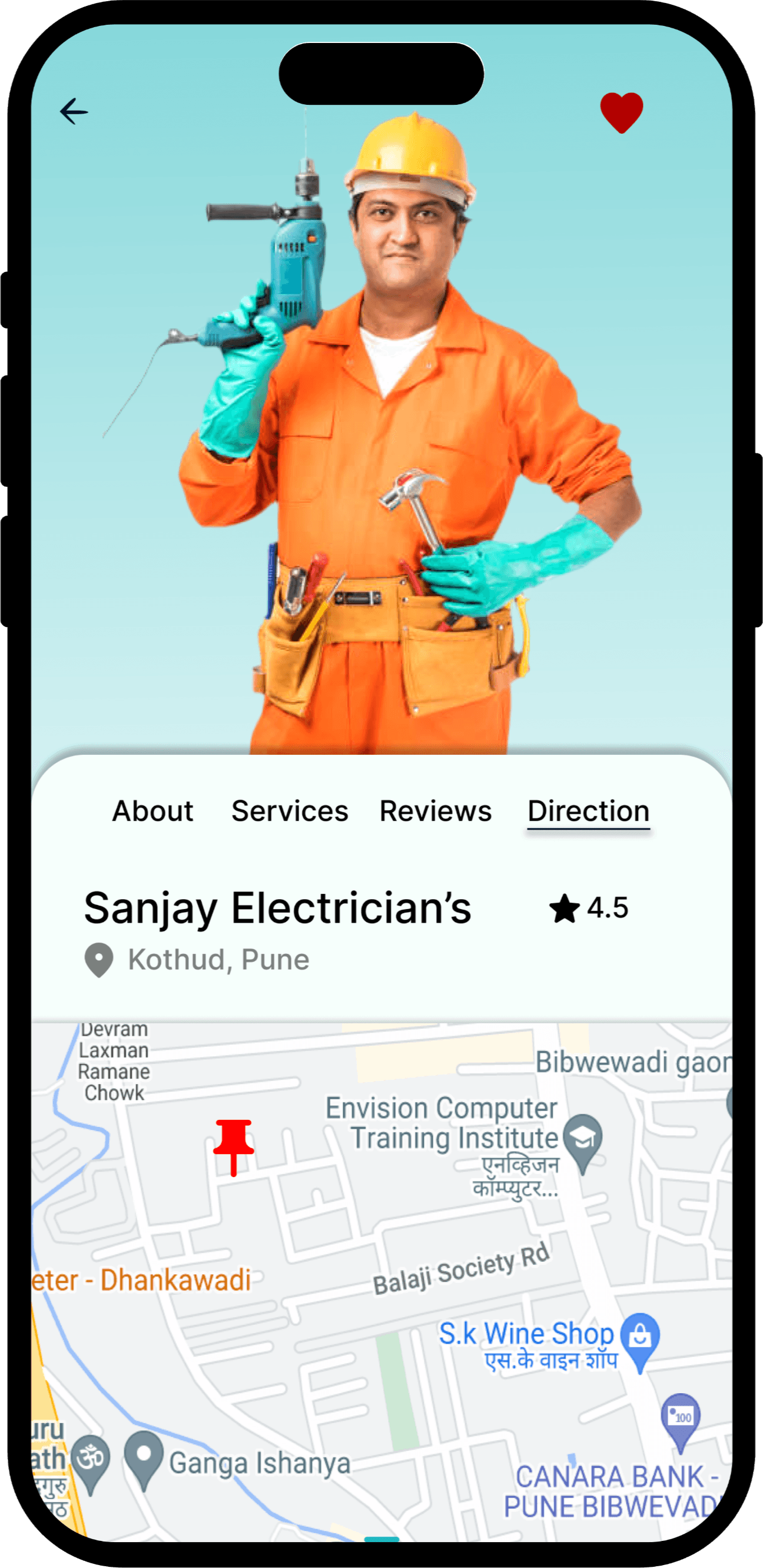
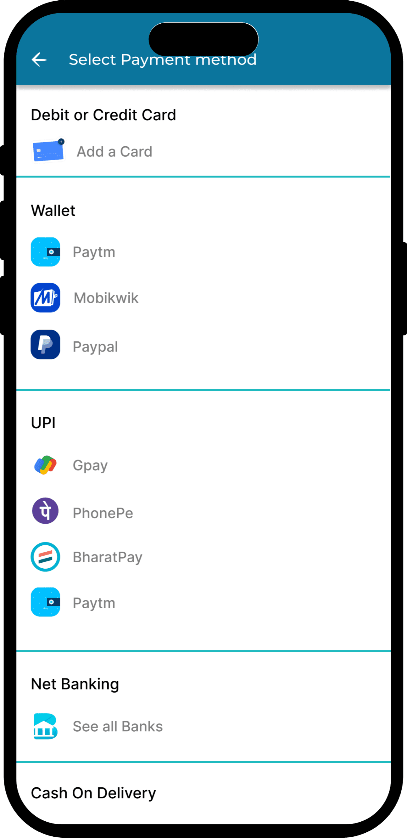
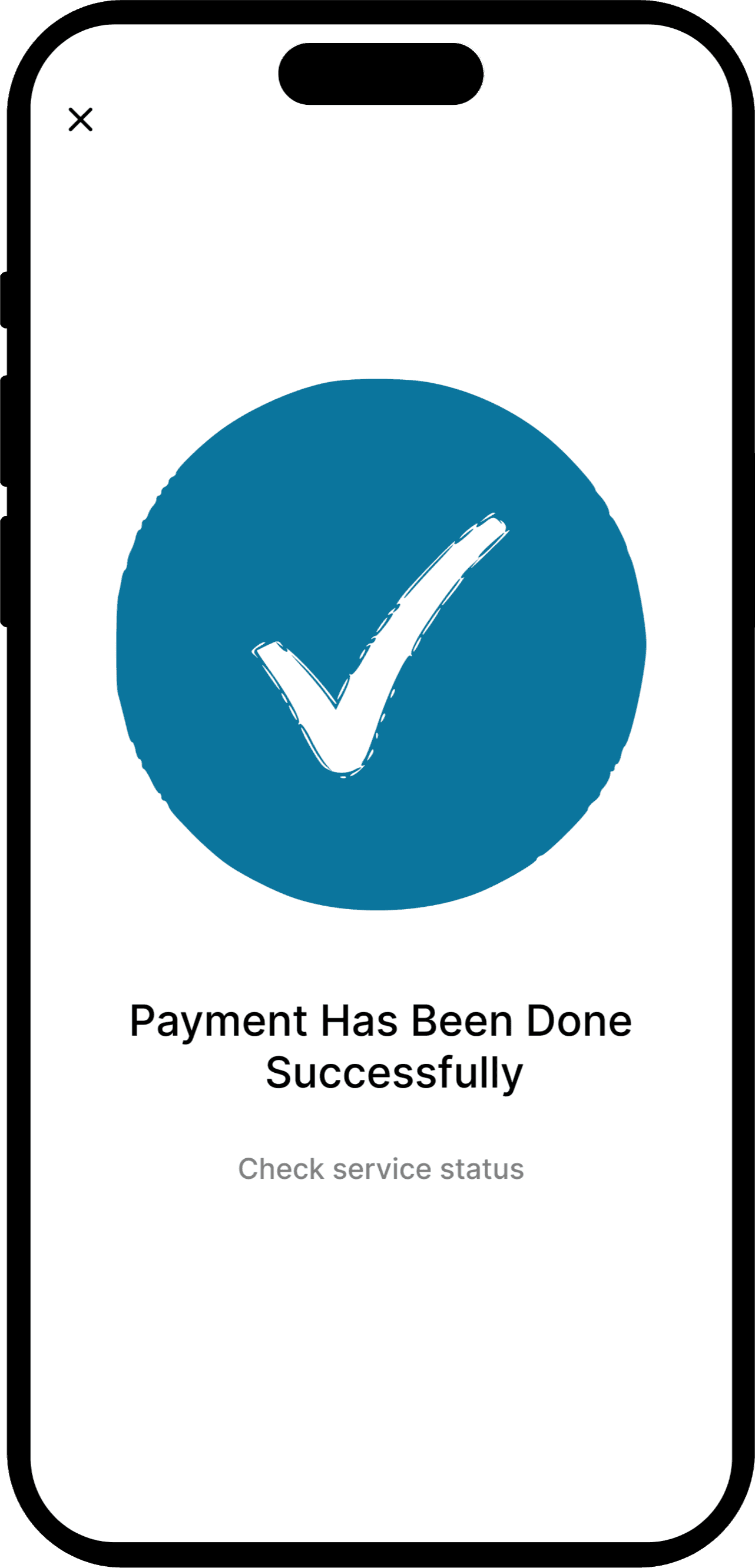
Service Booking
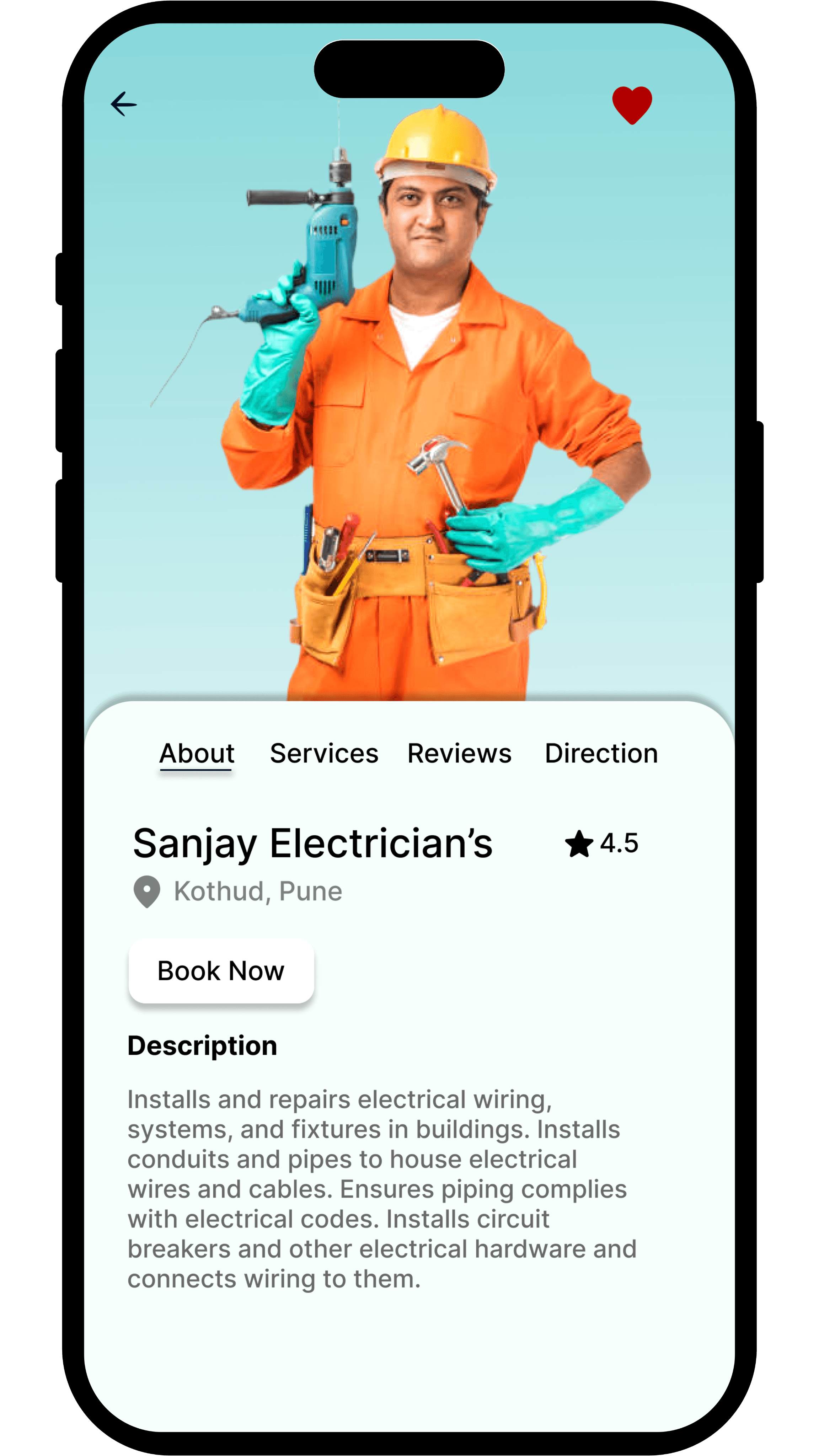
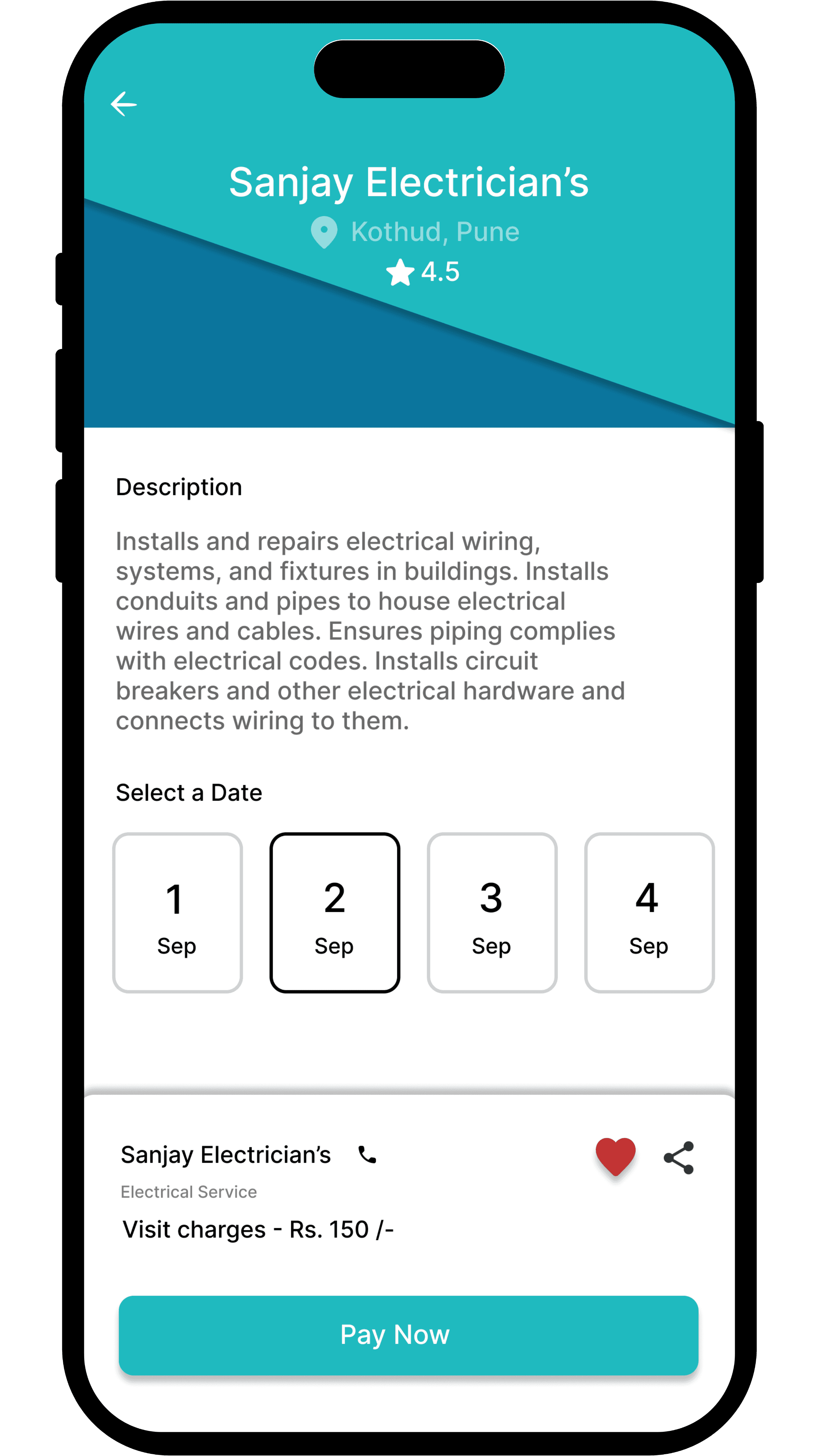
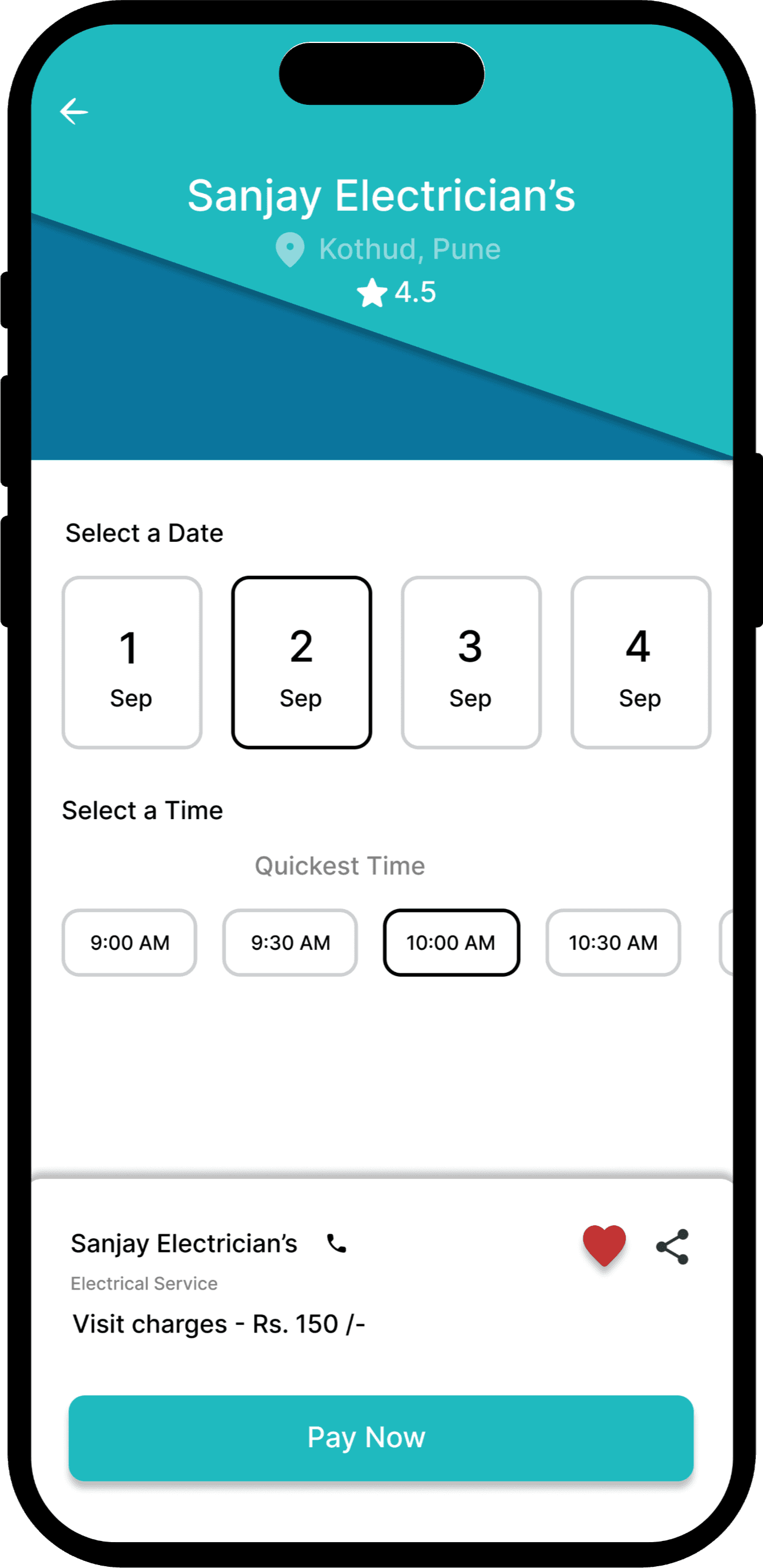
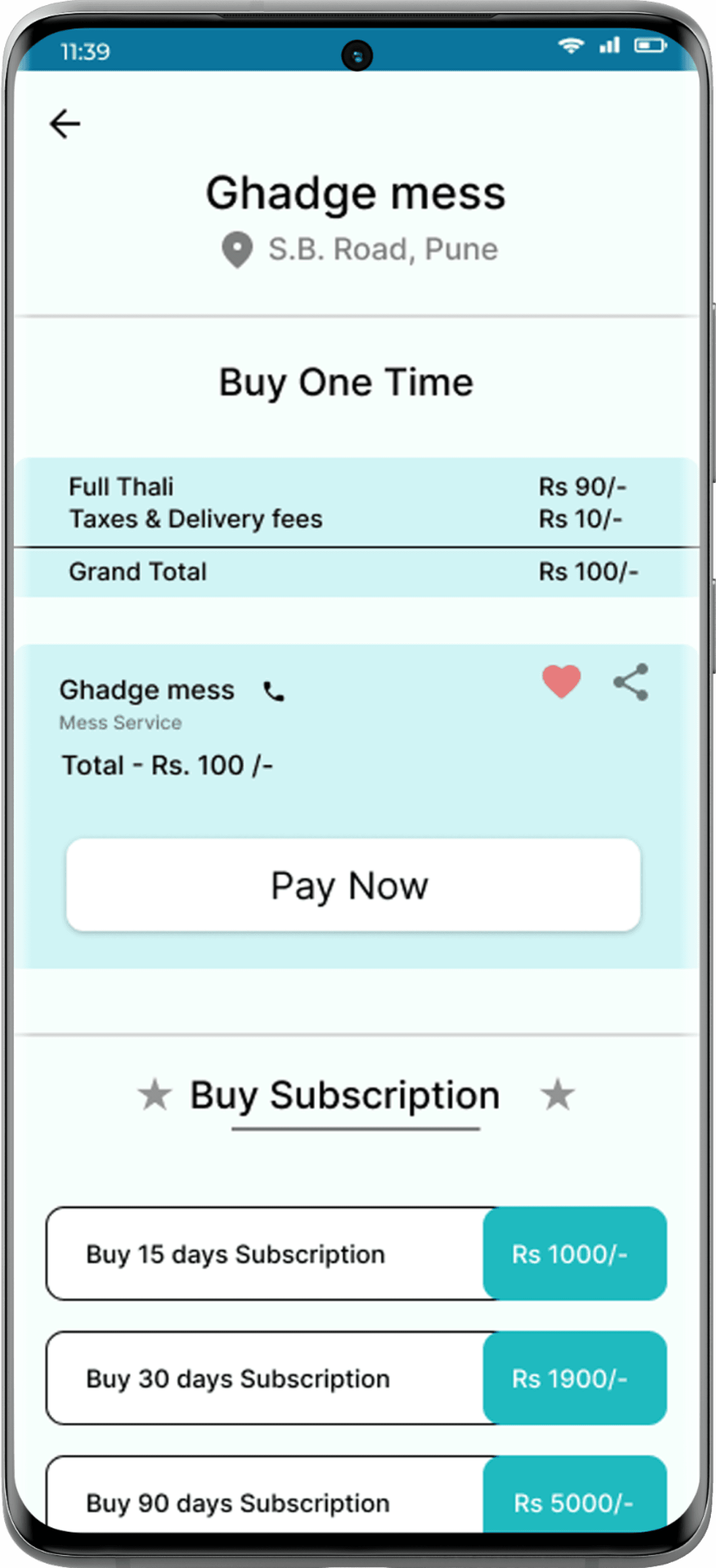
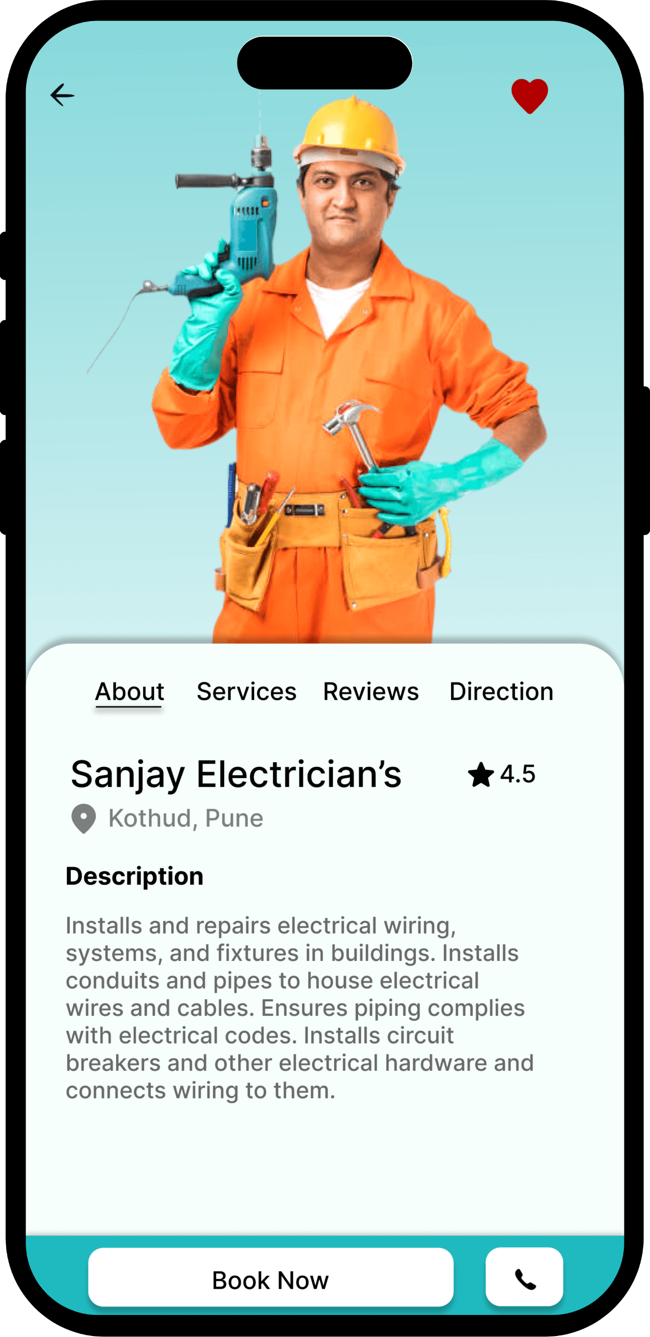
Users can quickly select a service, view provider details, choose a time slot, and complete payment—all in a few taps. The flow is simple, fast, and user-friendly
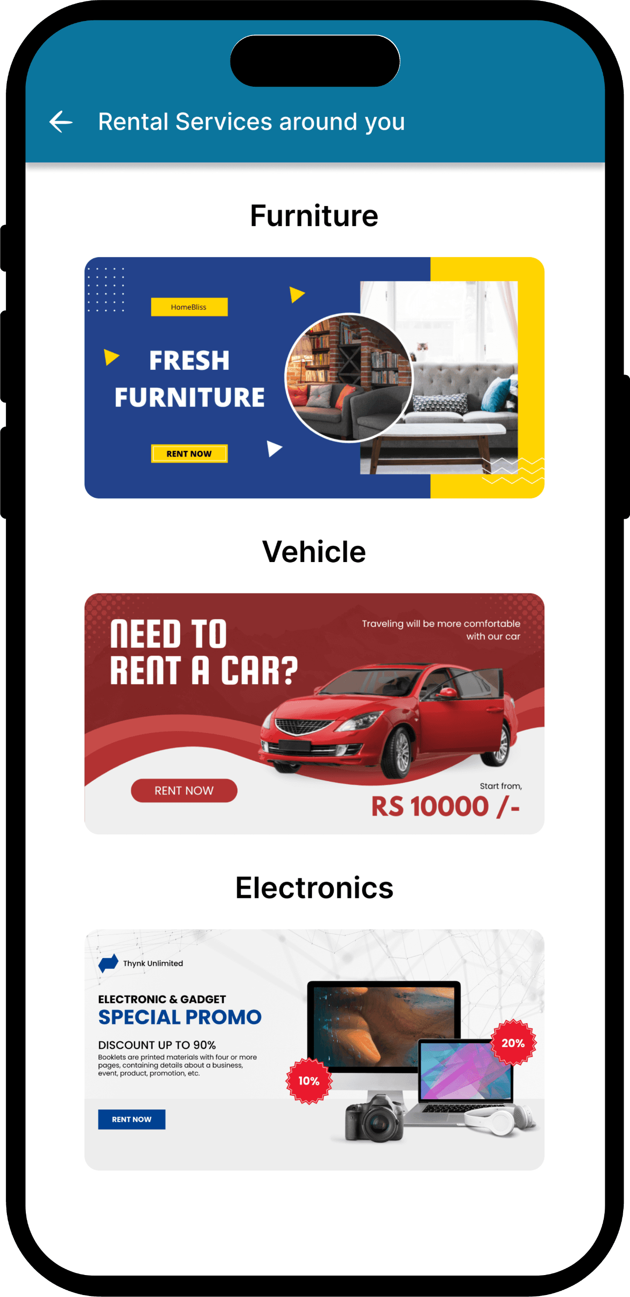
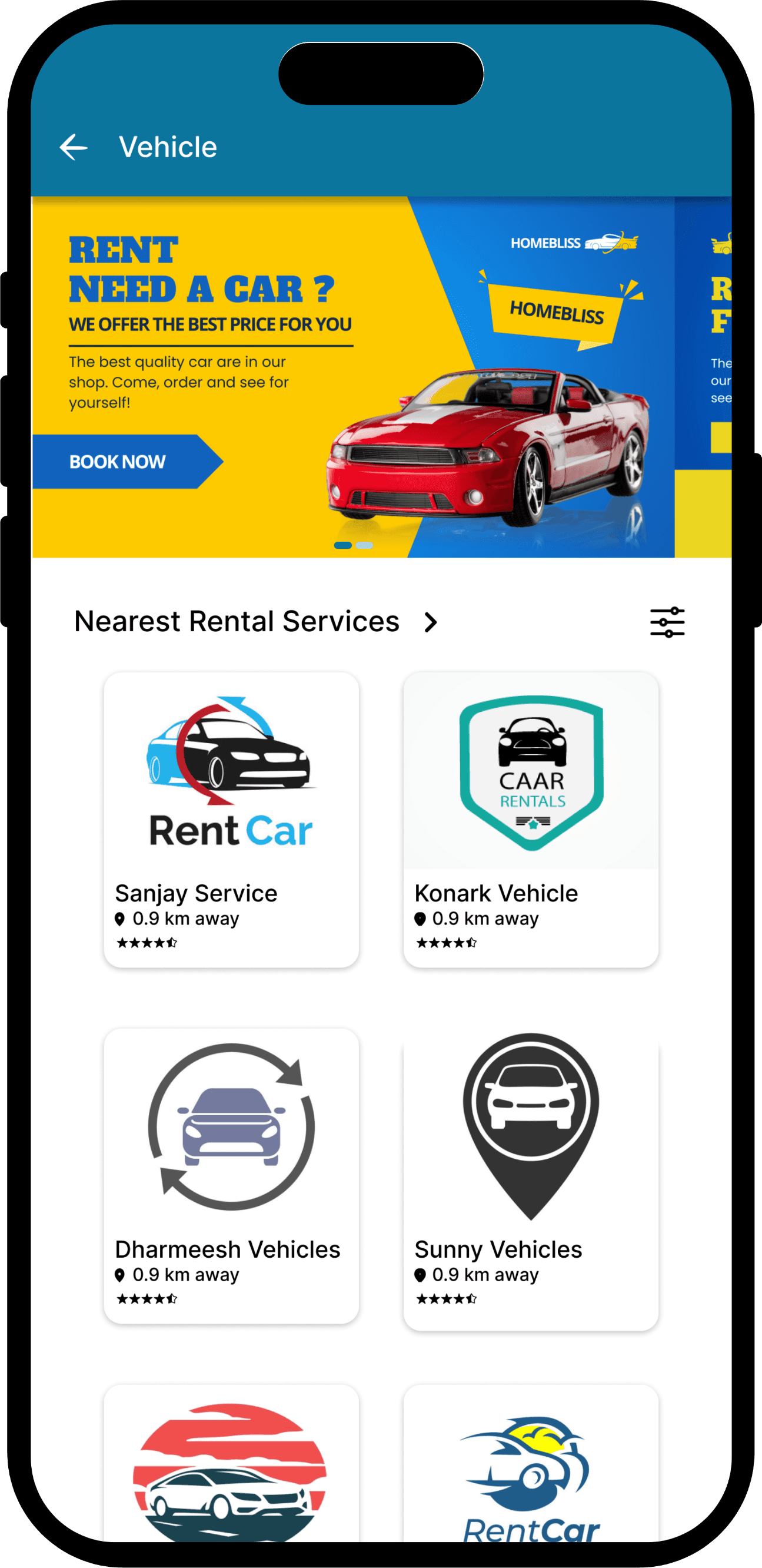
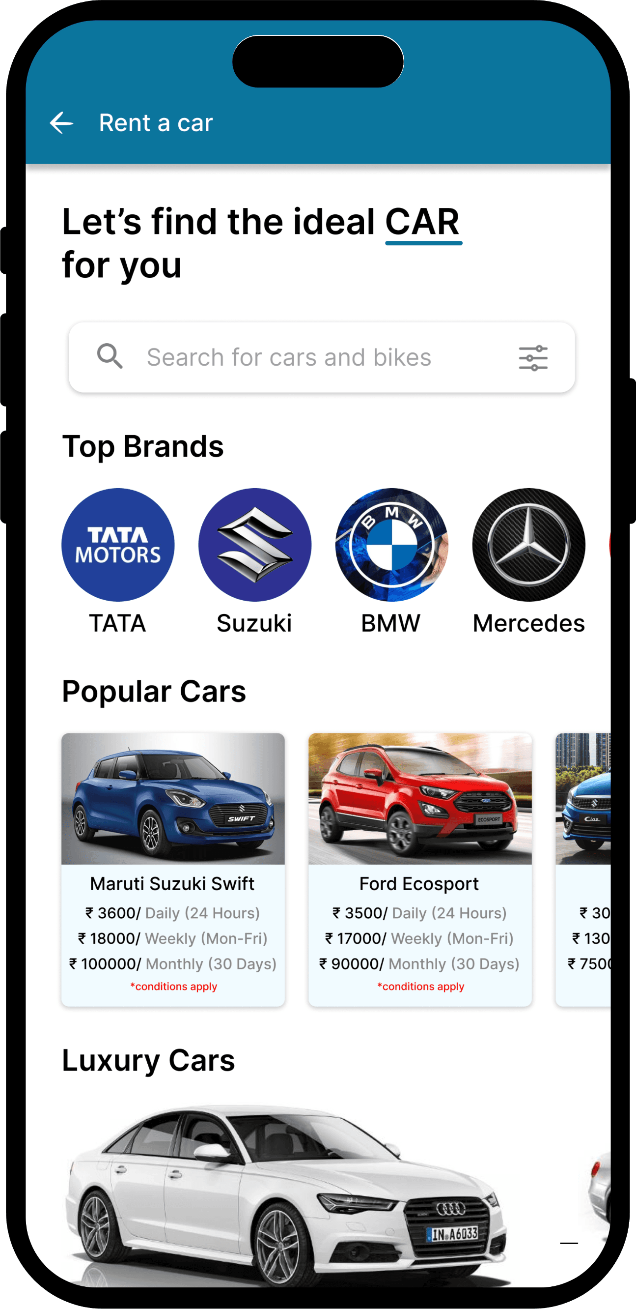
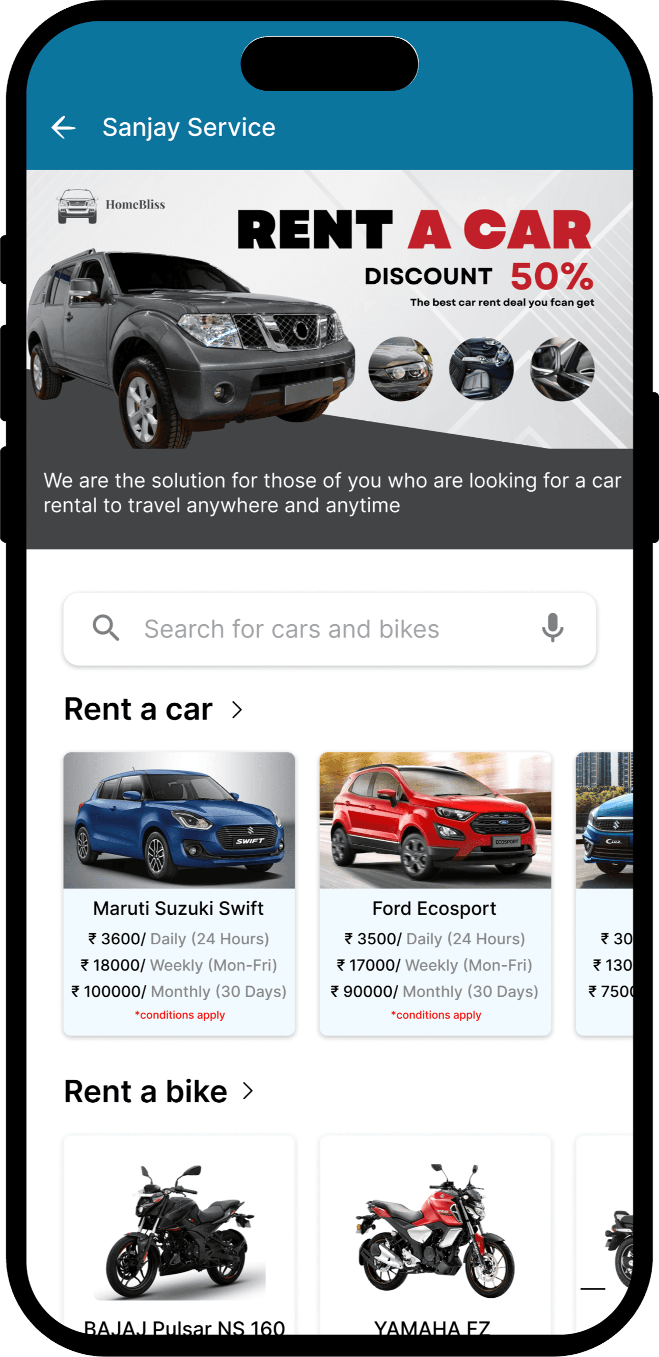
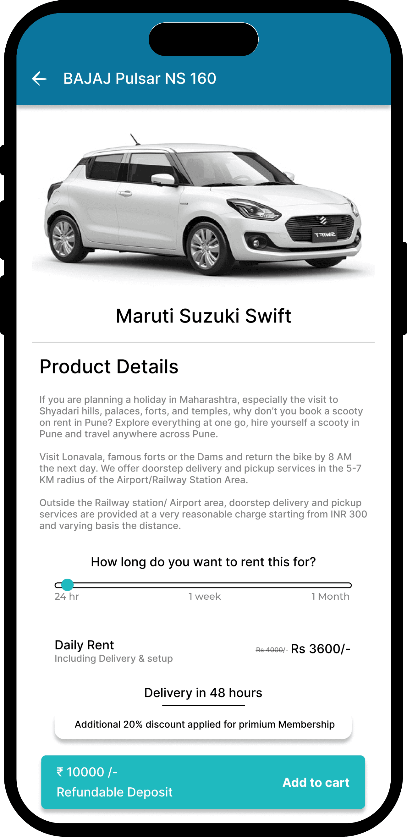
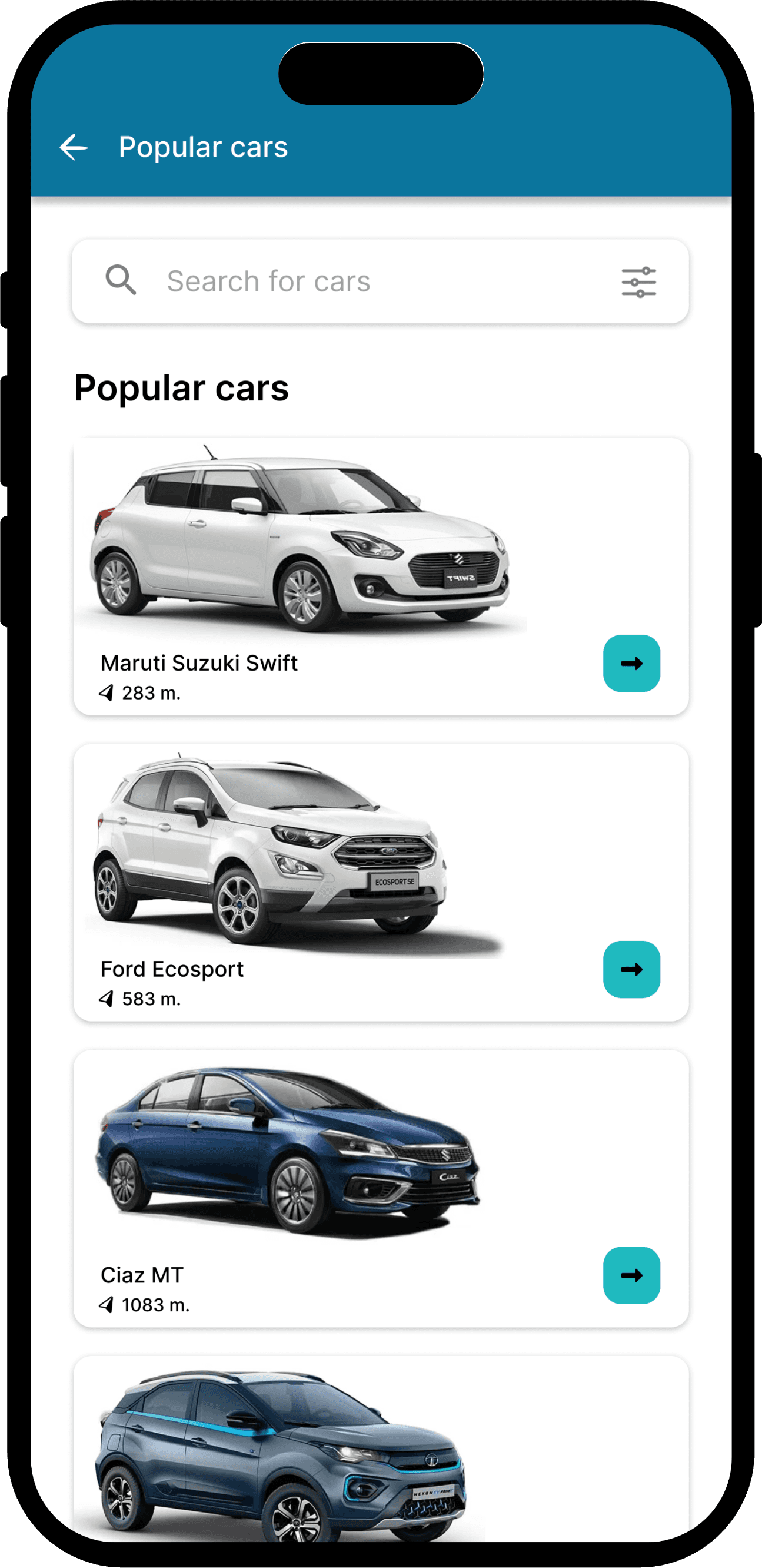
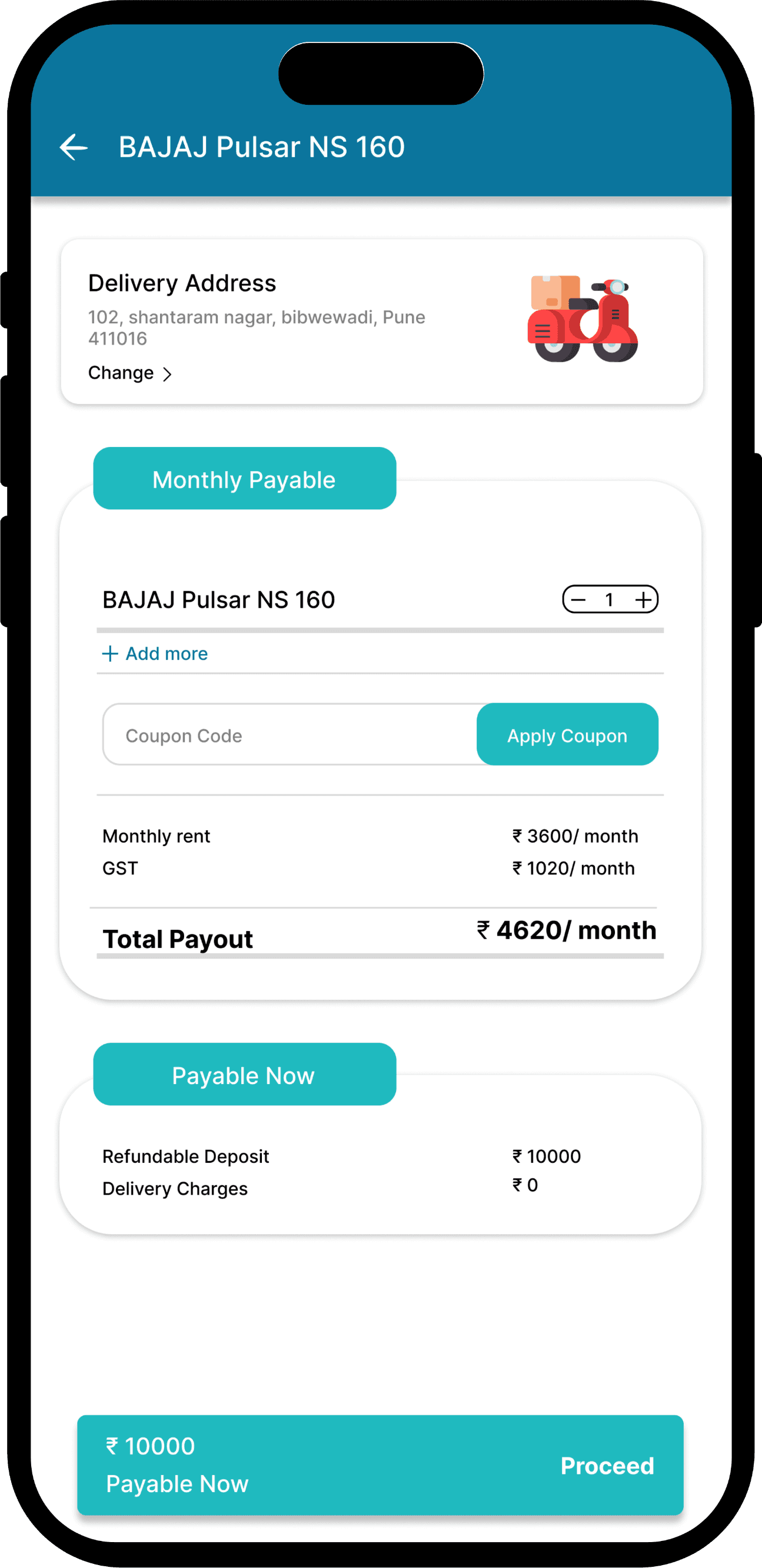
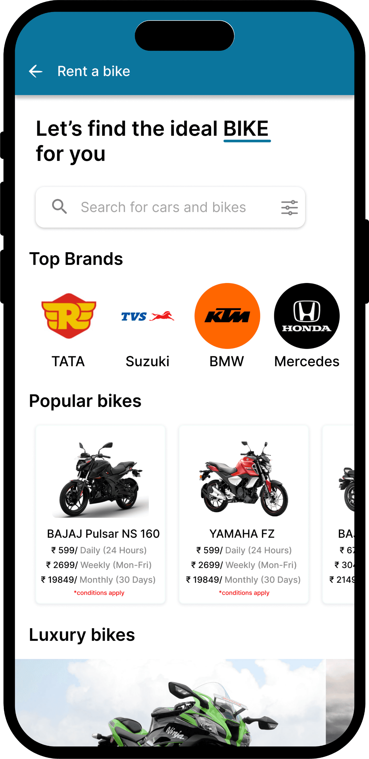
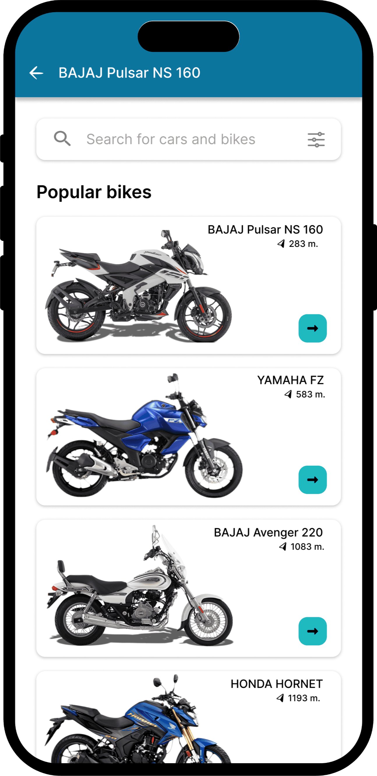
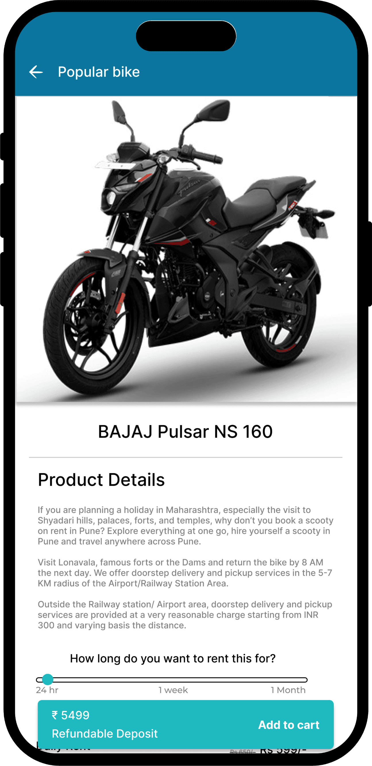
Rental Services
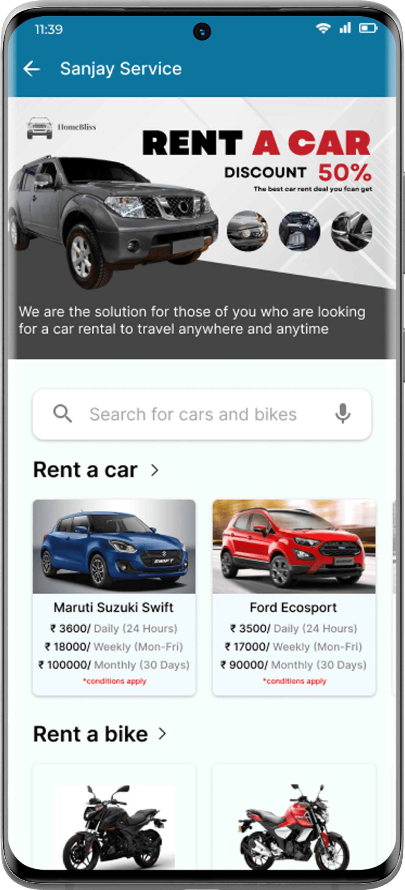
Quickly browse and book rentals with flexible plans, top brands, and easy doorstep deliveryRental
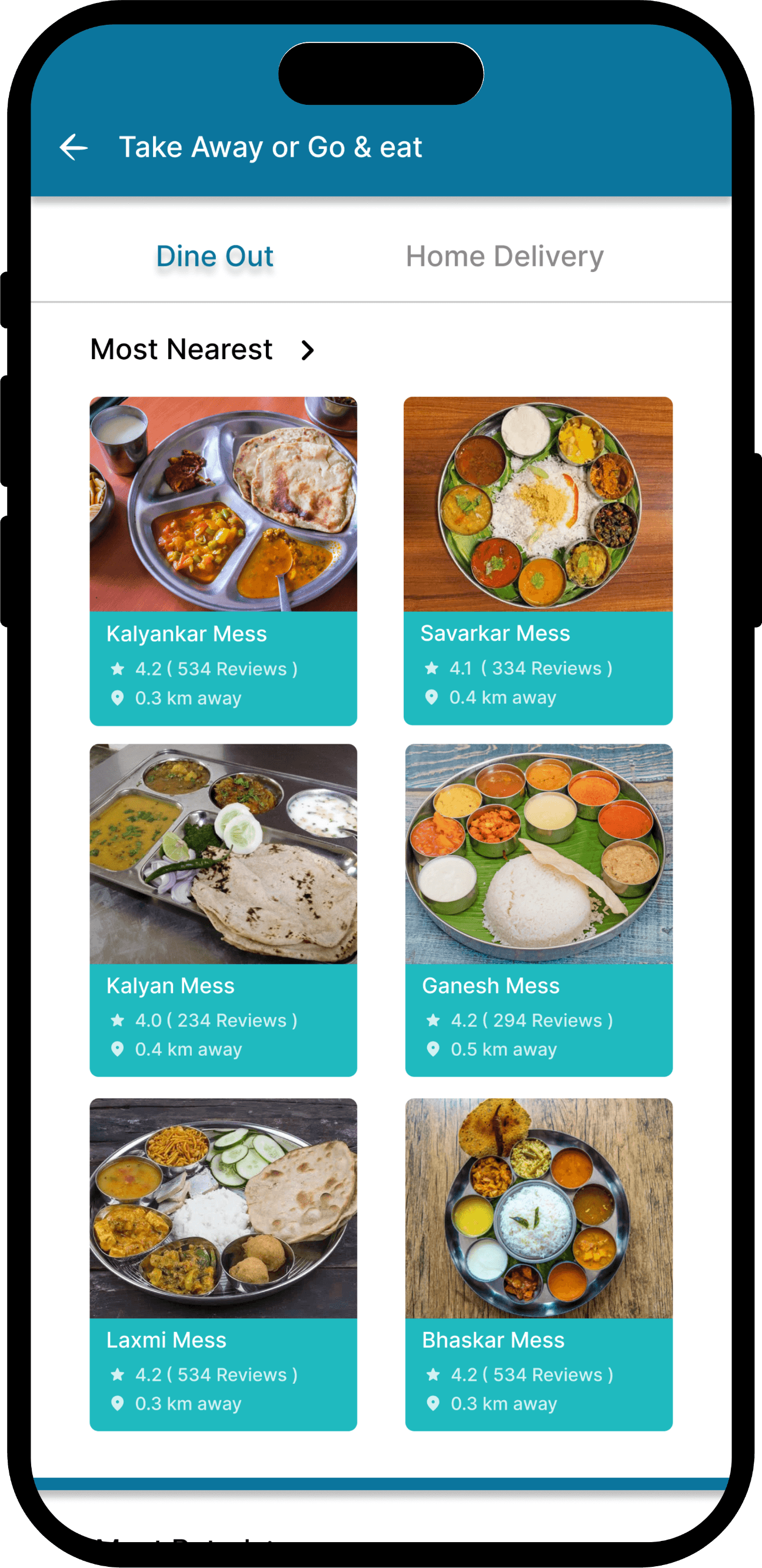
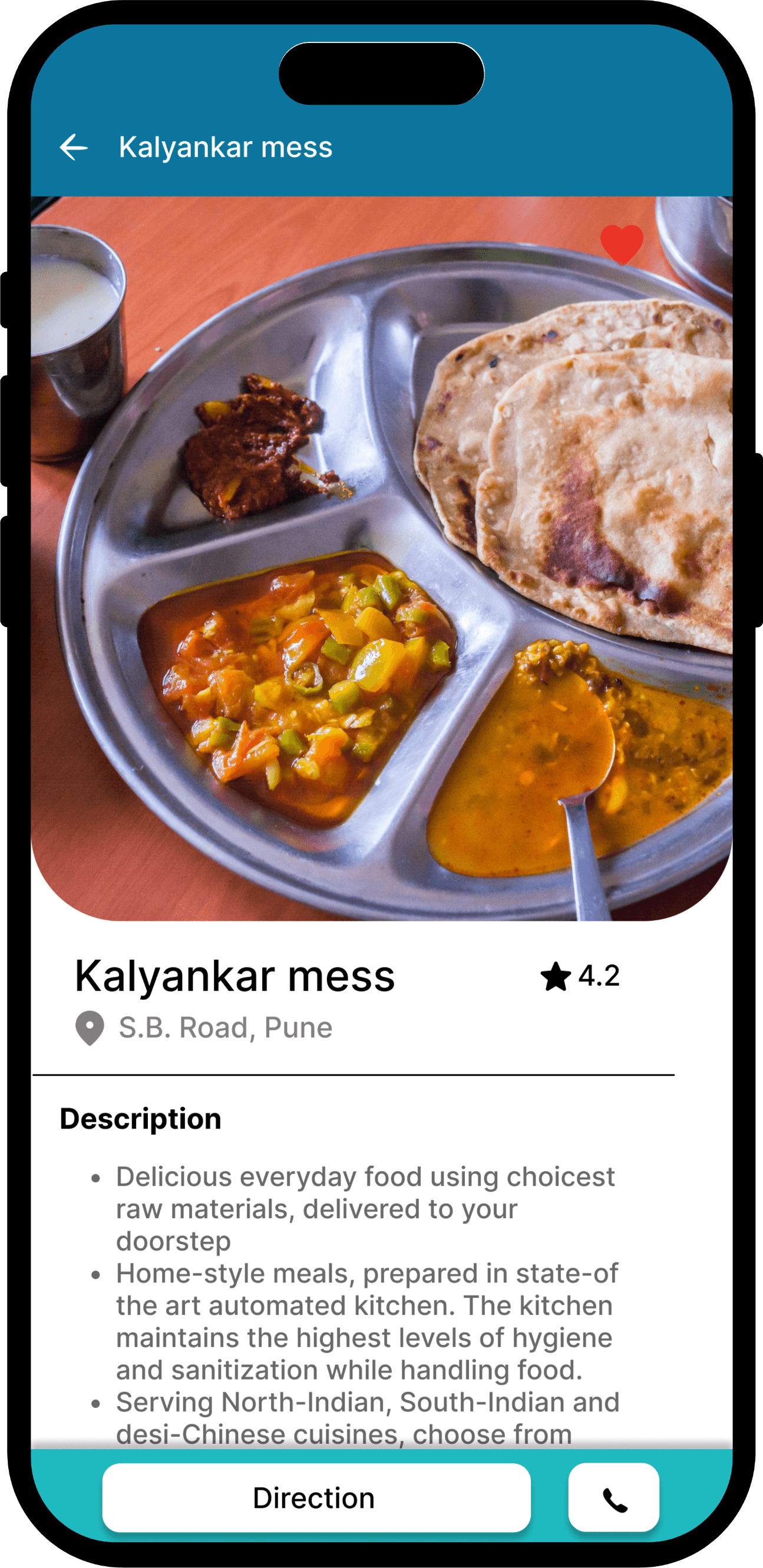
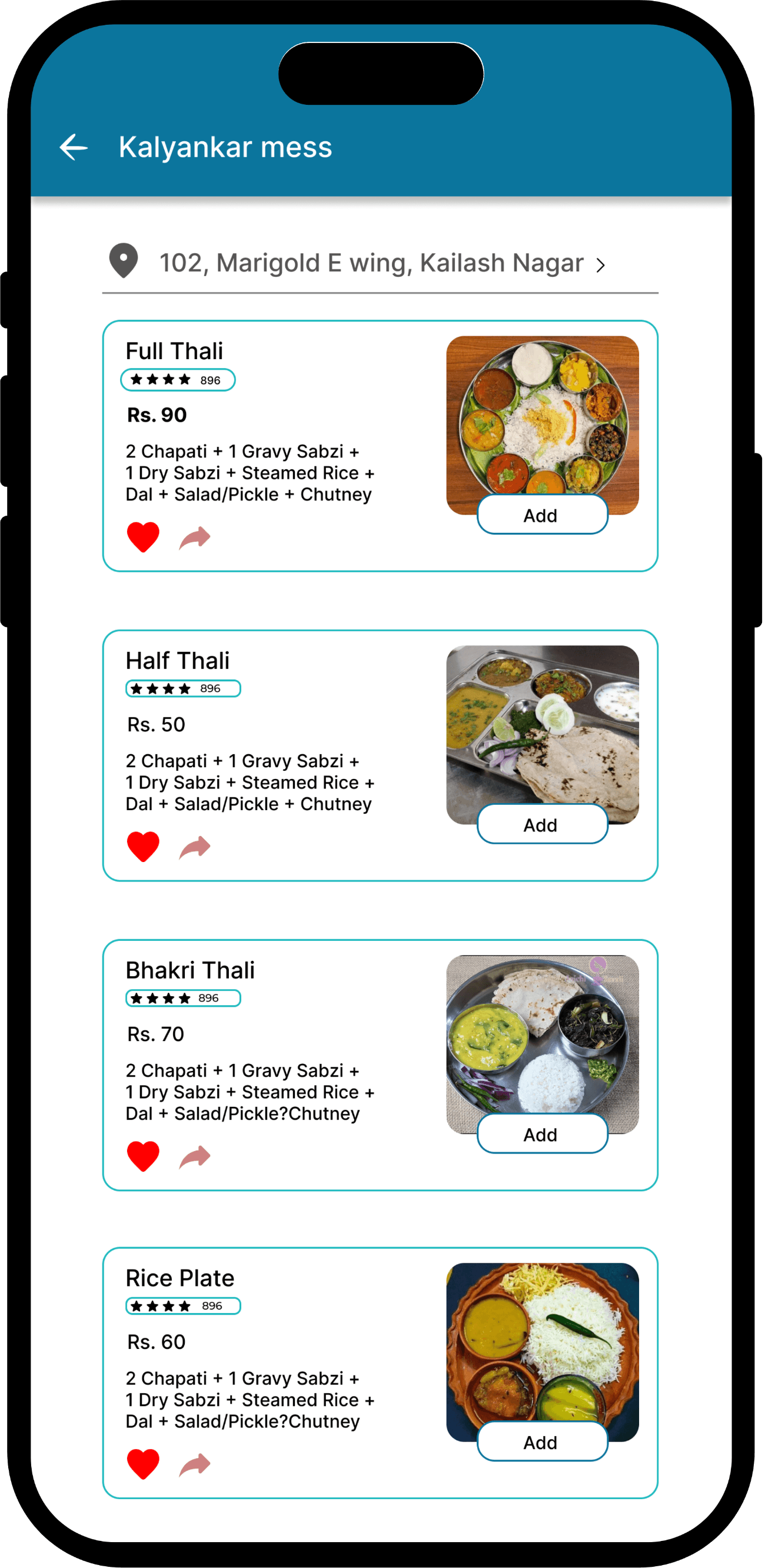
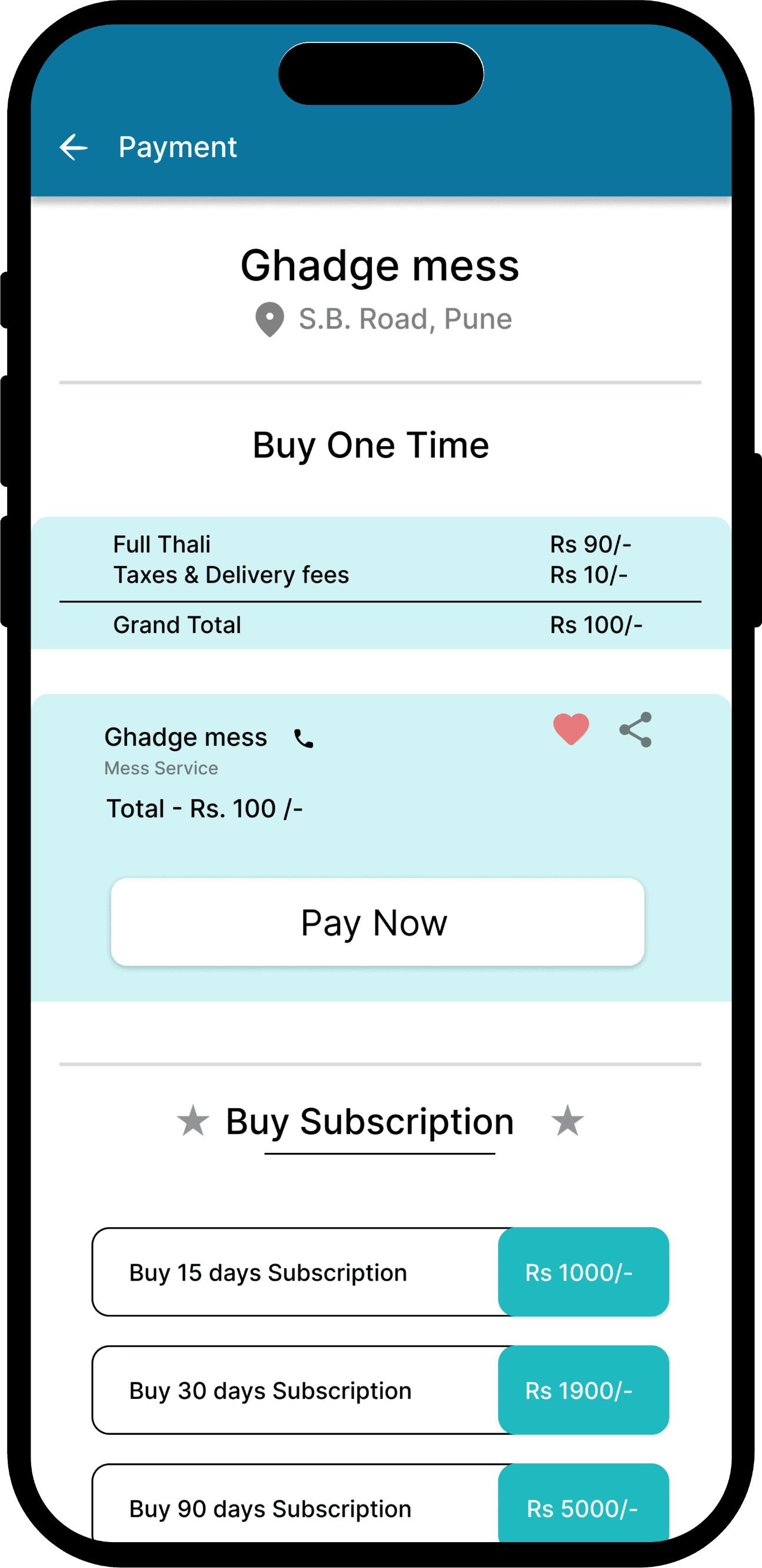
Food Service
Users can easily find vegetarian cooks or mess services for daily, home-style meals—quick, reliable, and affordable.
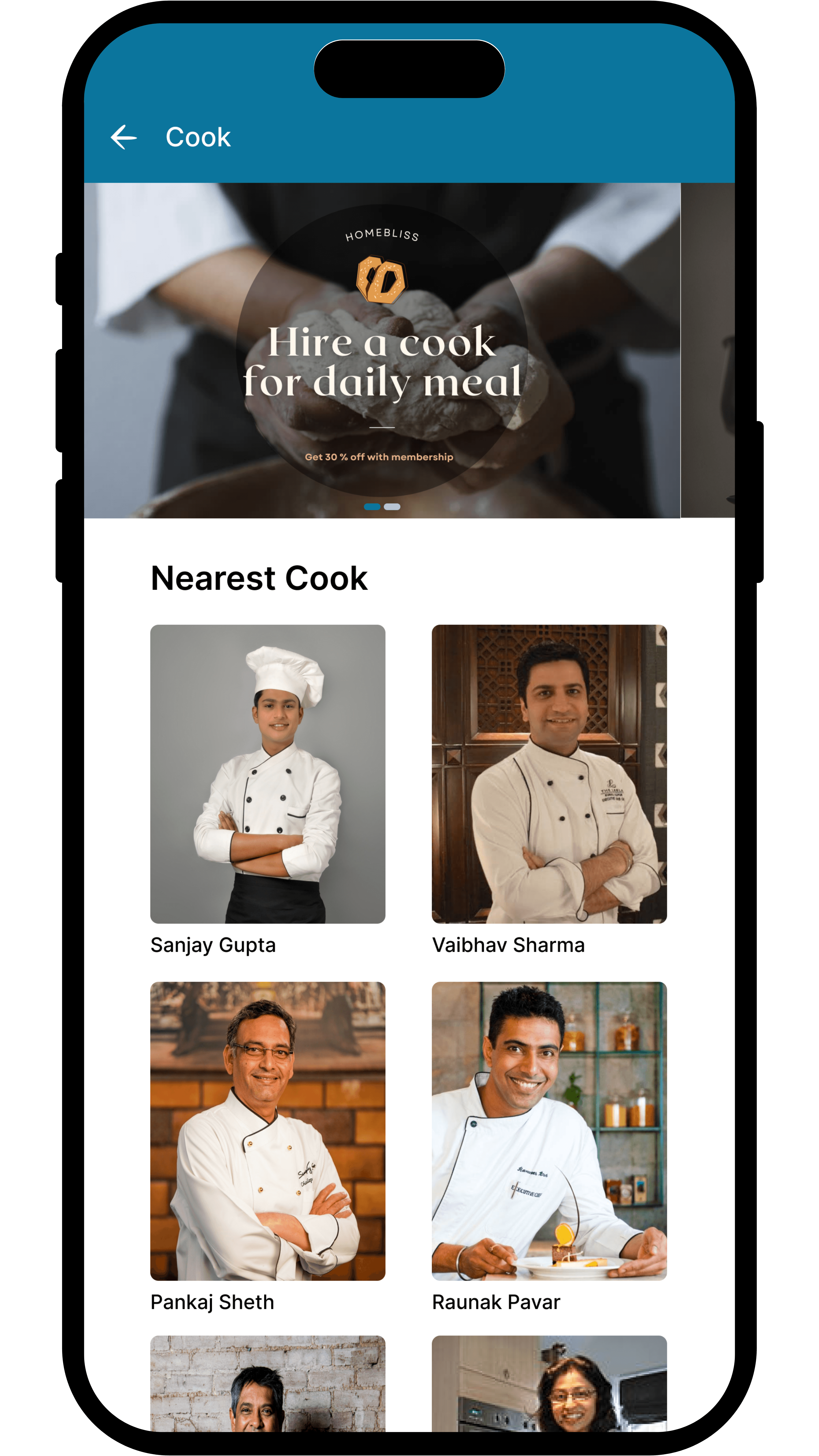
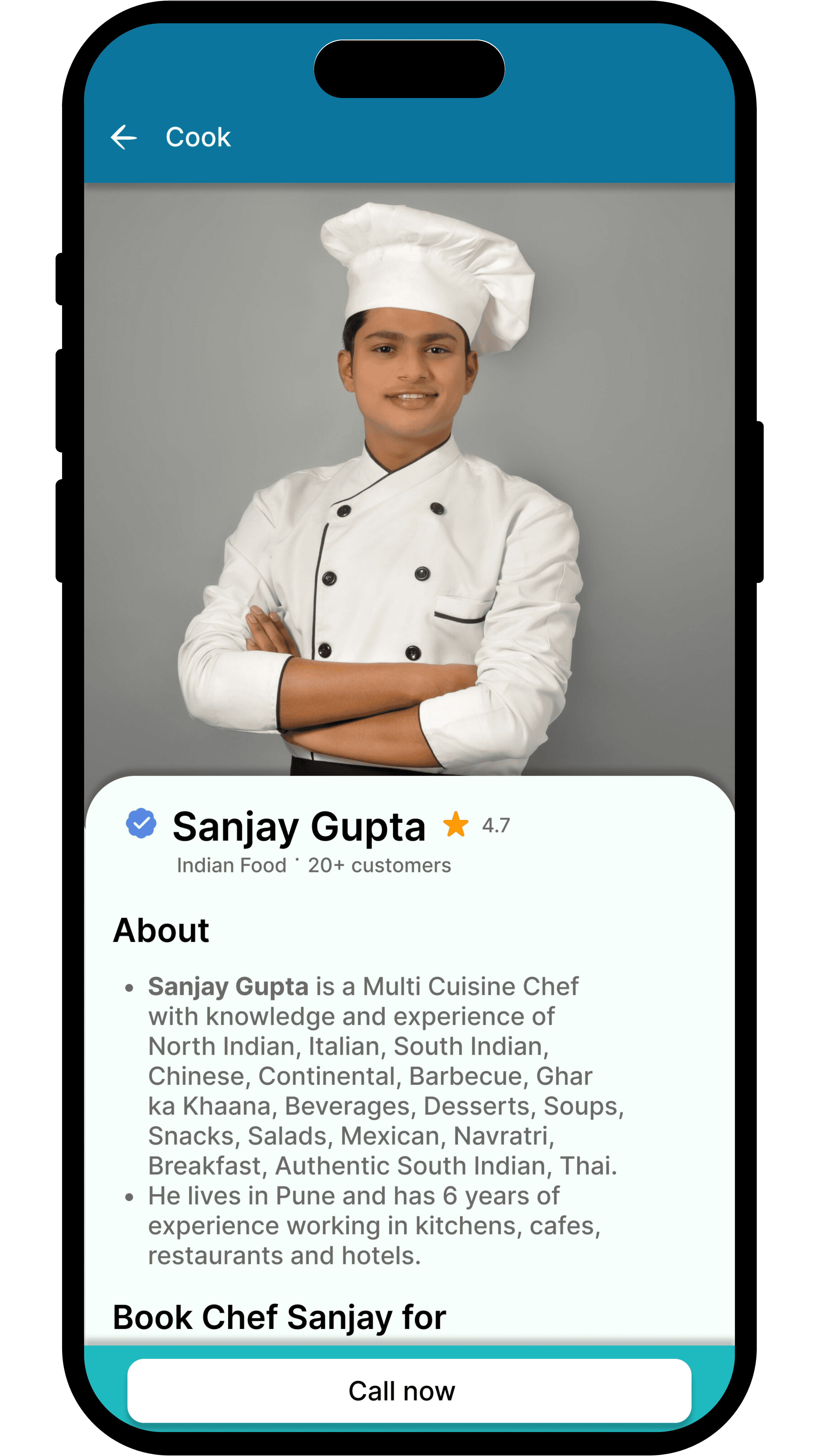
Cook Booking
Users can book home cooks by availability and preference—making daily meals easy and reliable.
07 — VALIDATE
Usability testing
I conducted usability testing with 5 target users, focusing on the service booking and split-pay flow. All users successfully completed the key tasks, confirming the design was clear and easy to navigate.
Feedback highlighted the speed and simplicity of the booking experience. Based on their input, I made small UI tweaks—like refining labels and improving visual clarity—to enhance overall usability.
5 users tested
Flows: booking, scheduling, payment
100% task success
08 — ITERATE
Feedback
After testing, I made key improvements based on user feedback—like enhancing button visibility, simplifying time selection, and refining layout spacing for a smoother, more intuitive experience.
Booking CTA
Feedback: Users said the “Book Now” button was hard to notice
Time Selection UI
Feedback: Users found time slots hard to find and awkward to select
Visual Hierarchy
Feedback: Users felt screens were cluttered and overwhelming
Iteration
Refined labels, buttons, and layout based on feedback. Simplified the vendor flow to match user-side ease—making the app more intuitive and dev-ready.
Booking CTA
Before: “Book Now” button was small and easily missed
After: Replaced with larger, more prominent “Book Now” button
Before
After
Time Selection UI
Before: Time slots were buried low on the screen.
After: Time picker brought above the fold for easier access. Remove unnecessary data.
Before
After
Visual Hierarchy
Before: Too many elements competed for attention on key screens
After: Refined typography, spacing, and color contrast to guide user focus better
Behance
Copyright @2026 Manish Durgude