Role
Product Designer
Client
o2h technology, Cambridge
Type
Website redesign
Scope
UX audit, accessibility, content fixes, design system, desktop and mobile
O2H, AS DESIGNED
CHAPTERS
01 — WHAT IT IS
o2h technology is the software arm of the o2h group, building products for life-science, tech and green-innovation startups out of Cambridge. Its site has to earn trust from founders and investors in a few scrolls: what the studio does, what it has shipped, and who it has shipped it for.
I kept the brand exactly as it was — the near-black canvas, the lime accent, the green service panels, the heavy Poppins headlines — and rebuilt the page underneath it as a component-based system with a real type scale, consistent spacing, accessible colour and a dedicated mobile layout.
All of it lives in Figma: a design-system page, a desktop page and a mobile page, each assembled from the same tokens and components.
02 — THE PROBLEM
A confident brand held together by guesswork.
The original was one 1440 × 8,802px frame of hand-placed layers. Cards were rectangles with text floating on top, buttons were a stroke grouped with a label, and the only component in the file was an empty card shell.
The colour had drifted: seven near-identical greens did the work of two, and 15 ad-hoc text sizes made the hierarchy wobble — footer links were set at 24px, the same size as card titles.
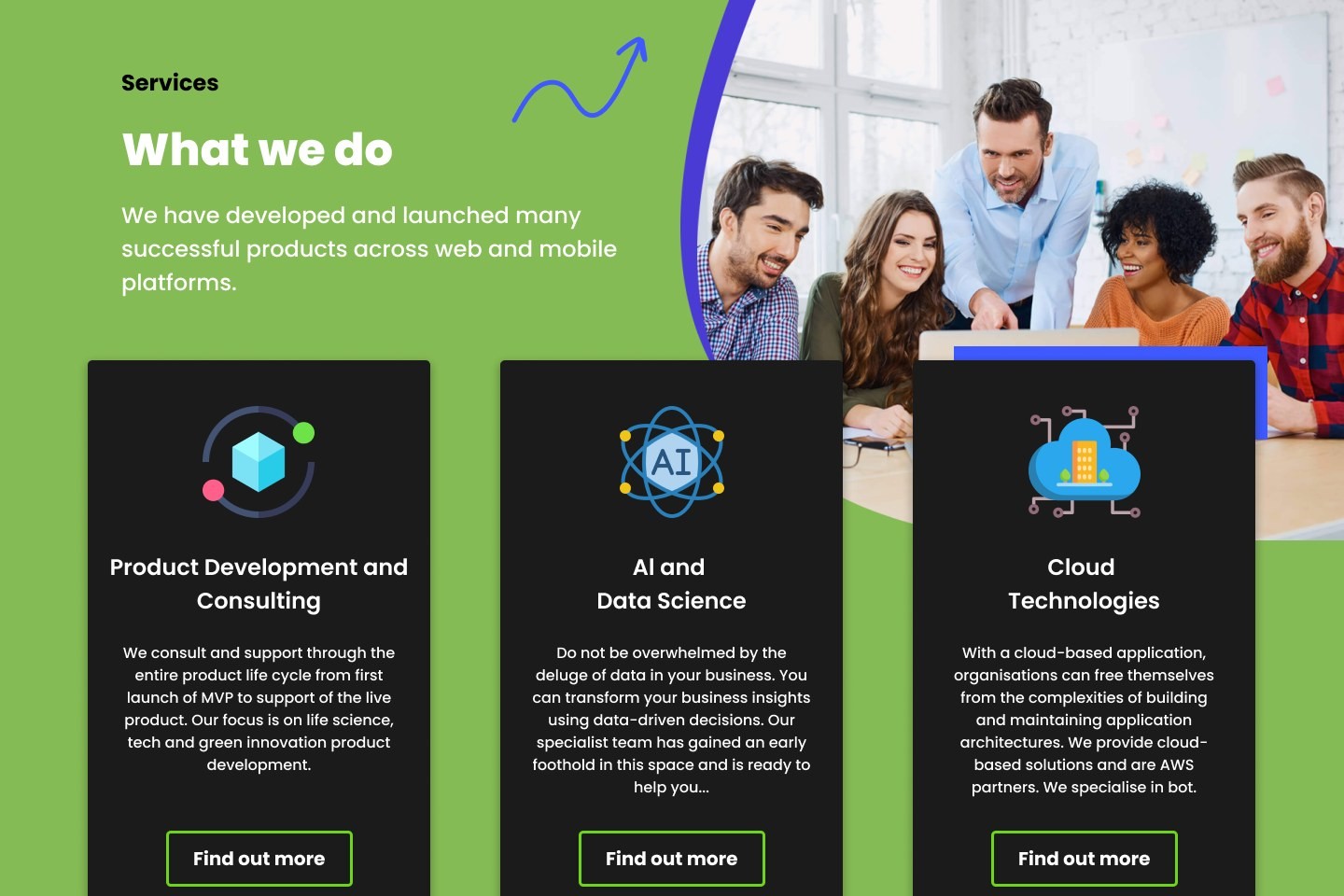
A lot of it was hard to read. White text on the green services and footer panels measured 2.3–2.9:1; “Join Us” was purple on an olive photo overlay at 1.1:1; news titles and “Continue reading” links were light green on white. The copy had slipped too — “Al and Data Science”, “Al RIghts Reserved”, and two carousel arrows that both pointed right.
THE DESIGN TENSION
The dark-and-lime look was the brand. The fix had to make it readable without making it any less loud.
03 — THE DESIGN
The full homepage, top to bottom — hero, the three pillars, about and stats, services, culture, portfolio, testimonial, news, newsletter and footer.

FULL PAGE
Desktop 1440
DESKTOP 1440
Services
04 — WHAT I DESIGNED
Three rules decided every change, in this order.
Keep the brand loud
Dark canvas, lime accent, green panels and ExtraBold headlines all stayed. Lime is now reserved for the primary action and the active state, so it still jumps off the page.
Readable by everyone
Every text colour passes WCAG AA. Where white failed on green, the text went dark and the panel kept its colour; where green failed on white, it moved to a deeper olive.
One system, two screen sizes
Desktop and mobile share the same tokens and text styles. Cards that didn’t fit a phone got compact counterparts rather than being squeezed.
05 — THE DESIGN SYSTEM
23 colour tokens in two families — lime and olive — replacing seven stray greens, 20 text styles, four shadow styles, and 15 components with 22 variants. Buttons alone cover five roles in two sizes: primary, outline, dark, white and outline-dark.
Headings follow one pattern everywhere — accent line, eyebrow, title, description — in three tones for dark, green and photo backgrounds, so a new section never has to invent its own.
COLOUR · 23 TOKENS · CONTRAST VS WHITE
LIME · 3
lime/100
#EEFBE0 · 1.1:1 —
lime/200
#C8F59A · 1.2:1 —
lime/500
#6FD613 · 1.9:1 —
OLIVE · 4
olive/500
#85BB54 · 2.3:1 —
olive/600
#7EA35D · 2.9:1 —
olive/700
#4A6B2A · 6.1:1 AA
olive/900
#3A5323 · 8.6:1 AA
BLUE · 1
blue/500
#3E59FF · 5.1:1 AA
VIOLET · 2
violet/500
#7432FF · 5.8:1 AA
violet/400
#696DF3 · 4.1:1 AA large
TEAL · 1
teal/500
#0FBA97 · 2.5:1 —
NEUTRAL · 1
ink
#101010 · 19.0:1 AA
INK · 2
ink/black
#000000 · 21.0:1 AA
ink/green
#24331A · 13.4:1 AA
SURFACE · 4
surface/card
#1B1B1B · 17.2:1 AA
surface/raised
#2A2A2A · 14.4:1 AA
surface/white
#FFFFFF · 1.0:1 —
surface/subtle
#F5F7F2 · 1.1:1 —
TEXT · 3
text/on-dark
#FFFFFF · 1.0:1 —
text/on-dark-muted
#B3B3B3 · 2.1:1 —
text/muted
#6A6A6A · 5.4:1 AA
BORDER · 2
border/dark
#333333 · 12.6:1 AA
border/light
#E6E6E6 · 1.2:1 —
TYPE SCALE · POPPINS · 15 STYLES + 5 MOBILE
Display
ExtraBold · 56/68
Heading/H1
ExtraBold · 44/56
Heading/H2
Bold · 32/44
Seeding new ideas
Heading/H3
SemiBold · 24/34
Seeding new ideas
Heading/H4
SemiBold · 20/30
We consult and support through the entire product life cycle.
Eyebrow
Bold · 18/28
We consult and support through the entire product life cycle.
Stat
SemiBold · 40/48
Body/Lead
Medium · 20/32
We consult and support through the entire product life cycle.
Body/Regular
Regular · 16/26
We consult and support through the entire product life cycle.
Body/Strong
SemiBold · 16/26
We consult and support through the entire product life cycle.
Label
SemiBold · 16/24
We consult and support through the entire product life cycle.
Button/Large
Bold · 18/26
We consult and support through the entire product life cycle.
Button/Medium
Bold · 16/24
We consult and support through the entire product life cycle.
Caption
Medium · 14/20
We consult and support through the entire product life cycle.
Caption/Strong
Bold · 14/20
We consult and support through the entire product life cycle.
SPACING · 8PT GRID · RADIUS · ELEVATION
space-4
space-8
space-12
space-16
space-24
space-32
space-40
space-48
space-64
space-80
space-96
space-120
xs · 6
sm · 10
md · 16
pill · 999
Subtle
Card
Card
Glow/Lime
COMPONENTS · LIVE SPECIMENS
BUTTONS · ON DARK
Get in touch
Find out more
See careers
View all news
BUTTONS · ON GREEN · NEWSLETTER FIELD
Subscribe
Learn more
Subscribe
FILTER CHIPS · CAROUSEL ARROWS
Show all
Mobile Application
QA Automation
FULL INVENTORY · 15 COMPONENTS · 33 VARIANTS
Button
10
Section Heading
6
Carousel Arrow
4
Filter Chip
2
Pillar Card
1
Service Card
1
Feature Row
1
Stat
1
News Card
1
News Card / Compact
1
Portfolio Tile
1
Portfolio Tile / Compact
1
Newsletter Field
1
Nav Bar
1
Nav Bar / Mobile
1
06 — THE MOBILE VERSION
The original had no mobile layout. At 390px the three pillars and six services become a scannable list of rows, the stats sit in one blue panel, the newsletter form stacks, and the portfolio filters, projects and news move into swipe rows with page dots.

MOBILE
390px
COLOUR TOKENS
TEXT STYLES
COMPONENTS
VARIANTS
GREEN FAMILIES (WAS 7)
SECTIONS
BREAKPOINTS
WCAG CONTRAST
07 — SELECTED DECISIONS
D01
Change the text, not the panel
The green services and footer panels are the most recognisable part of the site, and white text on them failed badly. Darkening the green would have fixed the contrast and lost the brand.
So the panels kept their exact colour and the type on them switched to ink. The dark service cards sitting on the green were already fine and stayed dark — which also makes them read as a separate layer.
2.3:1
white on the original green panel
8.4:1
ink on the same green
0
text colours left below WCAG AA
D02
Seven greens become two families
Seven hand-picked greens were doing the work of an accent and a surface. They collapsed into a lime family for actions and highlights and an olive family for panels and readable green text, each with a shade that passes on white.
D03
Mobile gets its own components
Instead of shrinking 373px desktop cards, the mobile page uses a compact Feature Row for pillars and services, 300px portfolio tiles and news cards in swipe rows, and a stacked newsletter form — each built at its real phone size.
08 — WHAT I WOULD TAKE TO THE NEXT ONE
Collapse the palette before touching layout.
Once the seven greens were two token families, most of the later decisions — button colours, link colours, panel text — made themselves.
Treat copy as part of the design.
Half the credibility problems on this page were typos and inconsistent capitalisation, not pixels, and they were the cheapest fixes of the whole project.
Loud brands can be accessible.
The page is still black and lime; it just stopped asking people to squint.
Behance
Copyright @2026 Manish Durgude