Role
Icon Designer
Company
openstroke, a Sketchish company
Timeline
9 months
Scope
Brief, metaphors, sketches, 48 px grid, vectors, Figma library, SVG delivery
OPENSTROKE, LIVE
48 px grid
Outline
Round caps
SVG + Figma
AI concepts
Landing page set
Delivered
Avatars
Chat app moods
Delivered
Emblems
Community event
Delivered
CHAPTERS
01 — THE STUDIO
An icon studio inside Sketchish.
openstroke is a sub-company of Sketchish that designs custom icon sets on request. A client arrives with a theme and a list of ideas; openstroke returns a consistent, ready-to-use icon family.
I was the icon designer. Every set I drew had to work on its own for one client — and still sit comfortably next to every other openstroke set.
This page is the record of how I did that: the brief, the construction decisions, the checks and the delivery, shown through 53 icons from three client themes.
02 — THE BRIEF
What I pull out of every request.
A request usually arrives as a theme and a rough list — “AI concepts for a landing page”, “moods for a chat app”, “emblems for a community event”.
Before drawing anything, I turn it into three answers:
Which ideas need an icon
The final list, one line per icon, with the meaning each one has to carry.
Where the icons will live
Website, product UI, slides or print — it decides contrast, colour and how much detail is useful.
→ The sizes they must survive
The smallest size sets the level of detail; the largest sets how much character fits.
Those three answers become the checklist the finished set is tested against.
Everything after this point — metaphors, sketches, grid work — is measured against that checklist.
03 — THE DECISION LOG
Four construction decisions, and why.
Every openstroke set shares one construction. These are the calls behind it — the context, the options, the decision, and what it means for each new set.
D01
A 48 px master, not 24
CONTEXT
Client icons appear large on websites and small inside products.
OPTIONS WEIGHED
·
Draw at 24 px and scale up
·
A separate drawing for every size
→
One 48 px master, scaled down
DECISION
Every set is drawn on a 48 × 48 master and ships at 24 and 48 px.
WHAT IT MEANS
Detail has room at 48 px, and the 2 px stroke becomes a clean 1 px line at 24.
EXHIBIT · THE GRID

The 48 px canvas with 4 px of padding and four keyline shapes, with three icons from different themes on top.
D02
One 2 px stroke for every set
CONTEXT
Icons from different requests should still look like one family.
OPTIONS WEIGHED
·
A stroke weight chosen per client
→
One stroke, round caps and joins, everywhere
DECISION
2 px on every icon, with round caps and round joins.
WHAT IT MEANS
A new request never changes how the existing sets look.
D03
4 px of padding and four keylines
CONTEXT
A round brain and a square chip should feel like the same size.
OPTIONS WEIGHED
·
Let each icon fill the whole canvas
→
Fit every icon to keylines inside a 40 px live area
DECISION
Ø40 circle, 36 px square, 32 × 40 and 40 × 32 rectangles — every icon centred.
WHAT IT MEANS
Every icon is optically balanced and sits in the same place on the canvas.
D04
One silhouette for every avatar
CONTEXT
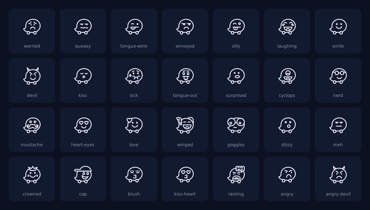
Twenty-eight avatar moods had to read as one character.
OPTIONS WEIGHED
·
A new head shape for each mood
→
One body; only the face changes
DECISION
Eyes, mouth and at most one accessory change. The body never does.
WHAT IT MEANS
New moods fit in without redesigning the base.
EXHIBIT · ANATOMY
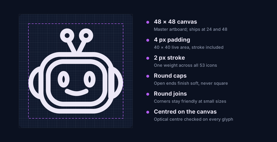
The robot at 10× on the pixel grid inside its 40 px live area — 2 px stroke, round caps, round joins.
ALSO DECIDED
Emblems on the circle keyline
Themed emblems are rebuilt on the Ø40 circle with the house stroke, so they sit next to product icons without looking borrowed.
Names describe the shape
ai/robot-chat, not ai/support — the name says what you see, not what it does.
currentColor for every stroke
One colour token recolours the whole set, in light or dark, with no second set of files.
Whole-pixel anchors
Points snap to the grid, so edges stay crisp when an icon is scaled down.
04 — THE SET
Three client themes, one construction.
53 icons from three requests. Each theme adds one rule of its own on top of the shared grid and stroke.
EXHIBIT · THE THEMES
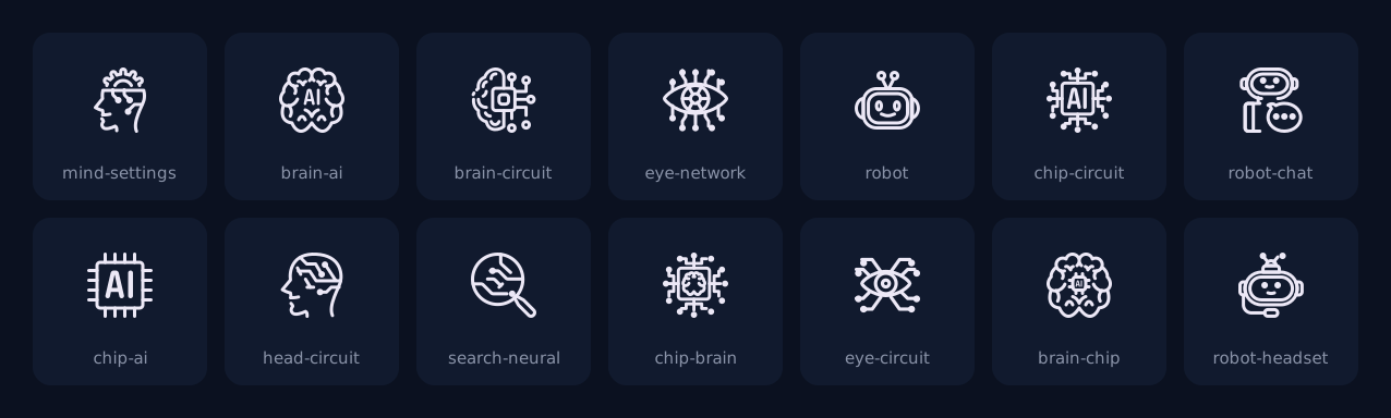
AI and tech (14): circuit traces end in open dots so dense icons still breathe. Expressive avatars (28): one body, many moods. Pop-culture emblems (11): recognisable shapes rebuilt on the circle keyline.
AI & TECH · 14 ICONS
EXPRESSIVE AVATARS · 28 ICONS

POP-CULTURE EMBLEMS · 11 ICONS

05 — TESTING
Three checks before anything ships.
Every icon is checked on its own and next to the rest of the set. A set ships only when every icon passes all three.
SIZE
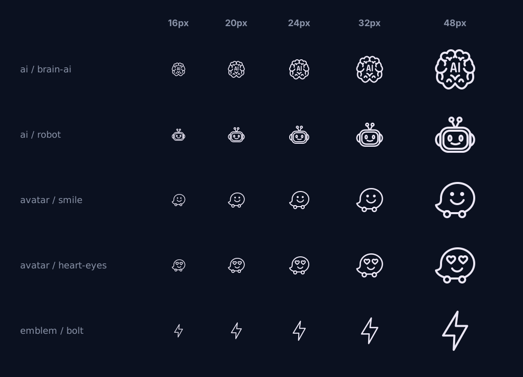
16, 20, 24, 32 and 48 px
Side by side with the rest of the set, on the pixel grid
The silhouette reads at 20 px and up
CONTRAST
The icon against its background
Measured on light and dark surfaces
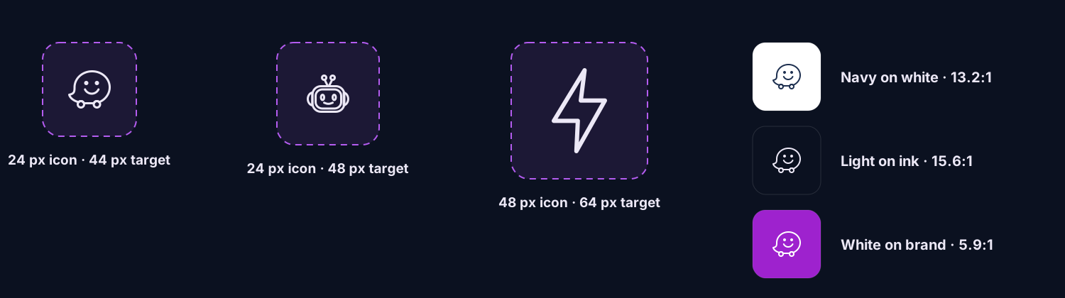
3:1 or better — navy on white is 13.2:1
THEME
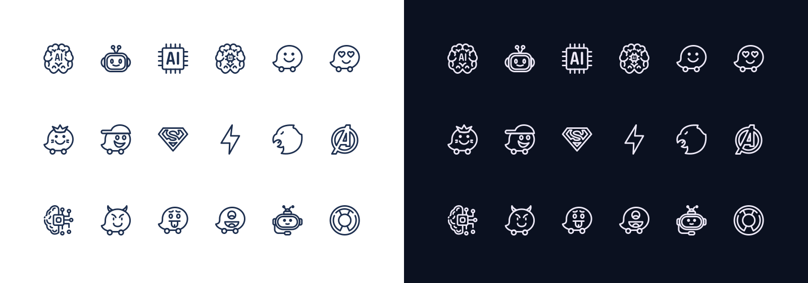
Light and dark
One currentColor stroke and one colour token
No second set of files is needed
SIZE RAMP · 16 → 48 PX
TOUCH TARGETS · CONTRAST
LIGHT · DARK
06 — MY PROCESS
From brief to delivery, in six steps.
The same six steps for every request, whether it is five icons or fifty.
1
Read the brief
List every idea the client needs, the sizes the icons will live at, and where they will be used.
2
Choose the metaphors
Two or three ways to draw each idea, then pick the one people recognise fastest — a brain for “AI”, a chip for “hardware”.
3
Sketch the silhouettes
Quick sketches settle the shape before any grid work. The outline has to read before detail is added.
4
Build on the grid
Each icon is drawn on the 48 px master with the 2 px stroke, snapped to whole pixels and fitted to the keylines.
5
Test at size
Every icon is checked at 16, 20, 24, 32 and 48 px, in light and dark, next to the rest of the set.
6
Package and deliver
Icons become named Figma components and optimised SVGs, with a usage sheet so the client’s team can use them straight away.
07 — DELIVERY
What every client receives.
Every set leaves openstroke in three forms, all using exactly the same names.
DELIVERABLE 1
Figma library
Every icon a named component, 24 and 48 px sizes, colour from a token
DELIVERABLE 2
SVG and PNG set
Optimised SVGs using currentColor, plus PNG at 1x and 2x
DELIVERABLE 3
Usage sheet
Grid, stroke, padding and sizing rules on one page
ONE NAME, THREE PLACES
FIGMA
openstroke / ai / robot-chat · Size = 24 | 48 · Colour = text token
SVG
os-ai-robot-chat.svg · stroke: currentColor · viewBox 0 0 48 48
DELIVERY
Figma component library · optimised SVG set · PNG @1x and @2x · usage sheet
08 — WHAT I CARRY FORWARD
Three habits I bring to every set.
Start from the smallest size
The smallest size in the brief decides how much detail an icon can hold, so I sketch at that size first.
Write the rules down
Grid, stroke and padding live on the usage sheet, so a new icon for the next request fits without redrawing the old ones.
Test the set, not the icon
An icon is only finished when it sits right next to the rest of the family, at every size.
An icon set is a promise that every new icon will look like it belongs. The construction is how openstroke keeps it.
Behance
Copyright @2026 Manish Durgude